
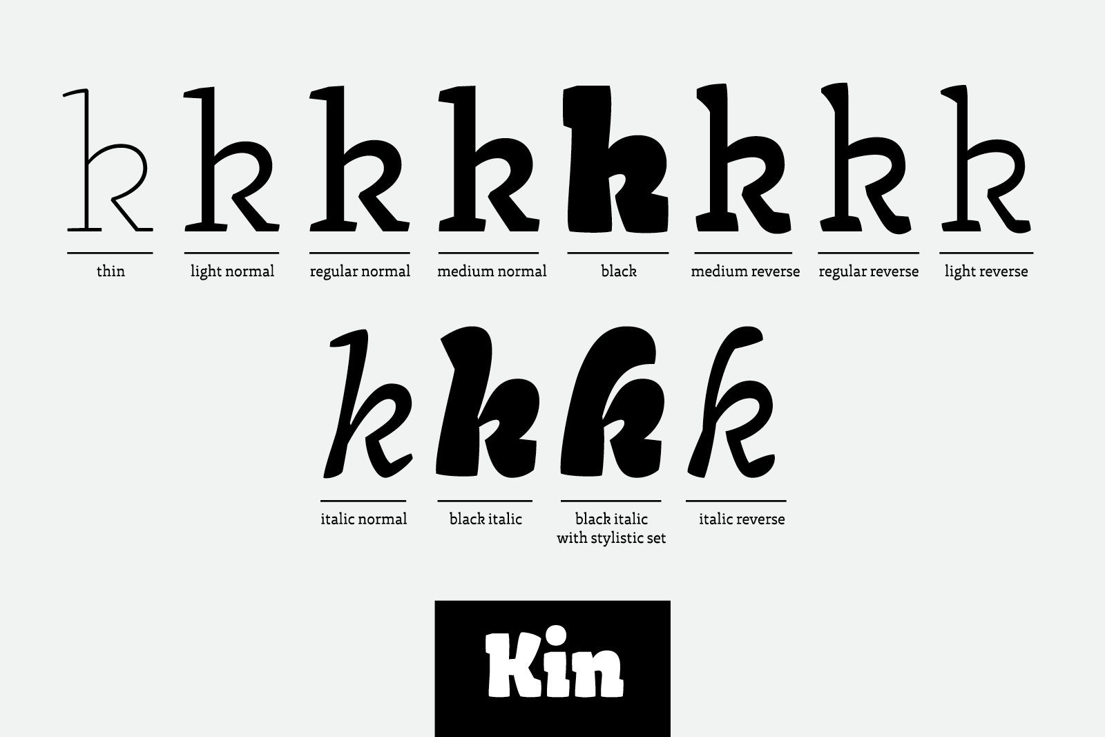
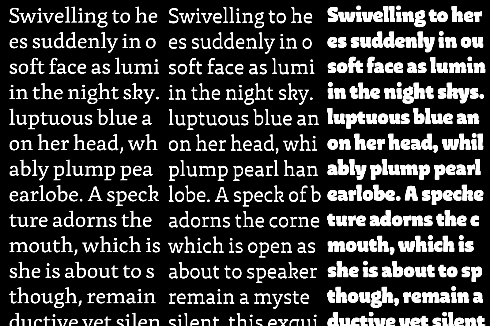
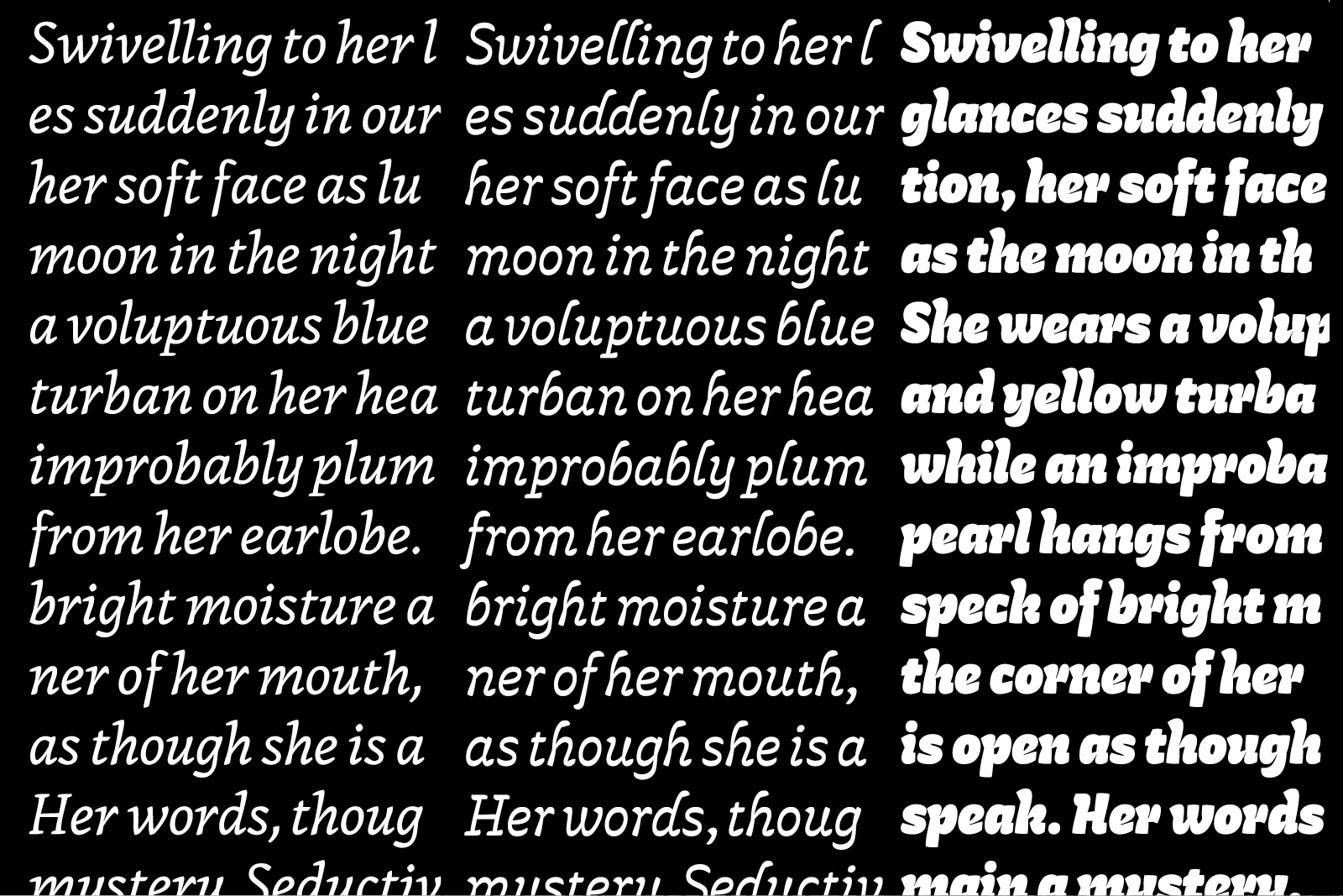
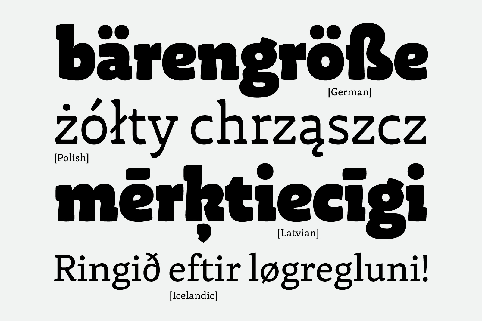
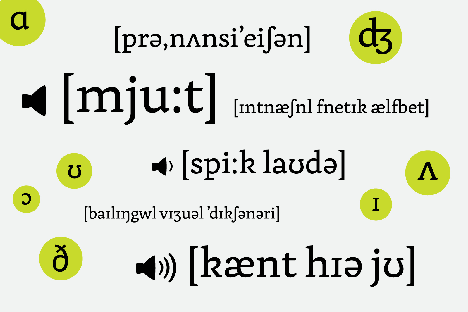
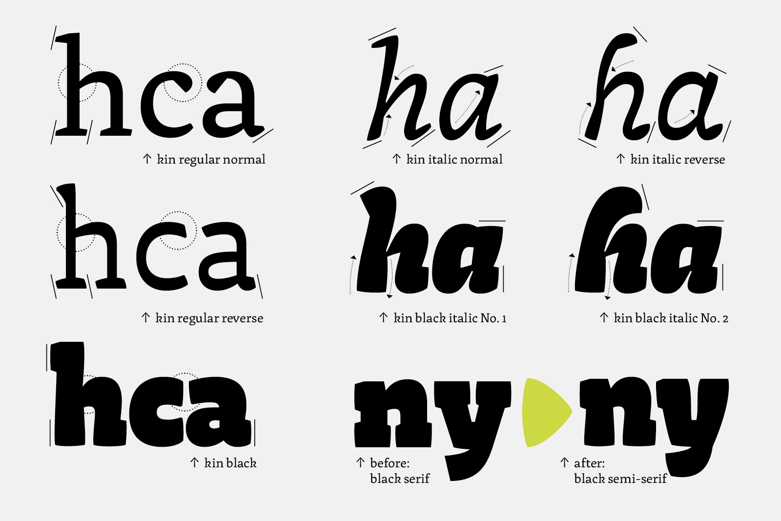
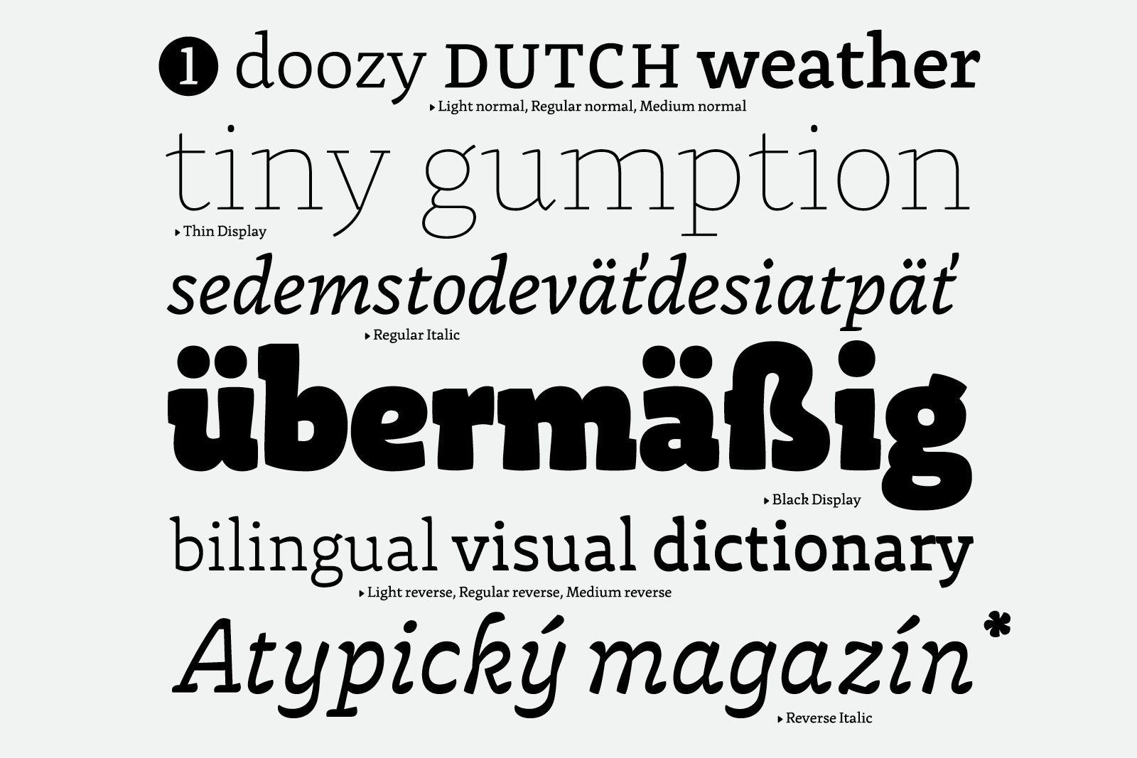
The Kin typeface family joins a few contradictory qualities to make an interesting experiment. In small sizes the type remains readable and delicate, while the expressive qualities of the letters come to the foreground when enlarged. This makes the type a perfect choice for periodical designs. Above all, the jury appreciated the alternative styles with reversed contrast. The reversed styles stress the horizontal strokes of letters instead of the vertical ones. Although this is not an common solution in Latin typography, Sláva Jevčinová has managed to achieve a natural and elegant stylization of the letter shapes. The alternative styles additionally cohere with the non-Latin scripts, among which such solutions are often applied. The author supplemented the set with symbols of the international phonetic alphabet.