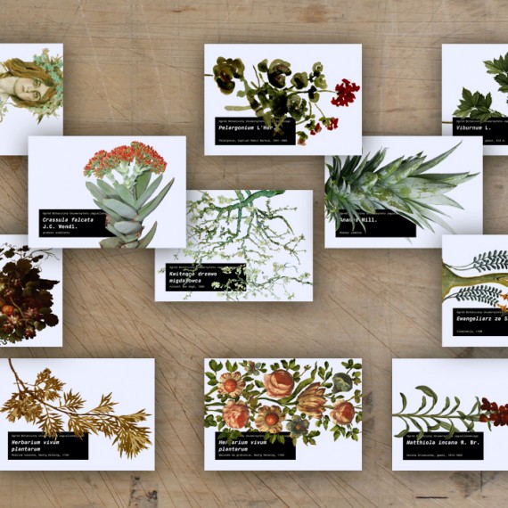
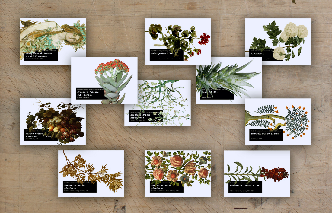
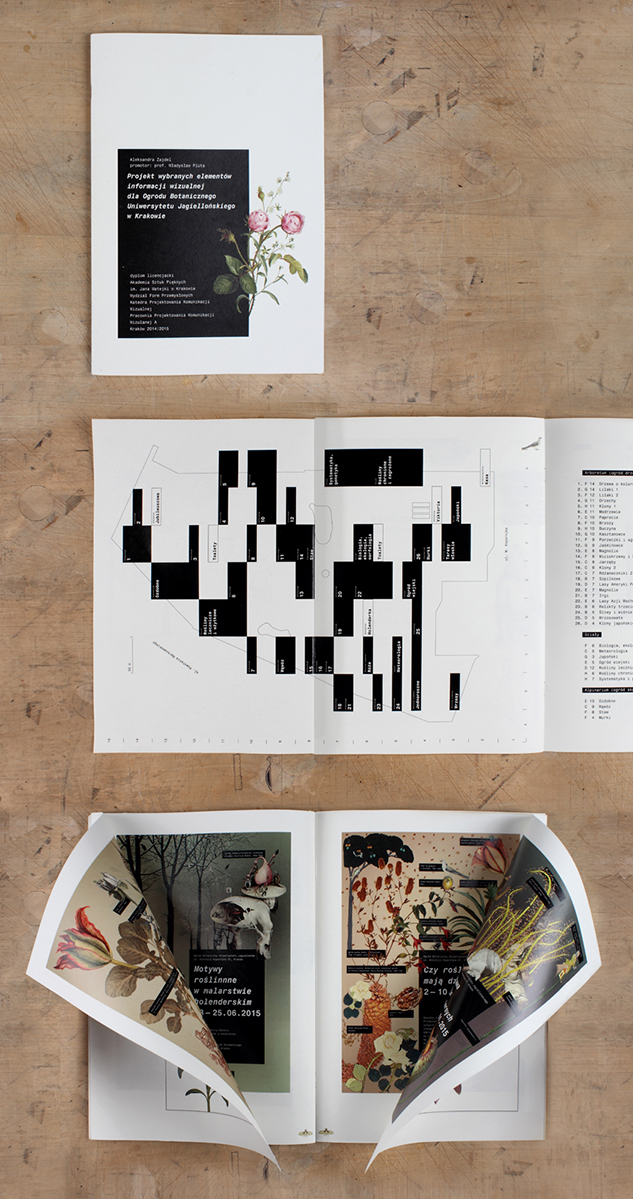
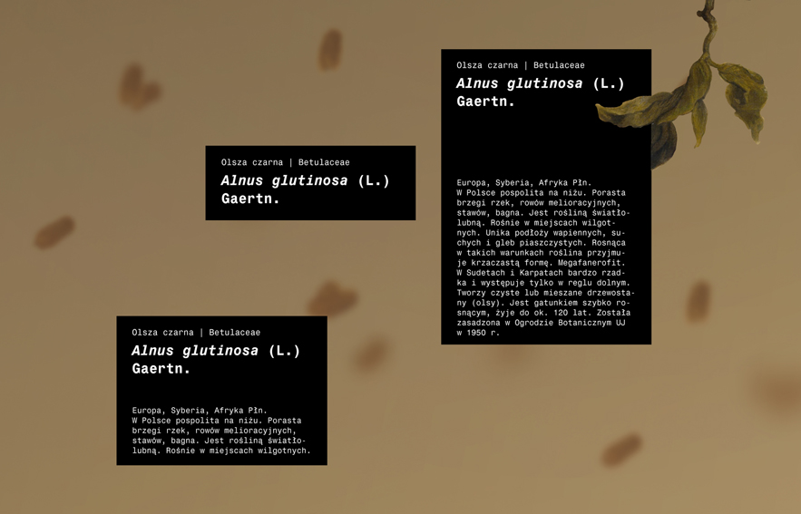
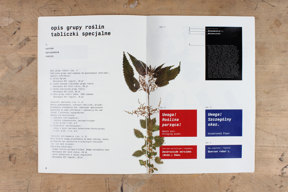
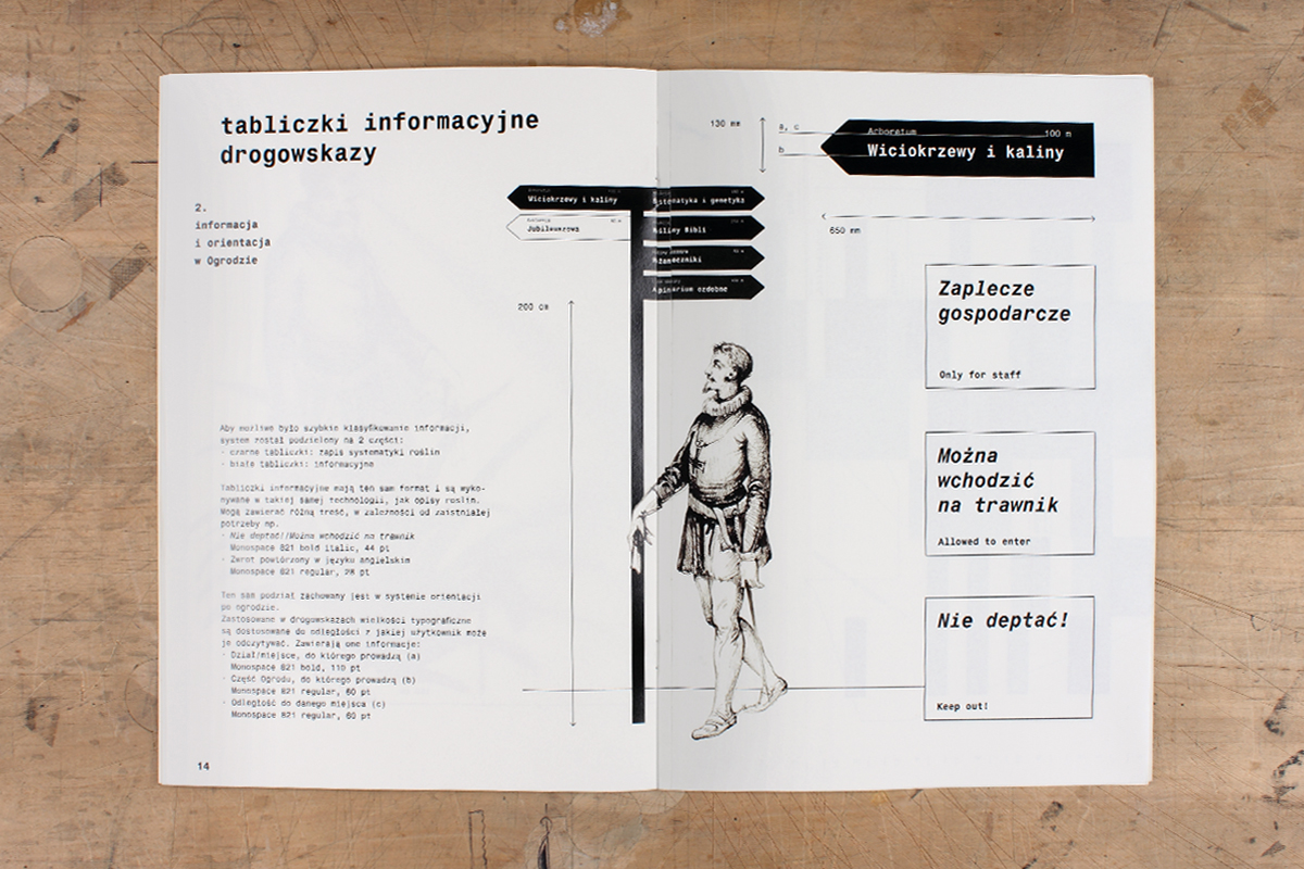
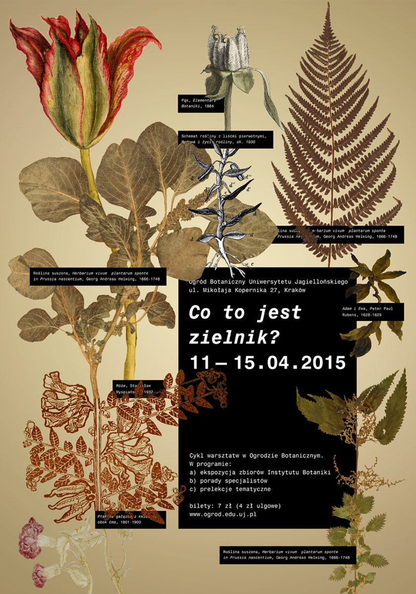
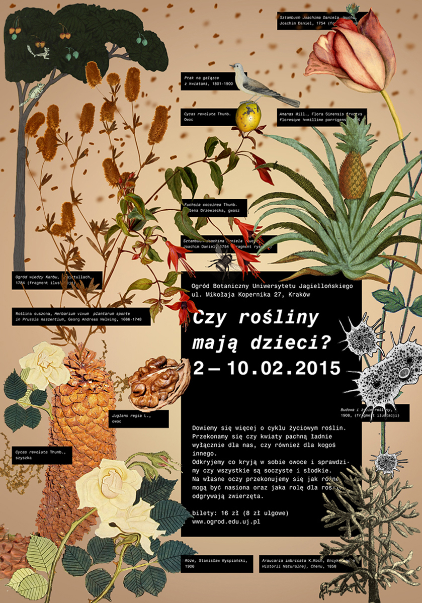
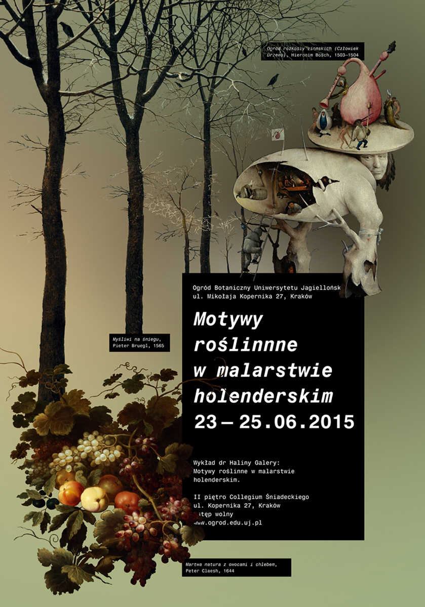
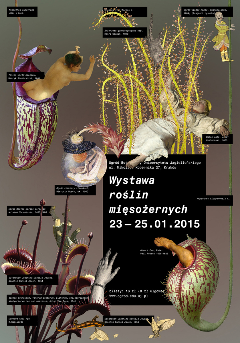
This straightforward BA project provides no innovations, nor even the slightest trace of formal experimentation. It is simply an apt identity for a branch of the university that need not especially court visitors or compete on the market. The idea involves joining black plates with “scientific” monospace script and illustrations drawn i.a. from old botanical atlases. The information on the plants (individual specimens, groups, families) makes for a visual key that splendidly replaces a logo, and which could inspire attractive promotional materials. This is all – but it’s quite a lot.