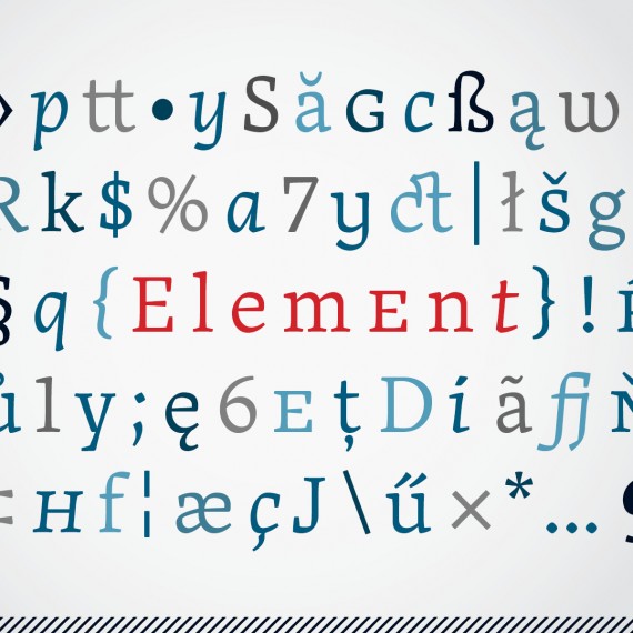
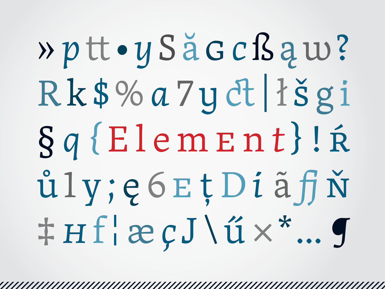
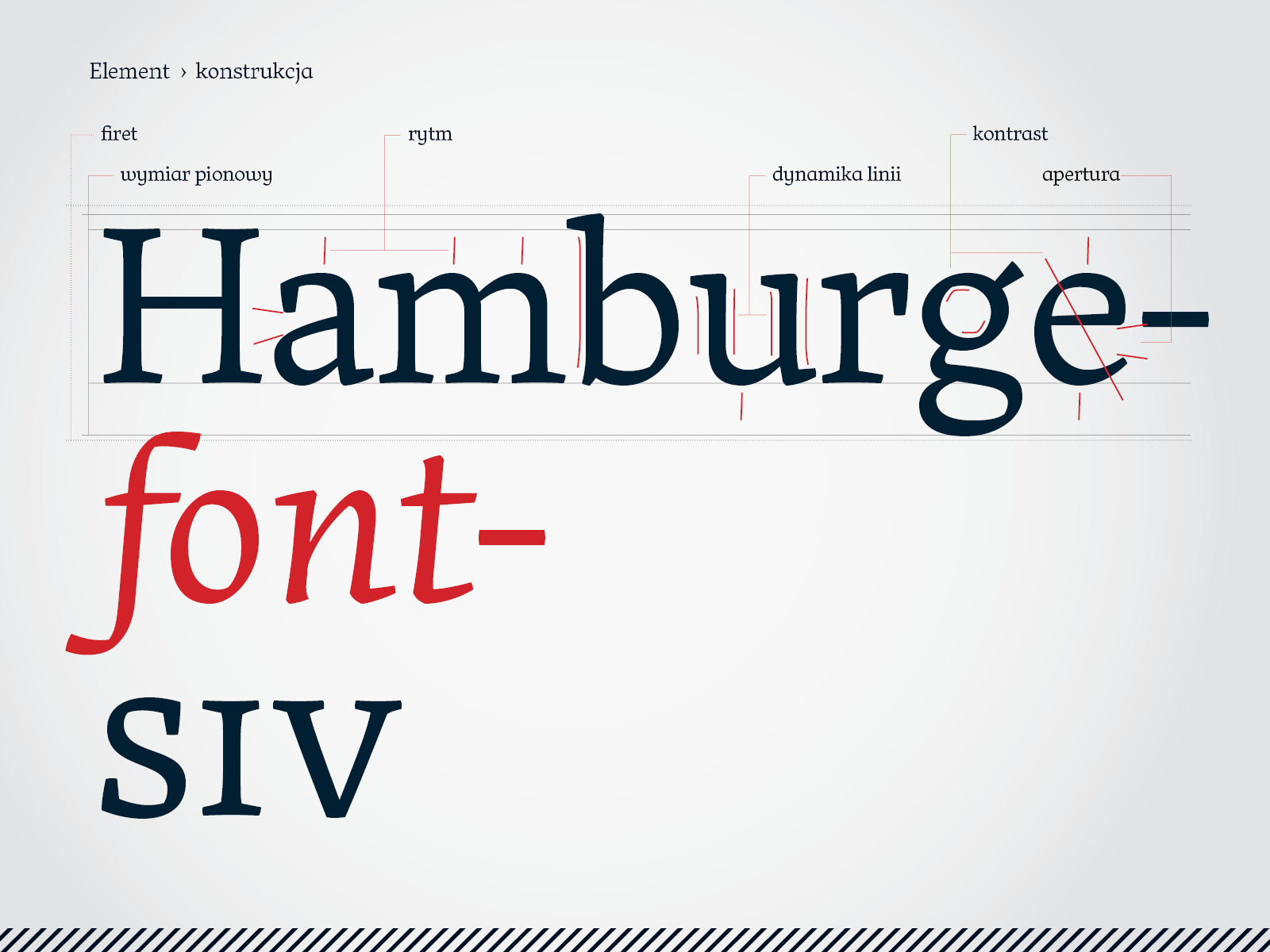
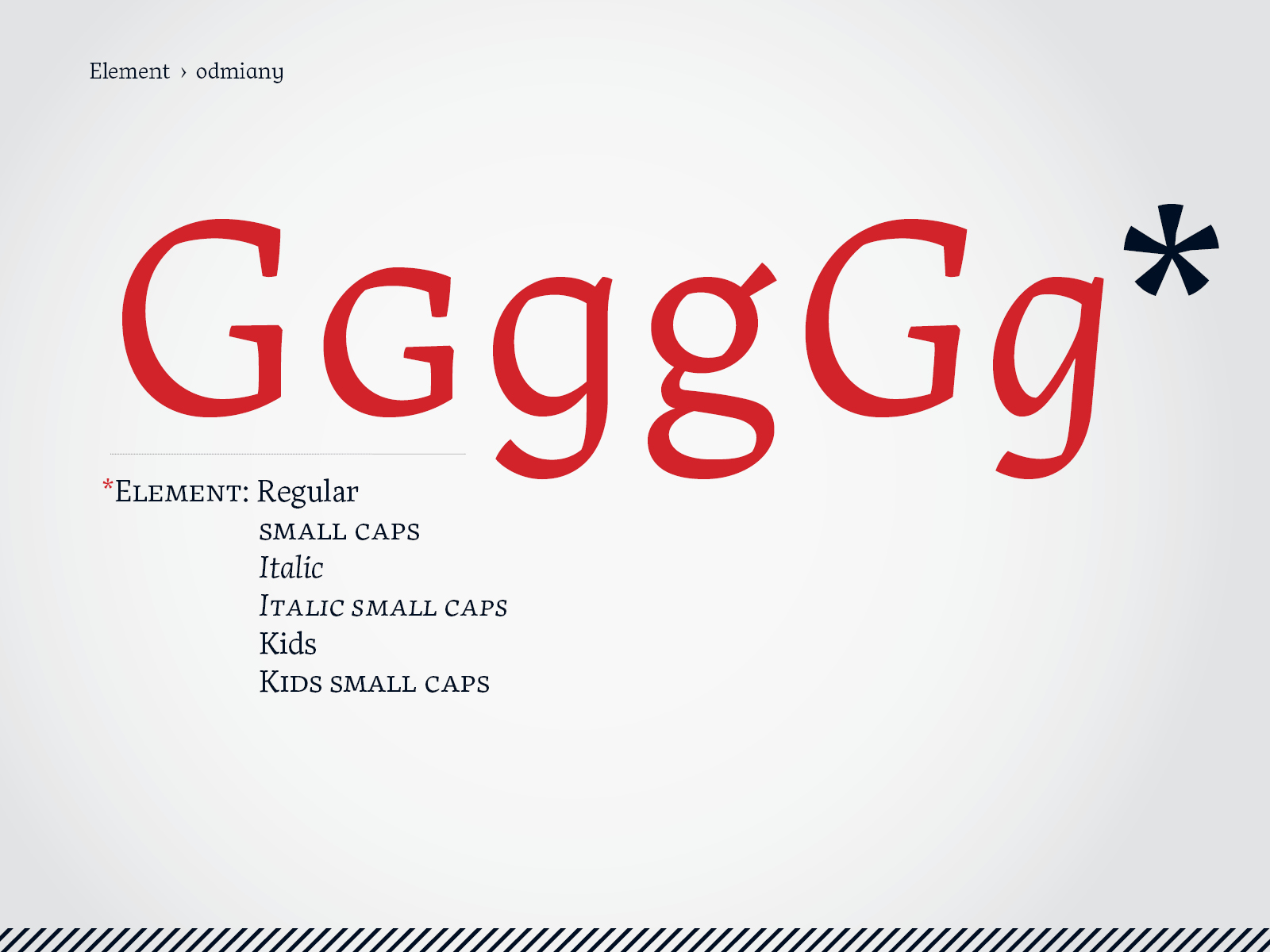
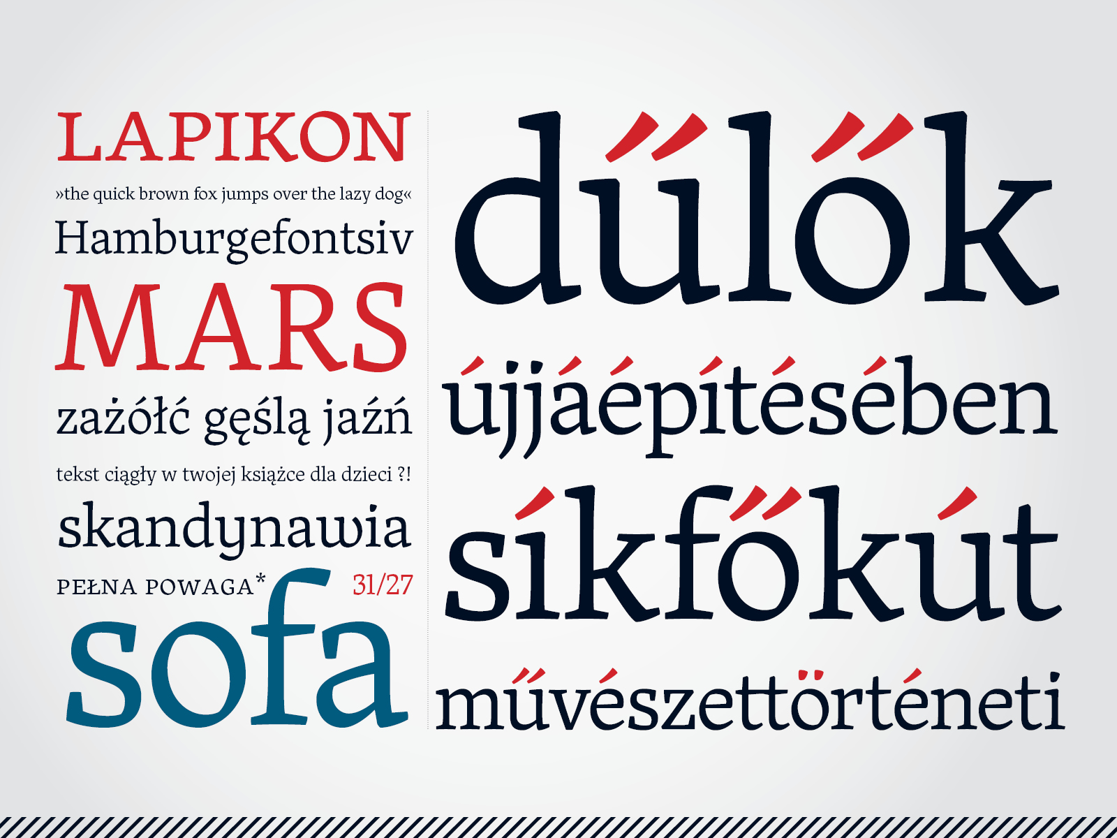
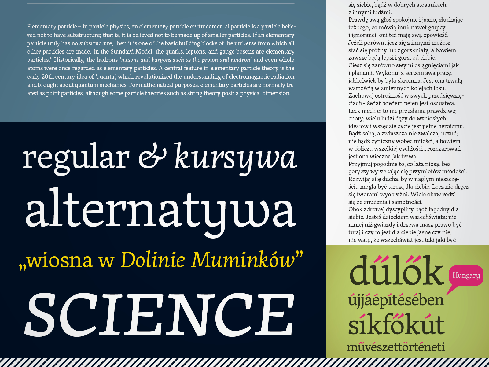
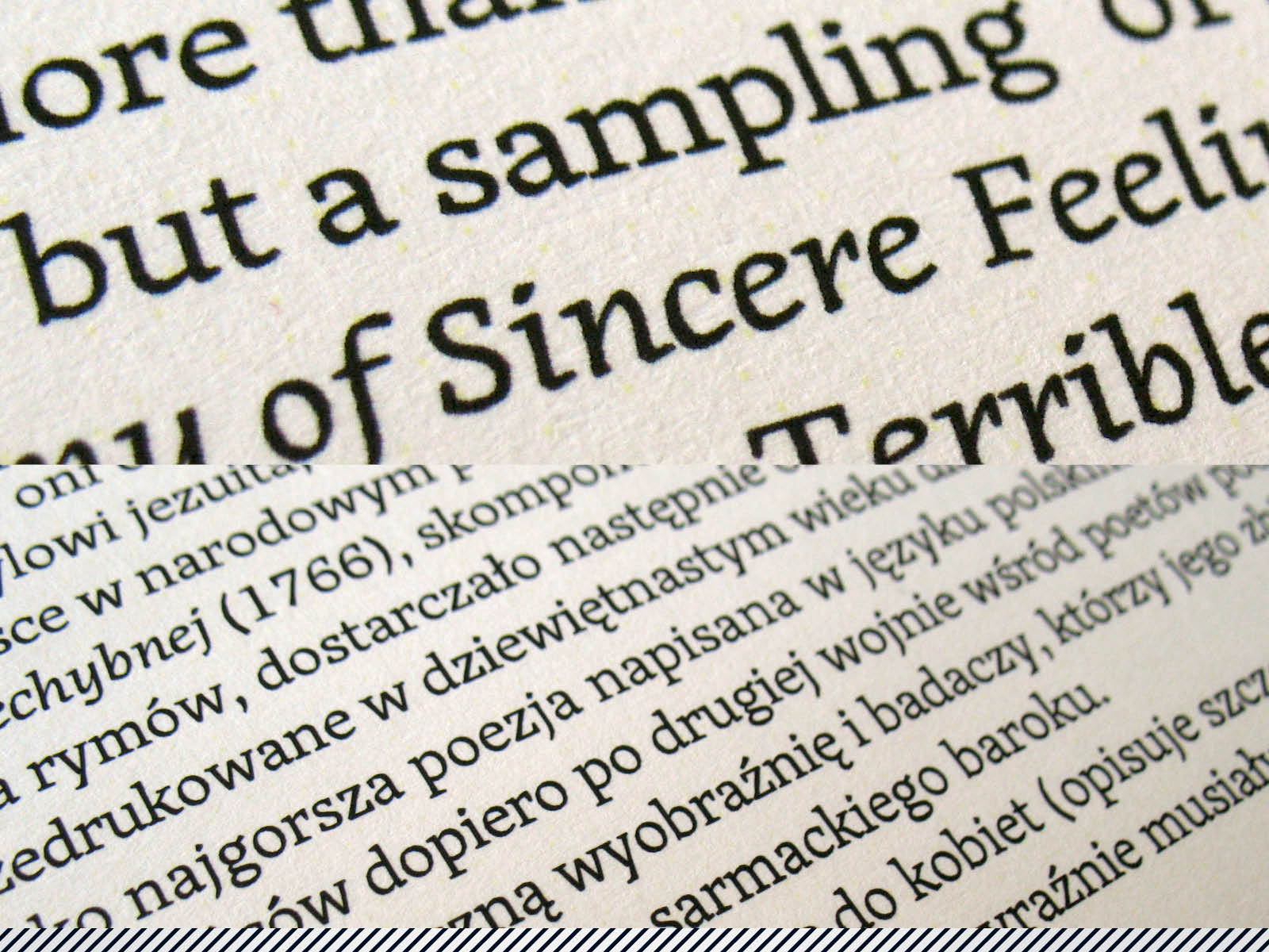
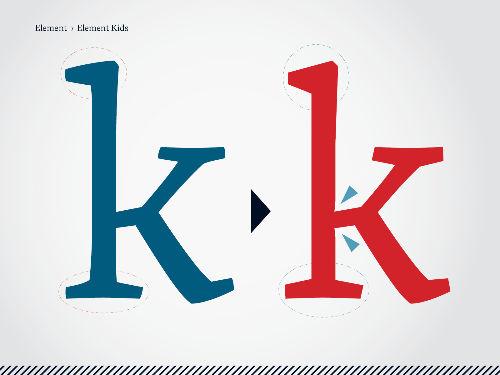
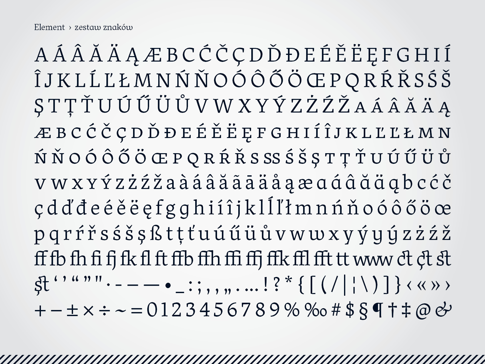
Element struck us as the most interesting of the body types submitted to the review. The designer’s premise was to create a universal typeface, combining aspects of body types and displays. As he himself states, Element works best on high‑quality paper prints. After his BA defense, the designer continued working on the design, creating the Element Kids version for printing fine type size in low quality paper. The typeface has a full characters set, including small caps and ligatures. Its charm is in the combination of elements characteristic of old‑style typefaces – including a strong left axis slant of the round letters – with very modern proportions, high elements contrast and arcs that join sharply. The irregular shape of the dot over the i might seem controversial, as might the fairly liberal treatment of the diacritical signs.