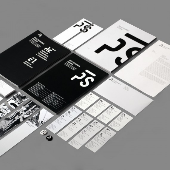
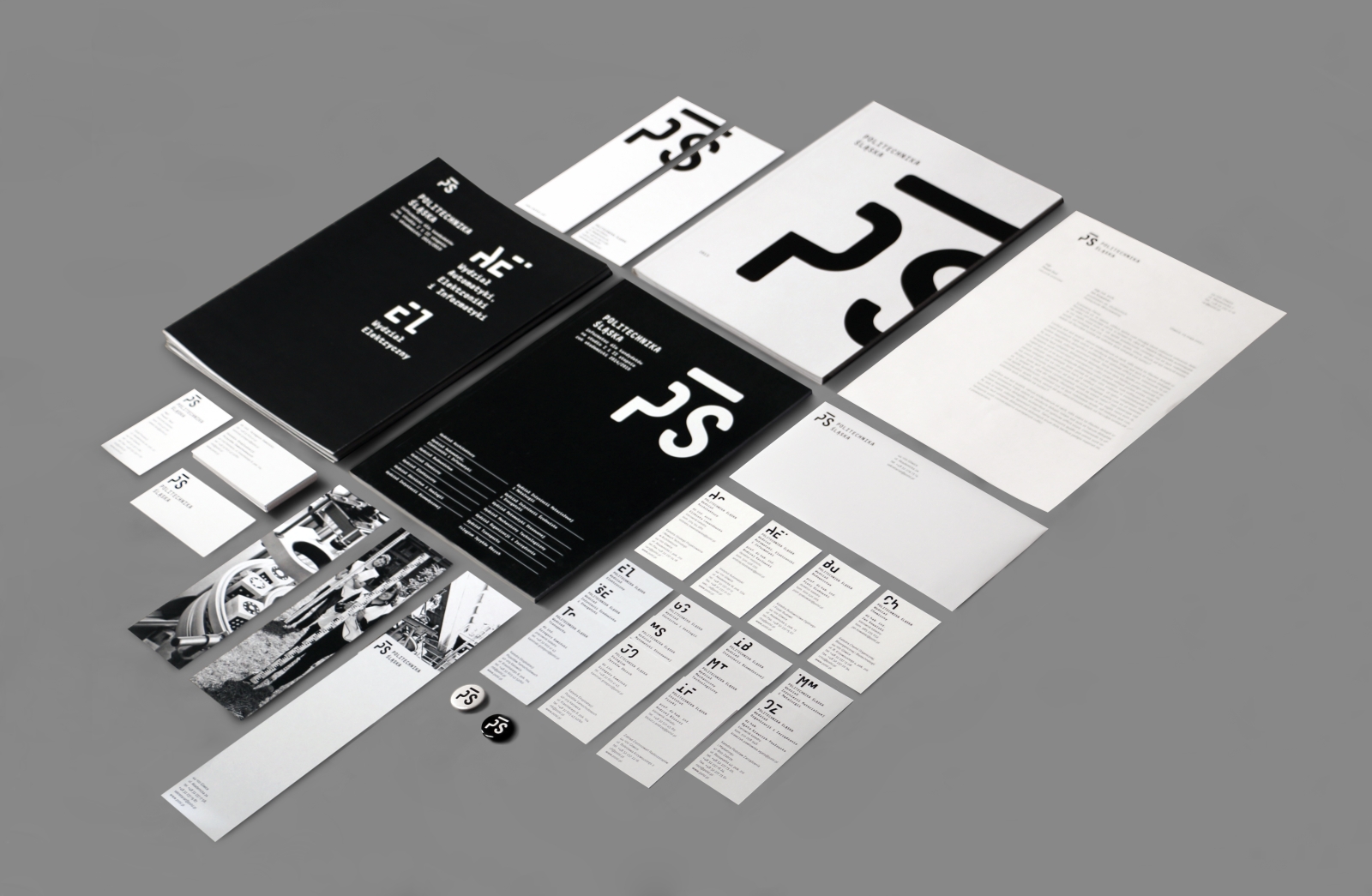
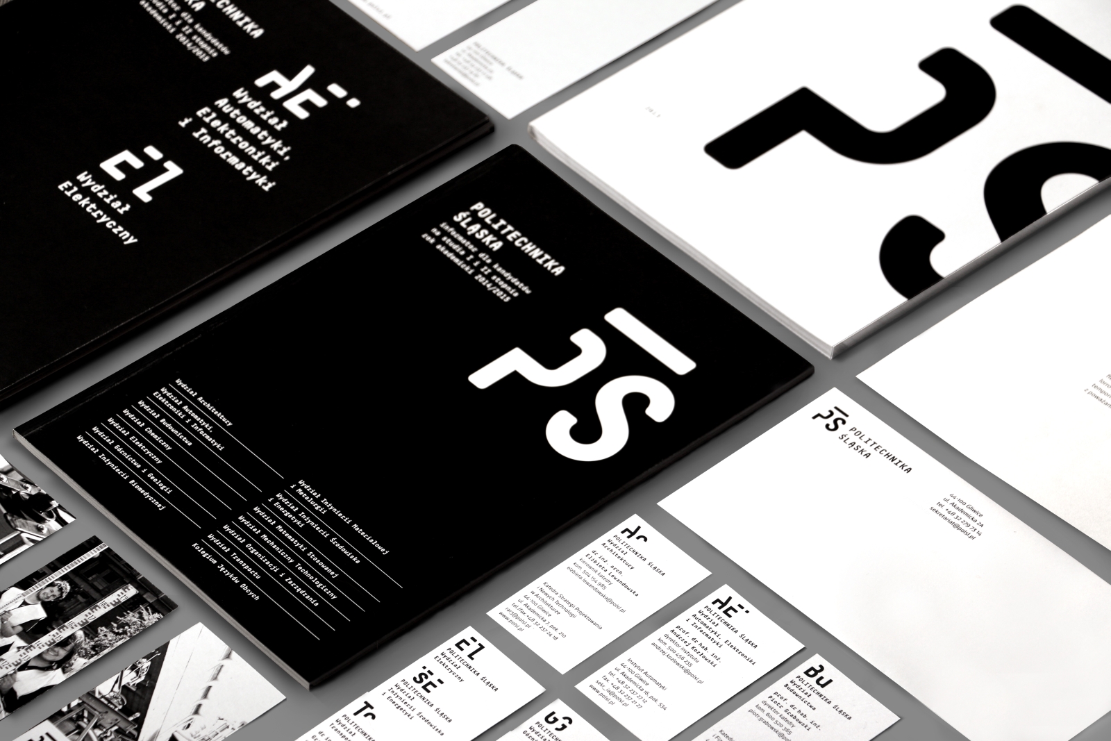
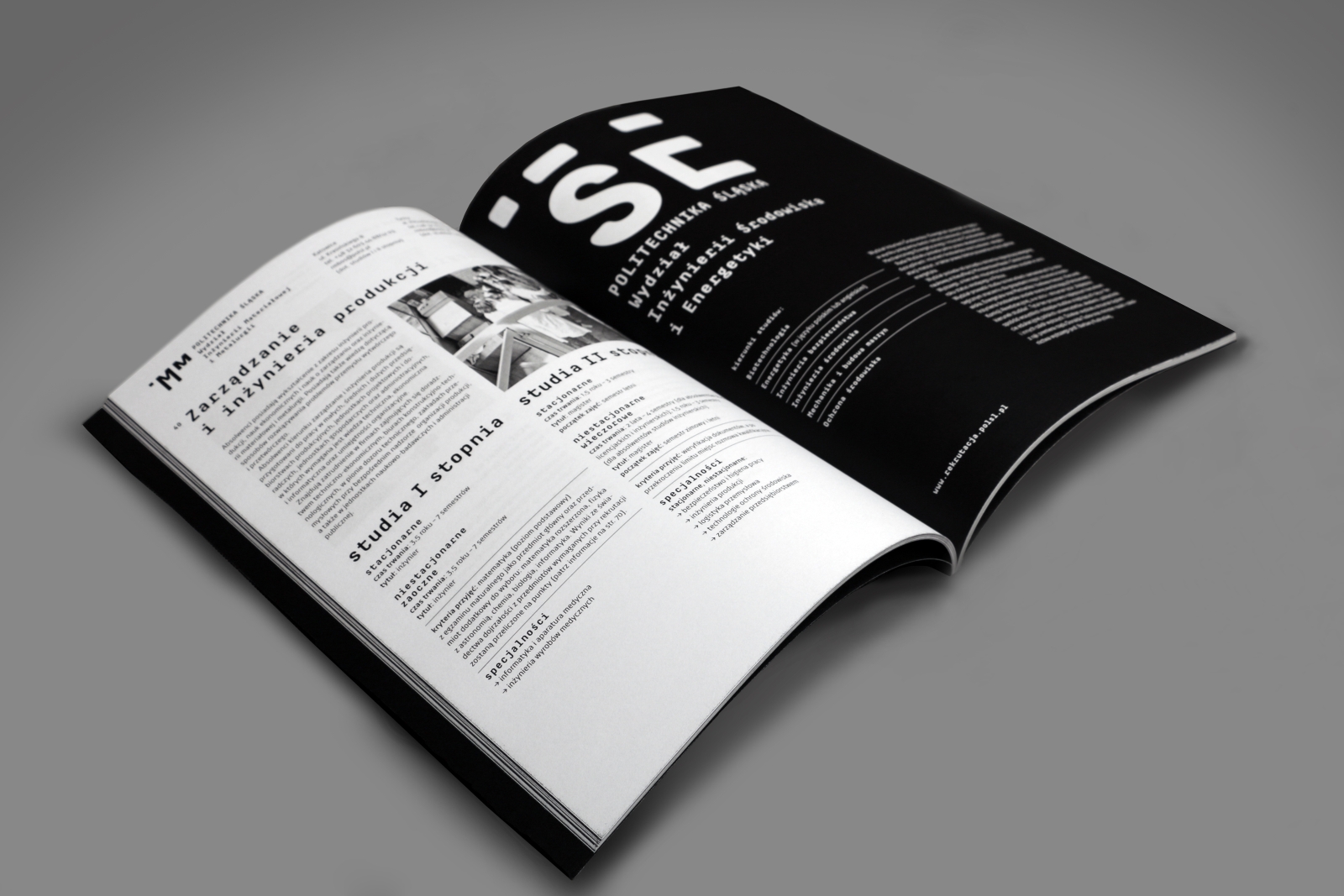
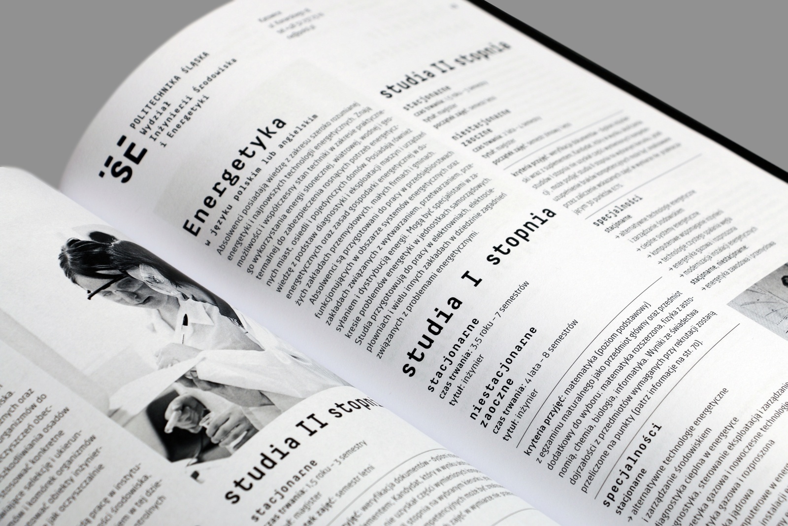
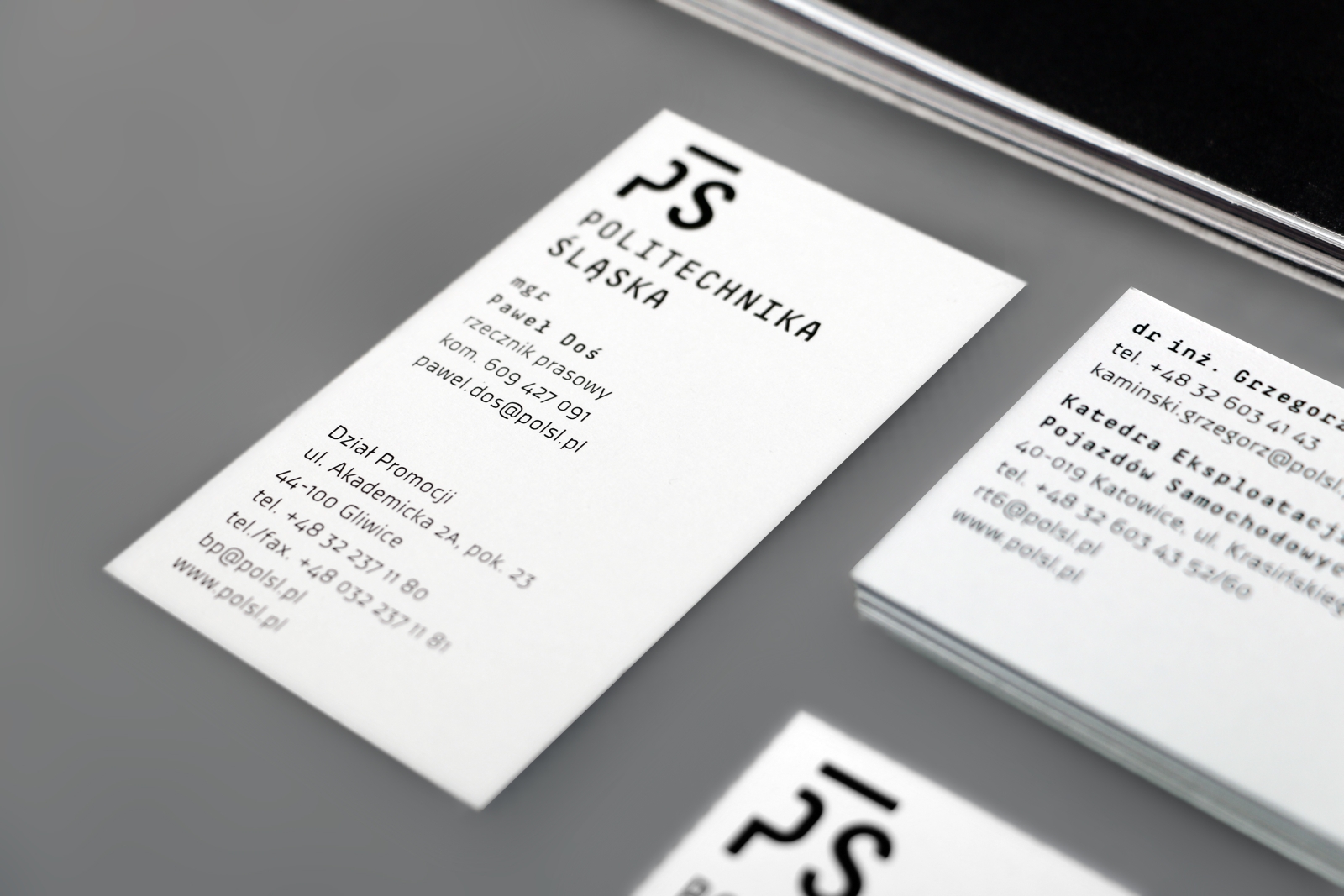
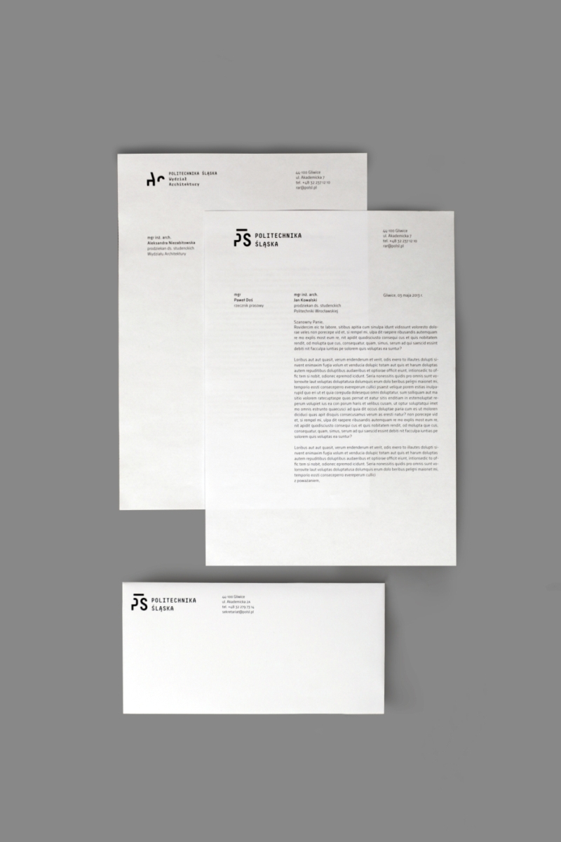
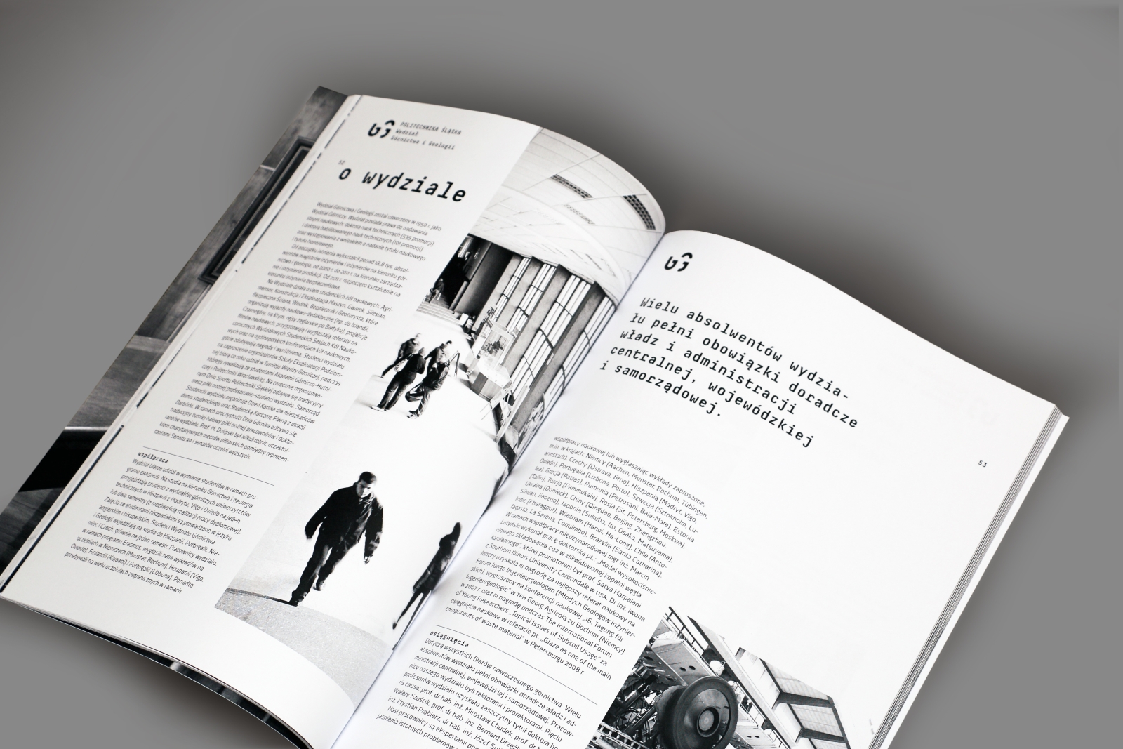
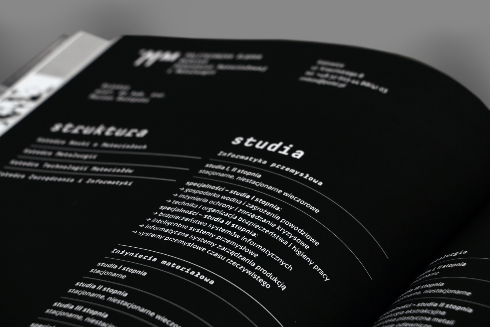
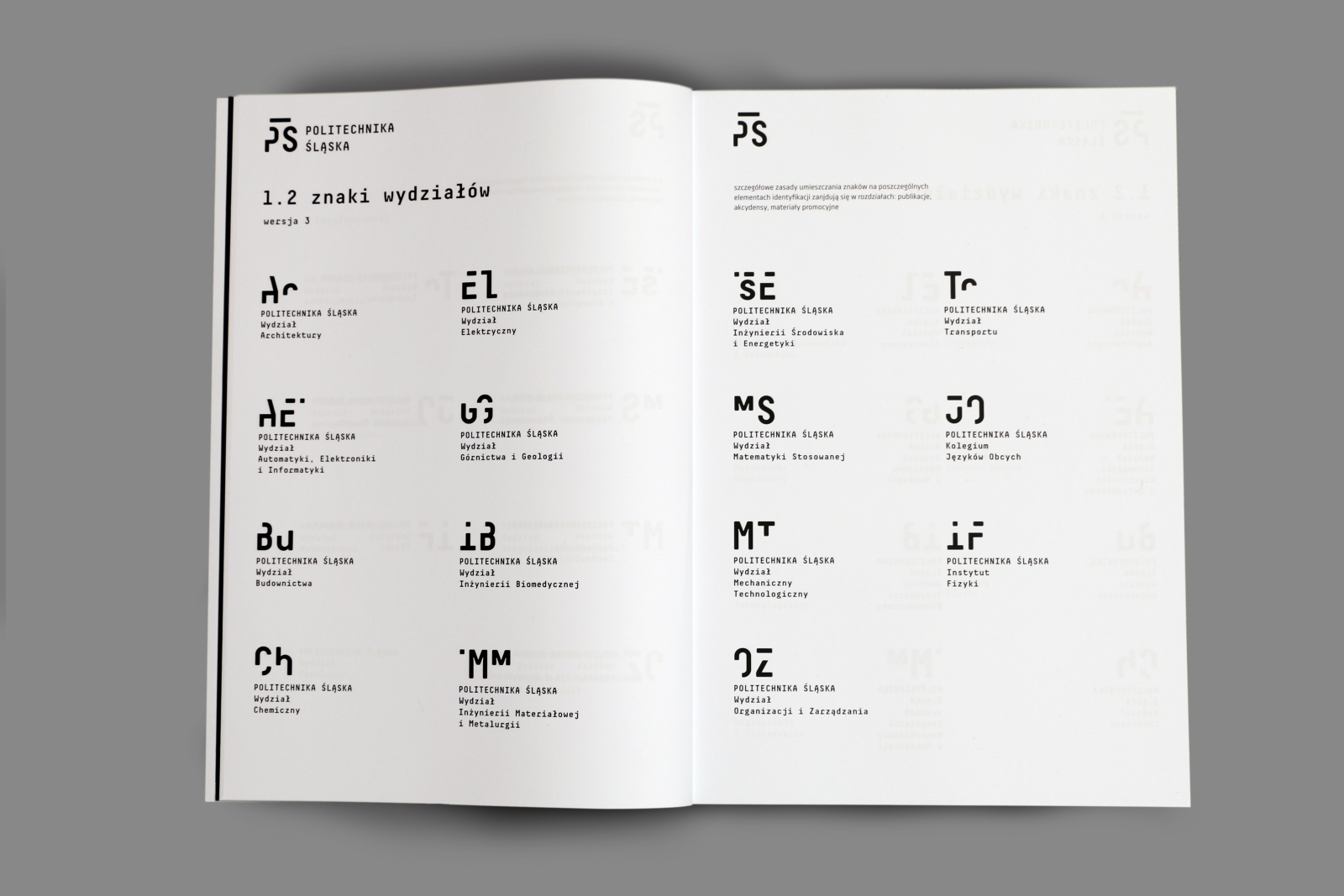
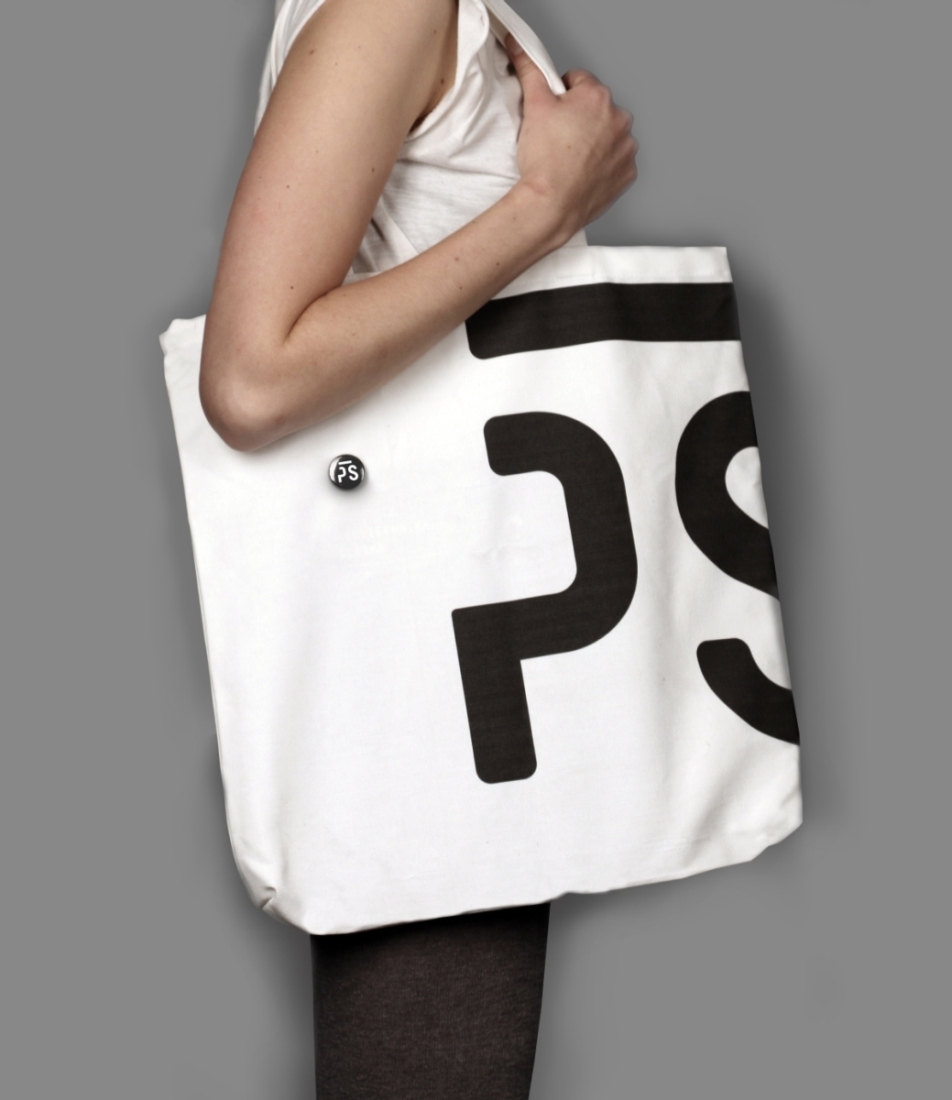
In visual IDs for institutions with long‑standing traditions, often the most difficult, yet most necessary thing seems to be departing from the solutions used to date. The present visual identity for the Silesian University of Technology is composed of graphic symbols that have evolved over the years, illustrating the various departments. Anna Kaleta’s BA project attempts to take a fresh look at the problem. The university and each of its fifteen departments are given new logos, created using acronyms of their names. The letter elements in their inscriptions were reduced to the bare minimum, guaranteeing recognizability. The technological look of the proposed typeface (Decima Sans) matches the university’s profile. The whole of the design is brilliantly executed in formal terms. Our only reservations were in the inconsistency with which the logo was used in the format. The key question is: Does the new system really improve upon the old one, taking into account the fact that a new set will have to be designed for other language versions? The equality with which the university and its various departments have been treated also gives us pause for thought. And finally, if we assume that the role of the designer is to give the existing reality structure – does every department really need its own logo?