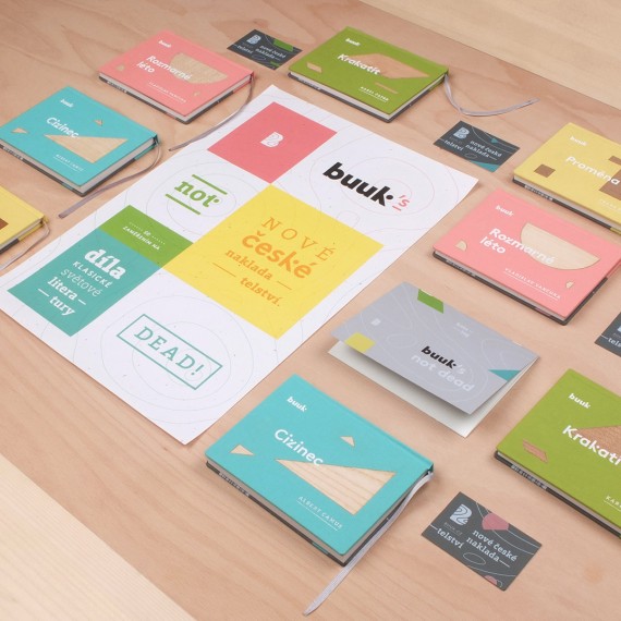
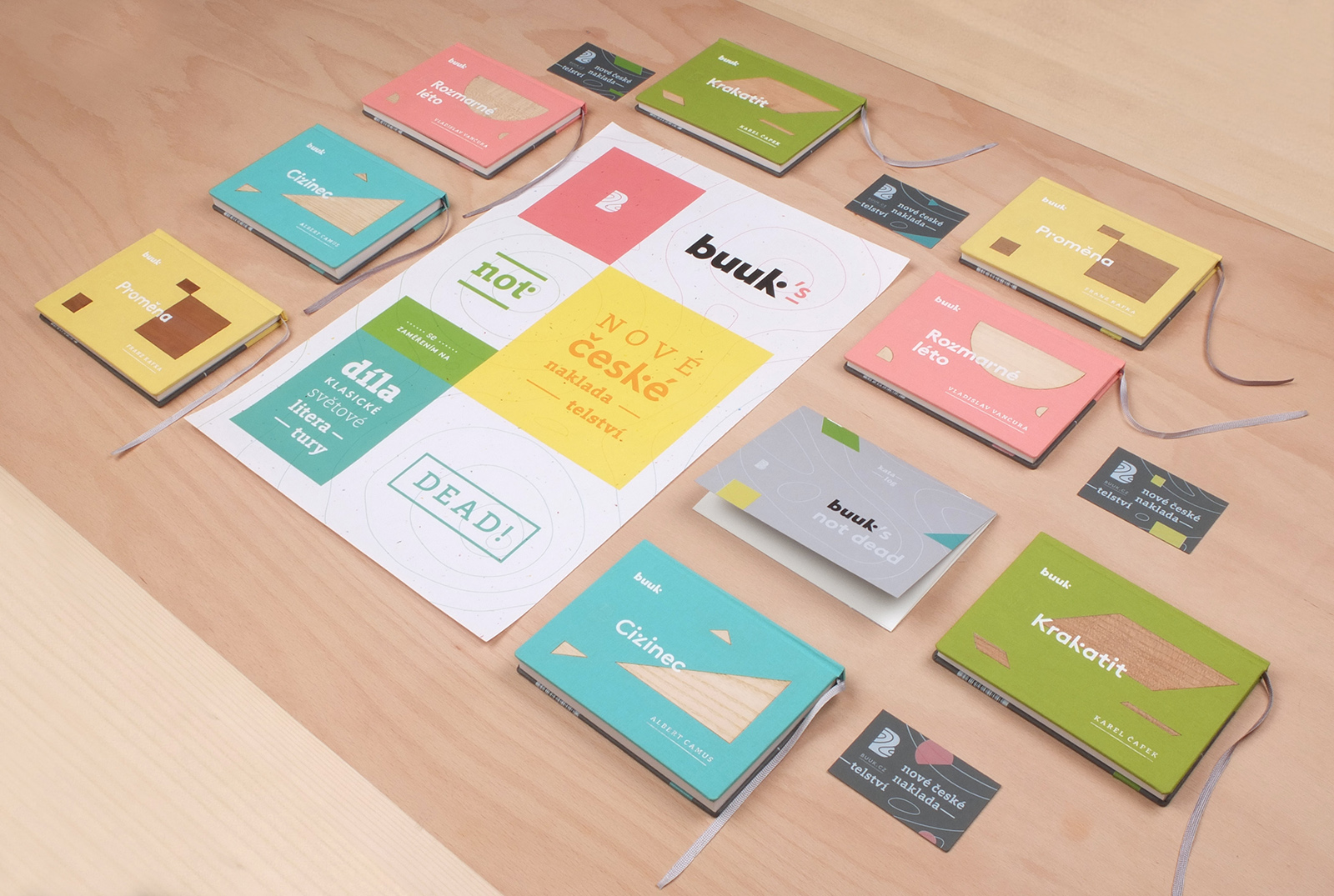
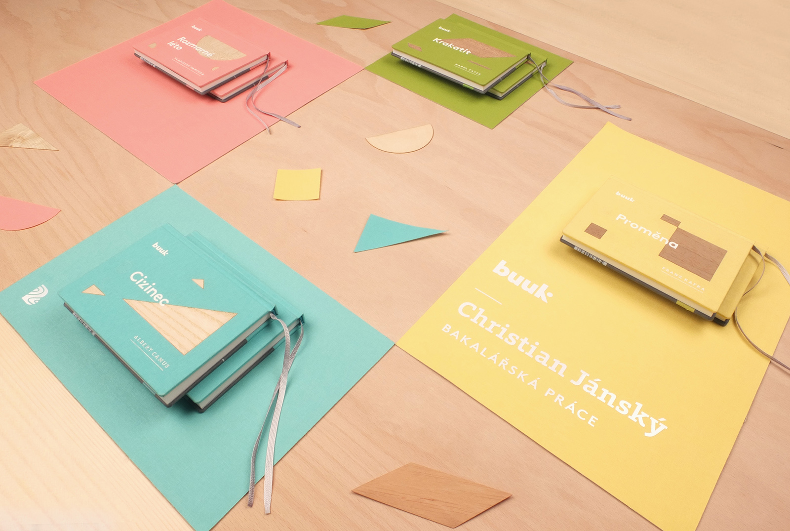
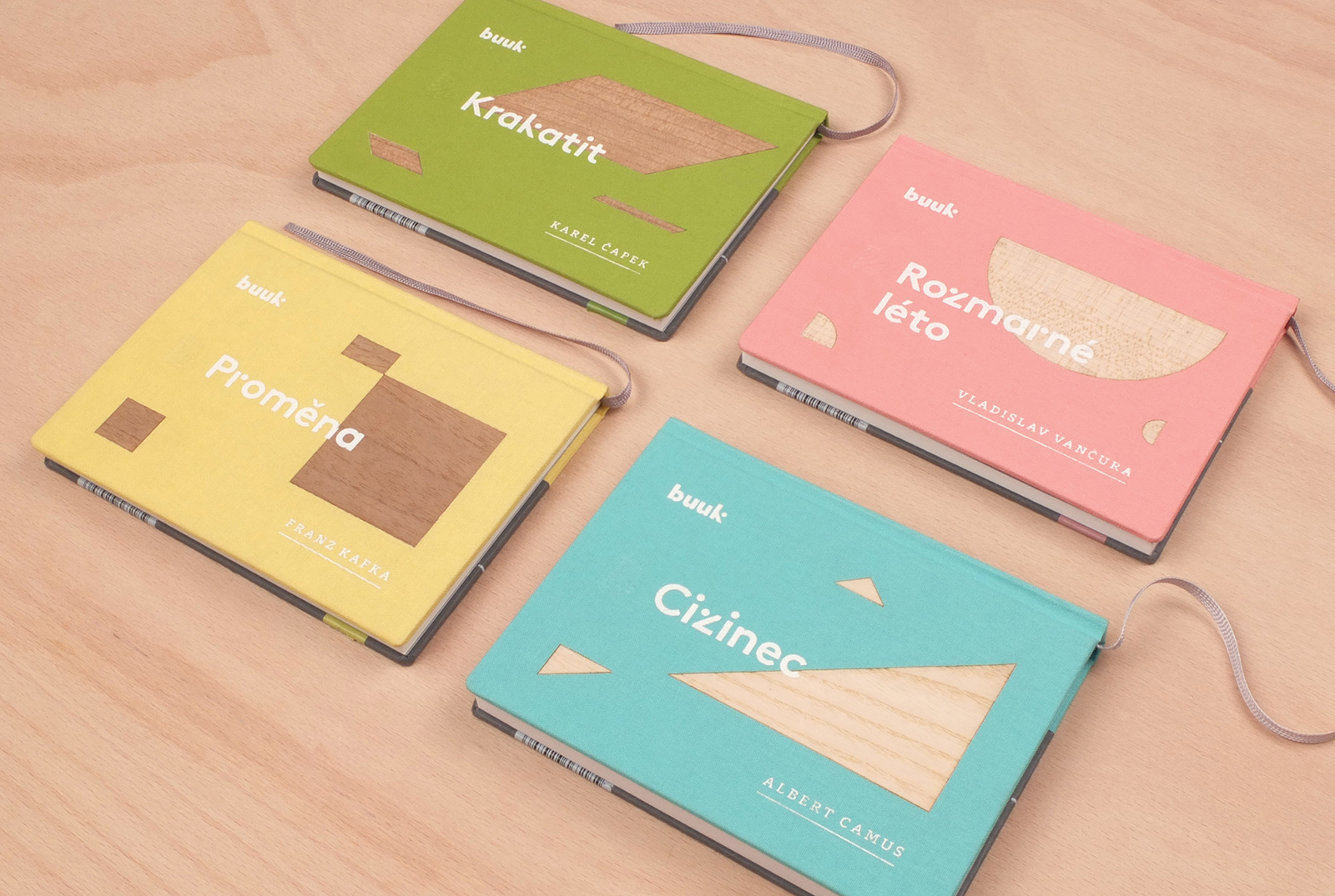
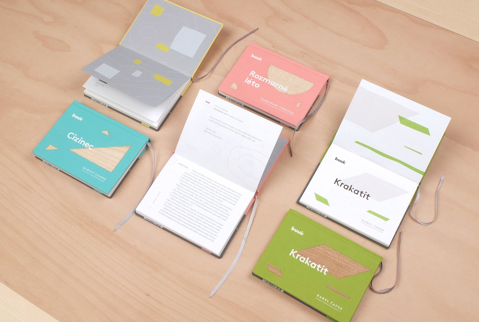
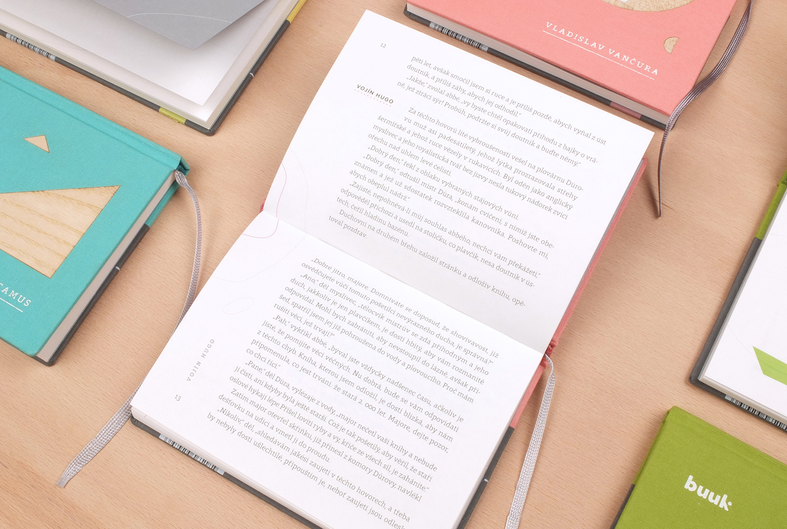
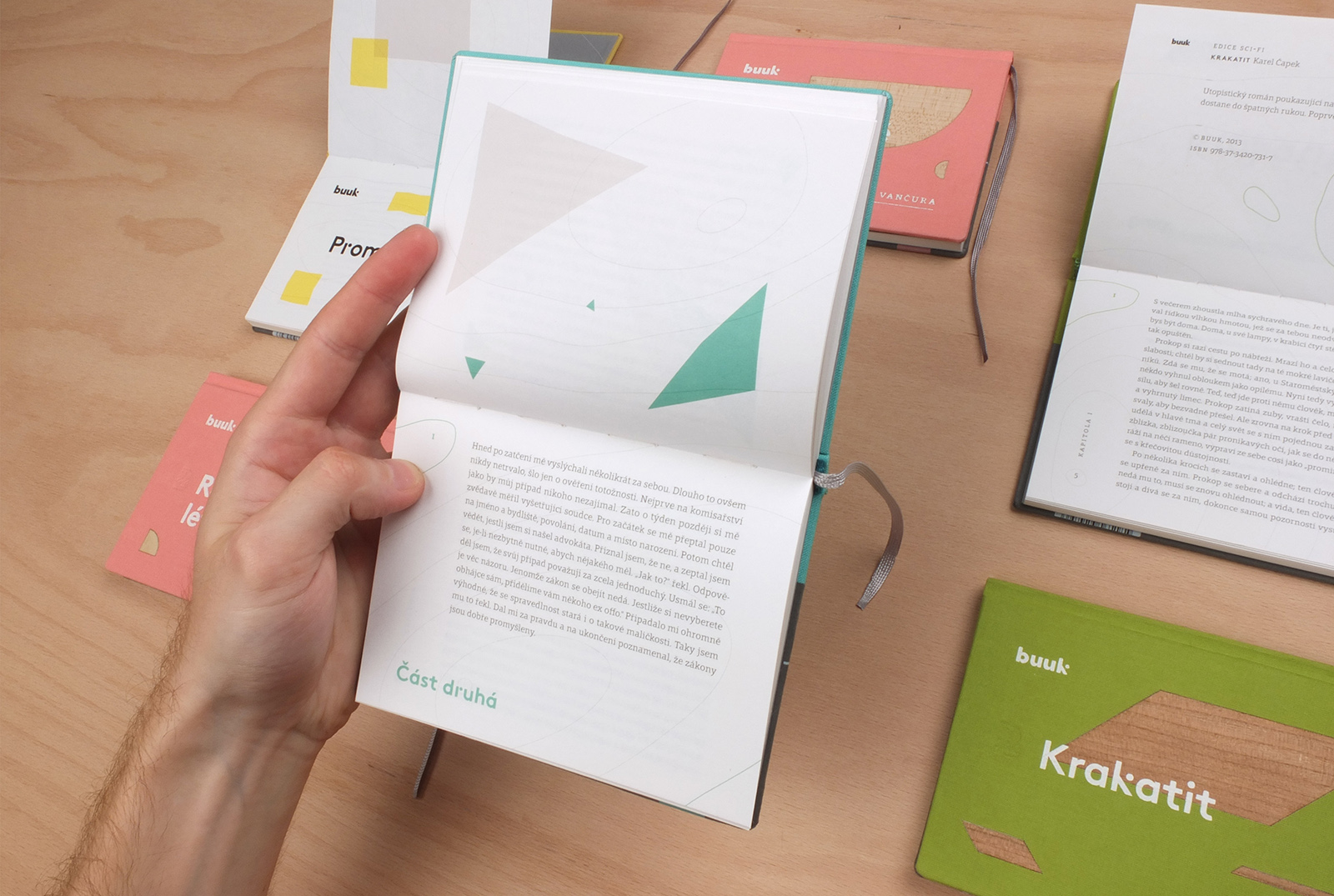
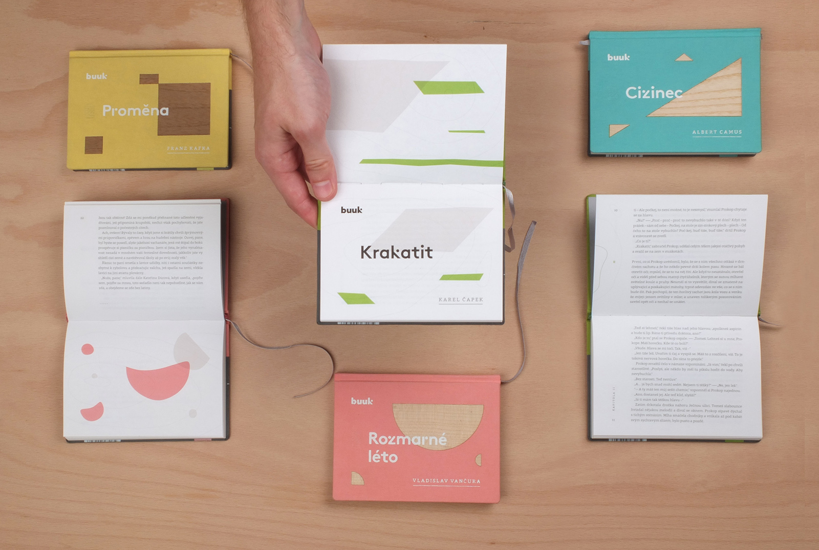
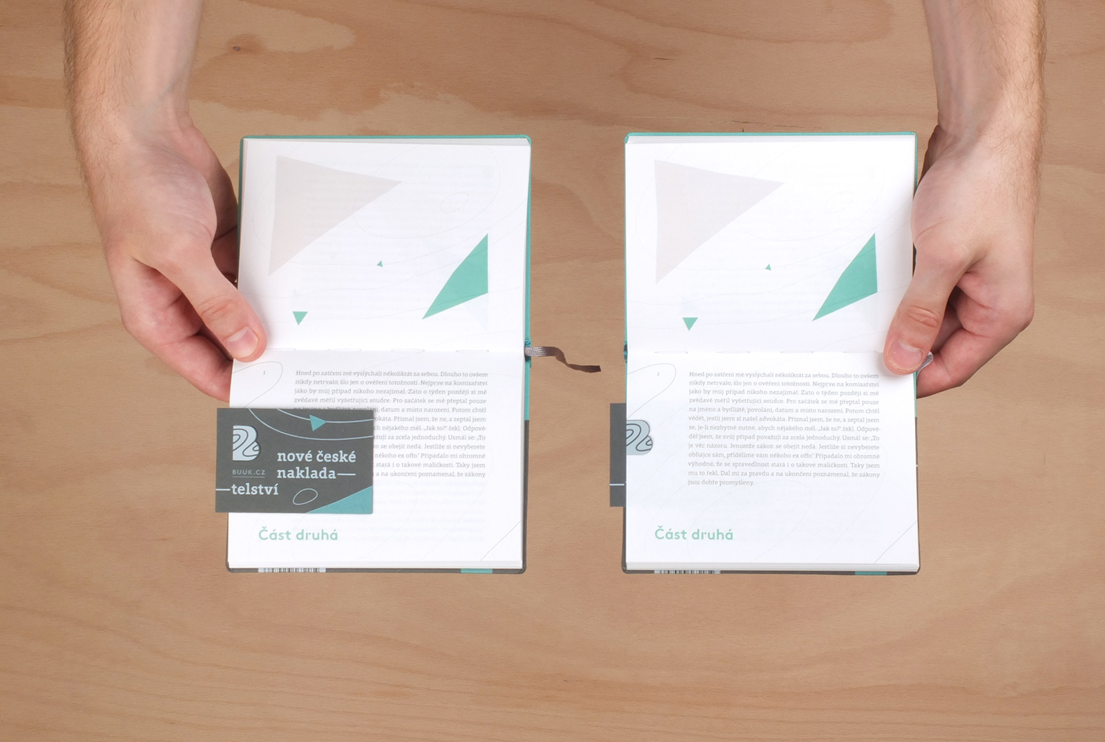
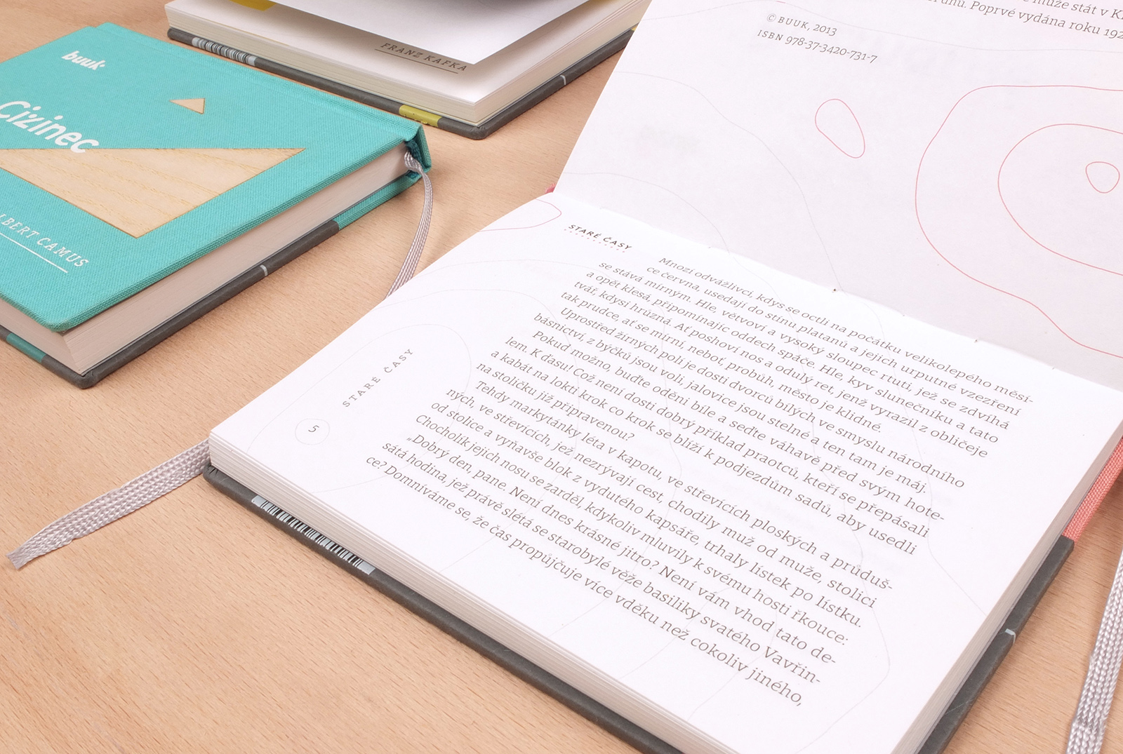
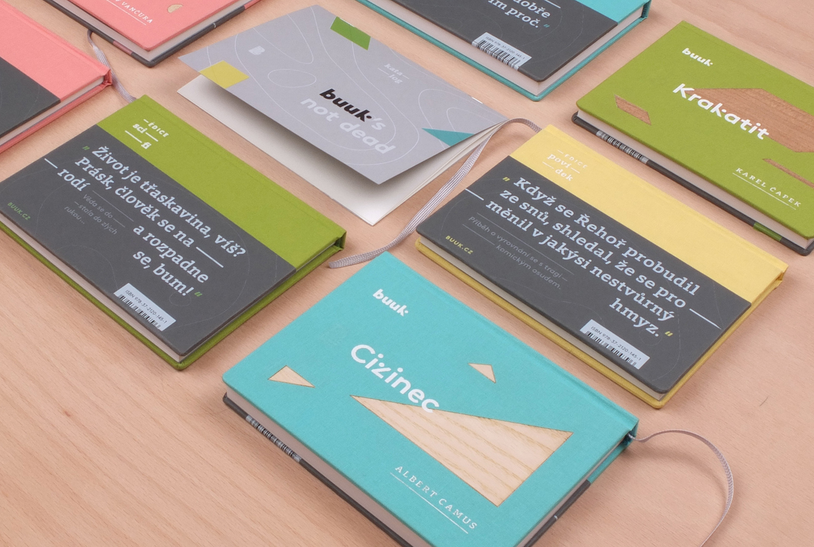
This is an elegant visual identity of a fictitious publishing house of modern literary classics. The publishing house’s name combines the English word “book” with the Czech word for beech (buk). The wood motif has been used in the identity (e.g. in the form of veneer on the covers). The designer’s visual style is easily recognizable: he proposed a pocket format of 140 × 105 mm for the publications. The boldest move in these designs was turning the books ninety degrees (they are to be read horizontally). The designer writes that he wanted to “challenge an age‑old habit of text layouts.” Although the idea sparked a fierce discussion among jurors, they appreciated the design for its attention to detail, execution, and its typography. It is only a shame that the designer did not suggest various stylistic solutions for the various publishing series. It would seem, after all, that a single very simple and recognizable style might not fit every author, genre, and topic.