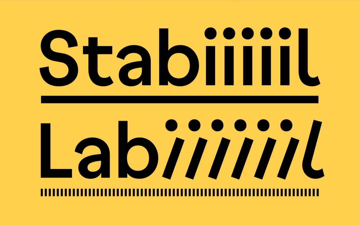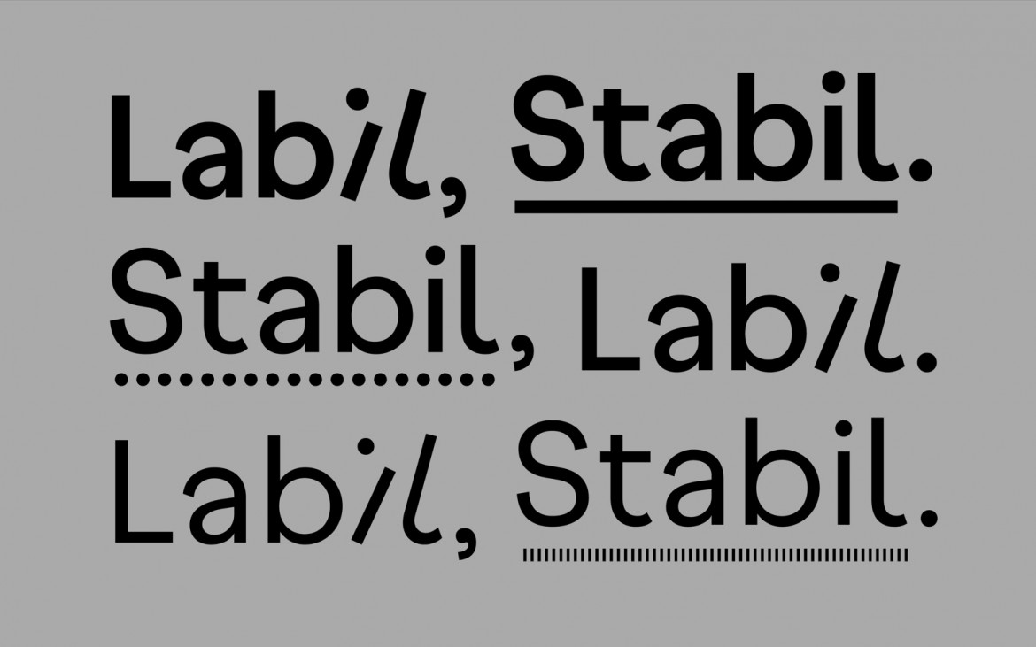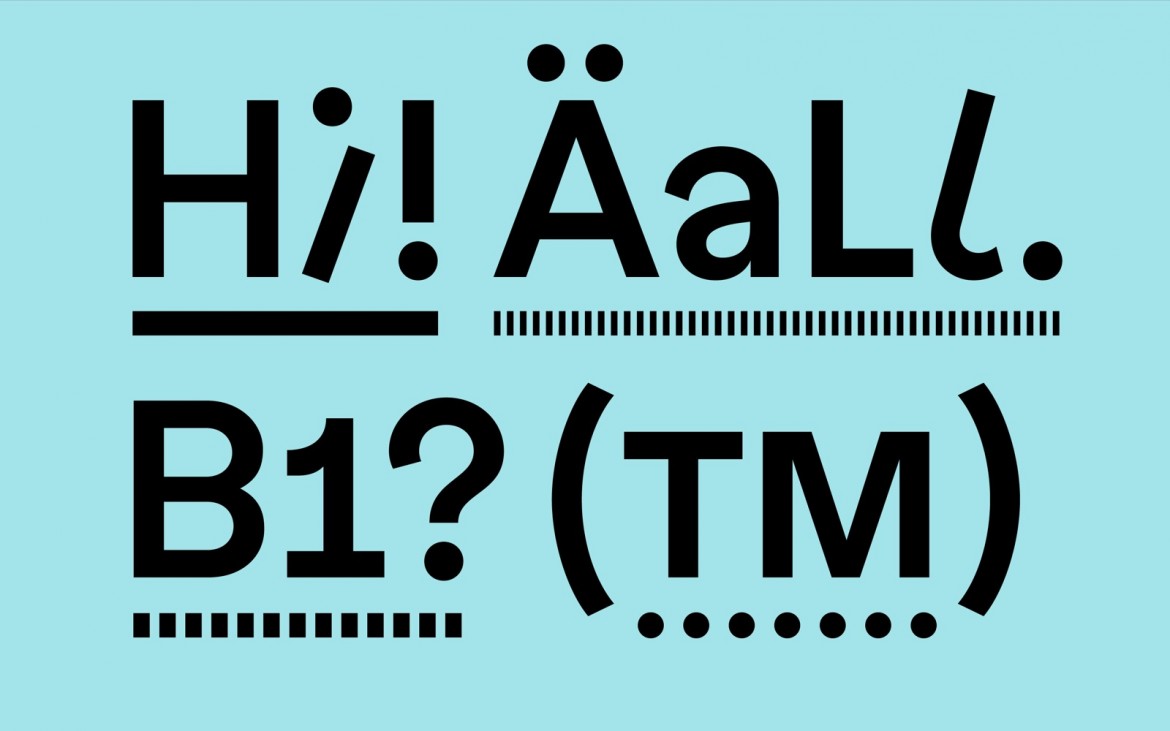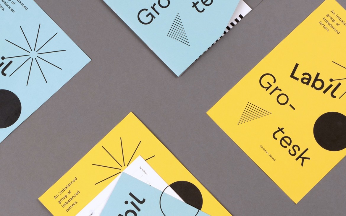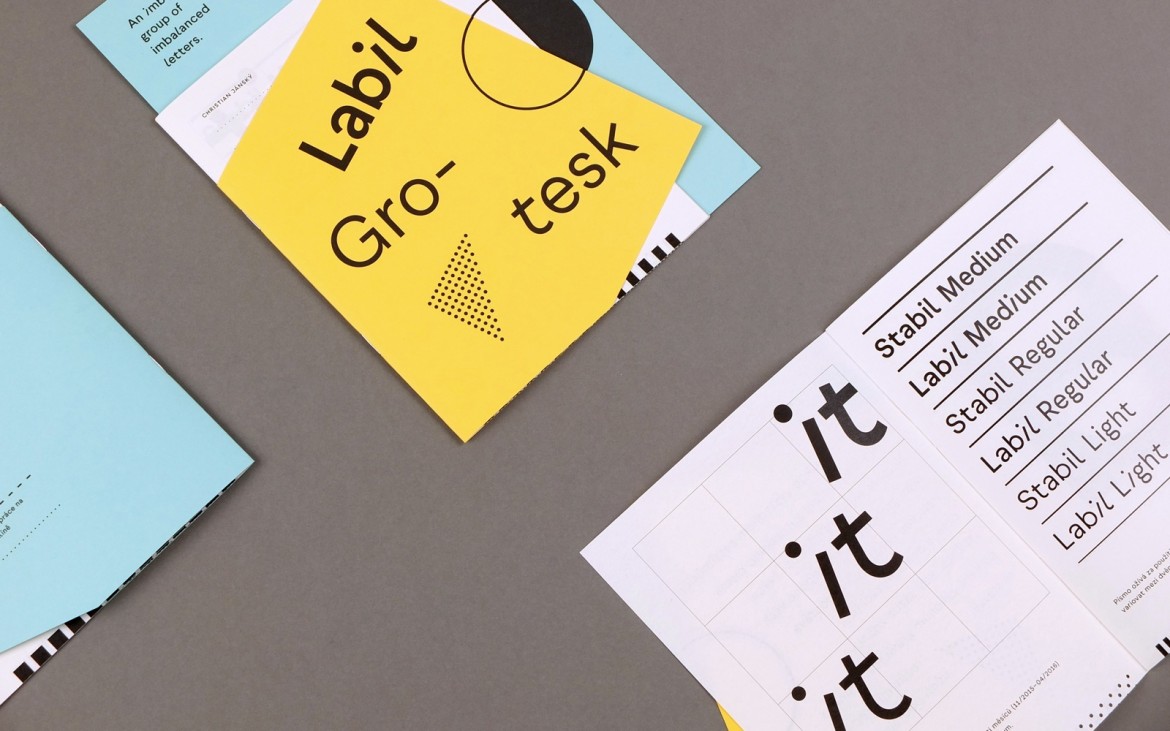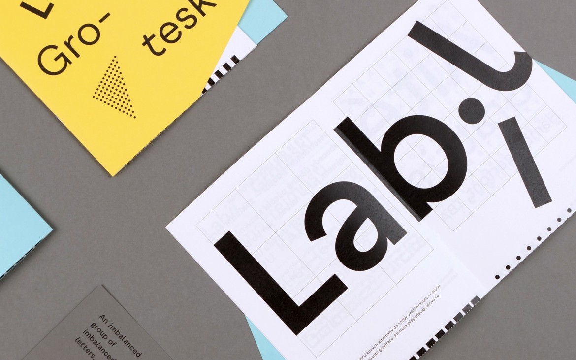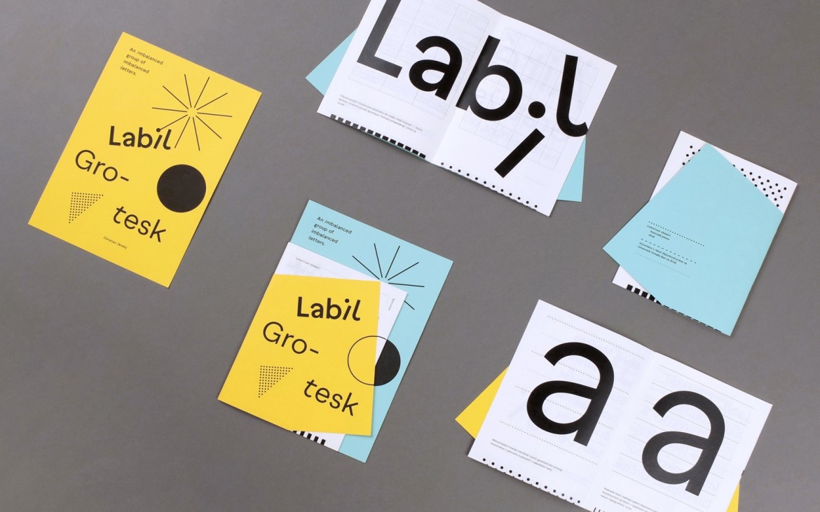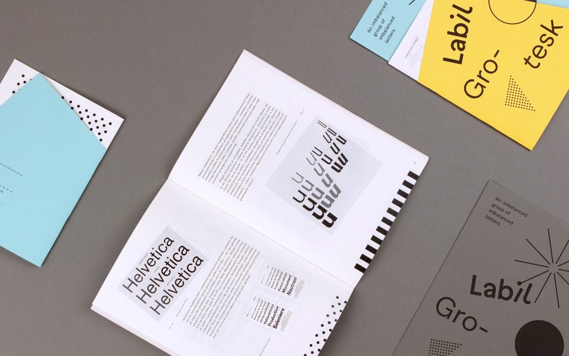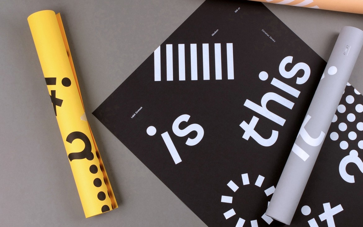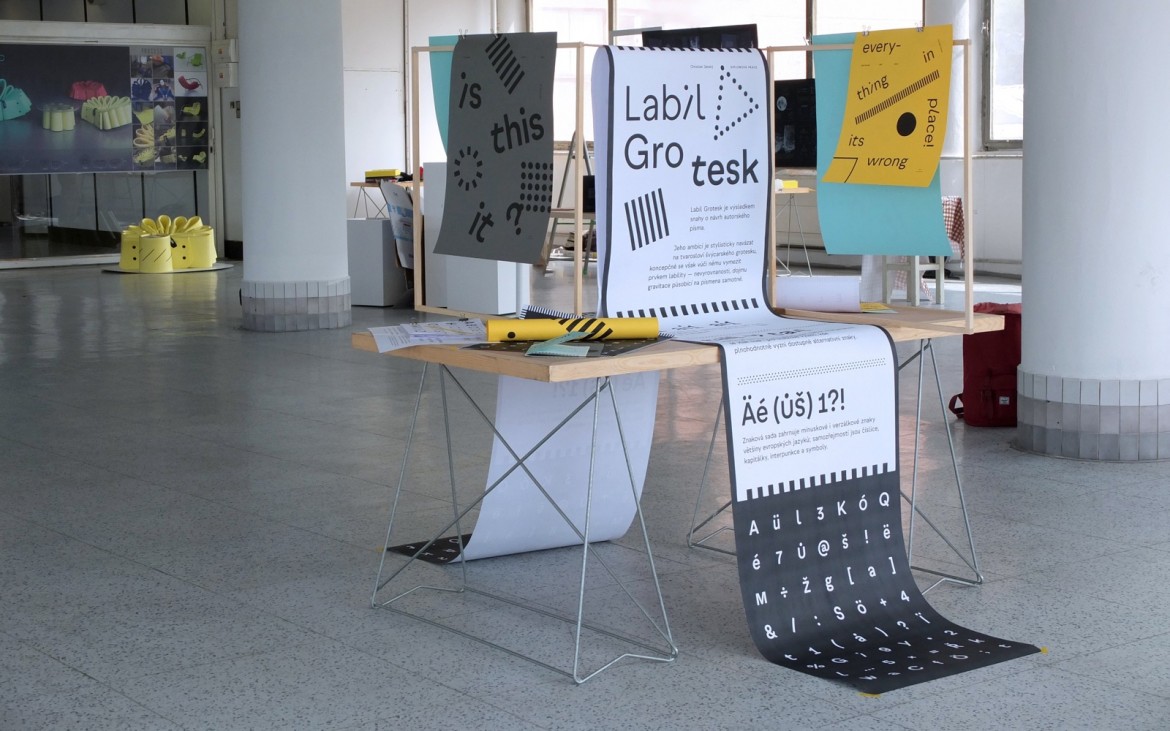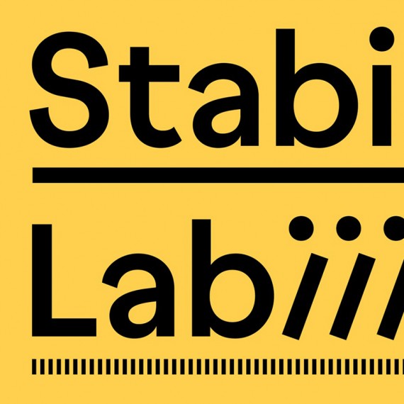
Labil Grotesk typeface is an interesting typographic experiment. According to the designer, he was inspired by the idea of combining the solid nature of sans‑serif fonts with something unstable. The sense of proportion and detail led him to create an original type design in three weights. The basic default characters look like a typical grotesque design. However, each individual character can be changed into its “imbalanced” version. For the author, these alternative characters are like objects subject to gravity, which gives them an unusual form. The alternative glyphs are saved in the style section, so it is easy to use them in programmes such as Adobe InDesign.

