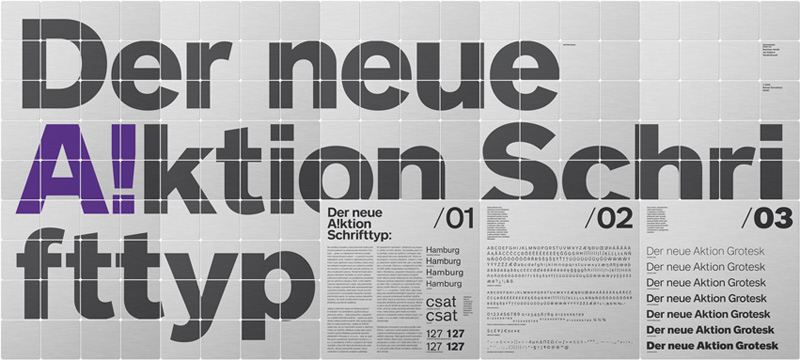
Many popular type families cause layout difficulties, because their various styles came about over the course of decades, under the eye of different typographers, and with constantly changing technologies. Incompatibility of the shapes of the glyphs, and gaps in the characters set are found in the Akzidenz Grotesk type family, for one.
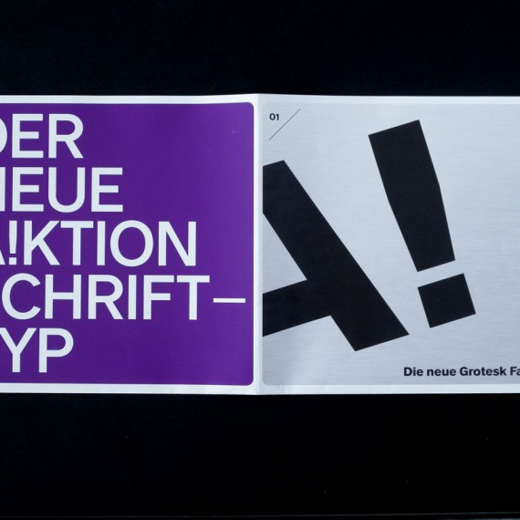
Roman Černohous has attempted to redesign it: he has made the characters uniform, from the basic versions through the narrow and extended ones, giving the whole family a coherence. He has adjusted the proportions of some characters, adapting the glyphs of the digits to the capital letters, and above all standardizing the boldness of the lines building the letters and their finals. The result was the A!ktion type family, with an assortment of diacritics for writing the majority of the European languages, alternate forms of the digits (old style, standard, small caps), punctuation, currency and mathematical symbols, Greek characters, and many others. One version includes 590 glyphs.