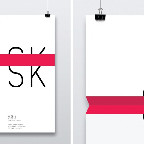
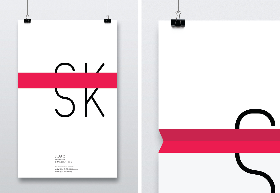
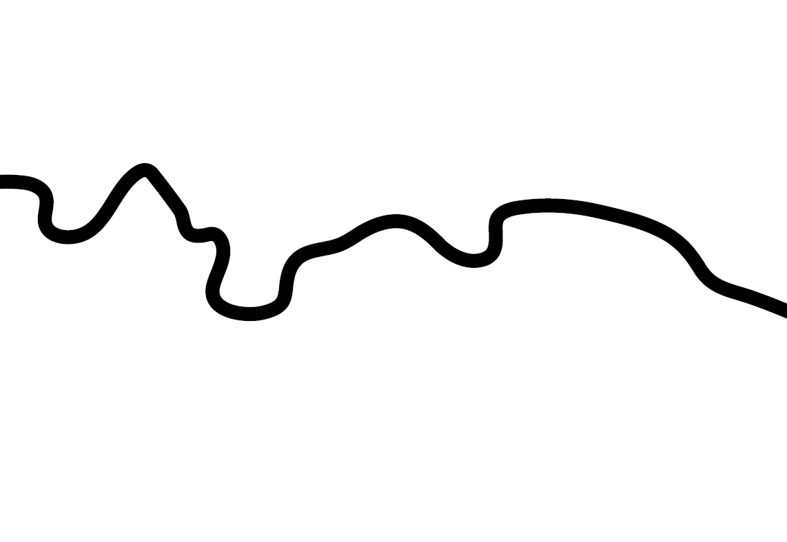
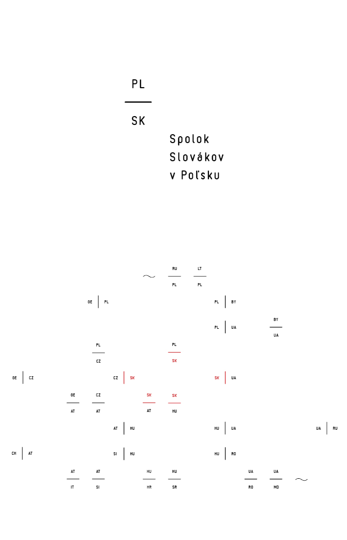

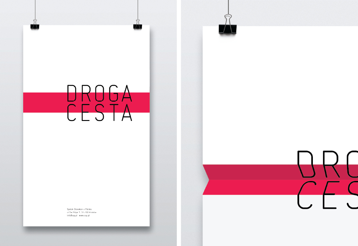
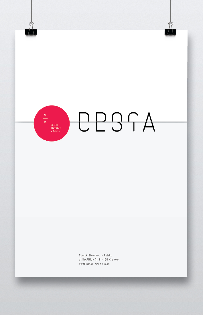

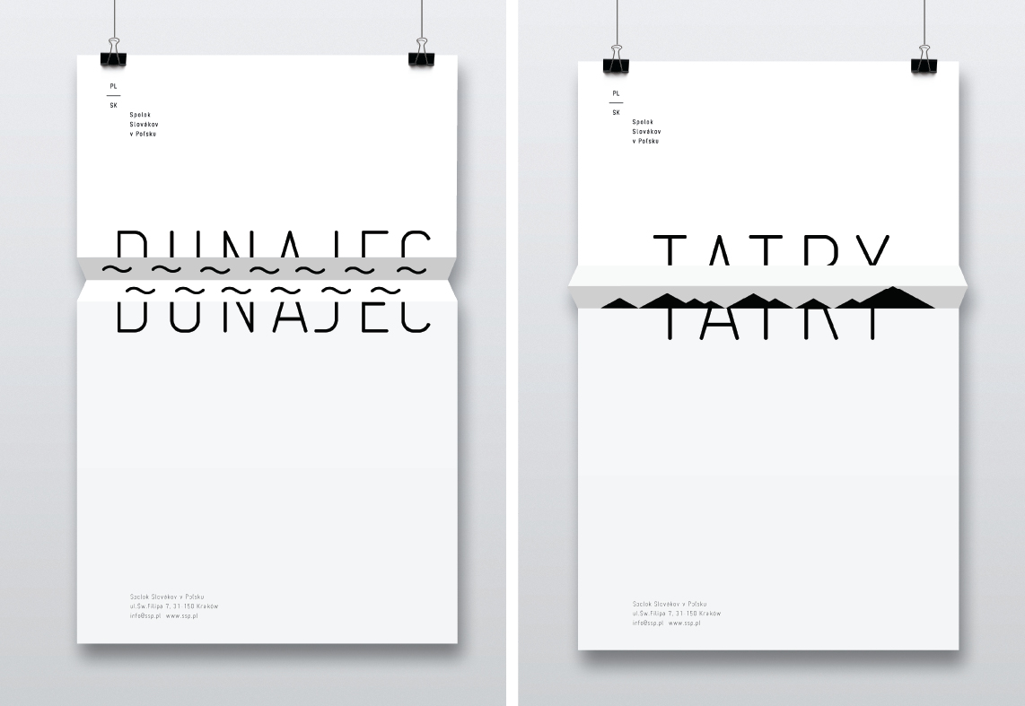

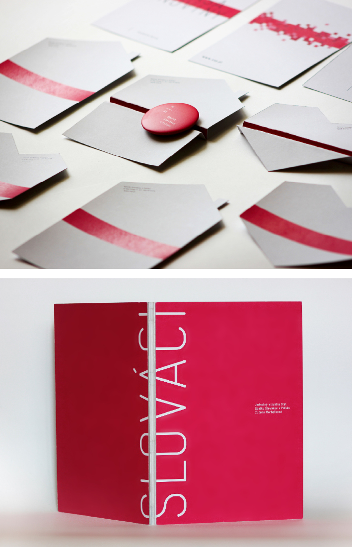
The main motif of the identity for the Slovak Association in Poland is the “(in)visible” border. The designer created an open system based on the analogy between the geographic situation of the two countries and layout of their letter symbols in the logo. She claims that in this way she can generate a graphic symbol for the Slovak Association in any country. It is less than evident from the material provided how a logo might be created for an association in a country that does not neighbor Slovakia (e.g. for the minority in Serbia). We ought to take, for example, the series SK | HU, HU | RS, which would not have the anticipated simplicity and power of expression. The motif of the line, which on the one hand divides, and on the other joins the countries, was also used in the promotional materials. The designer uses it to show language differences, to describe a border line, and to provide information about the percentage of citizens of a given country living abroad. Simplicity is a definite asset in this design, as are flexibility and practically endless possibilities provided by the motif of the (in)visible border.