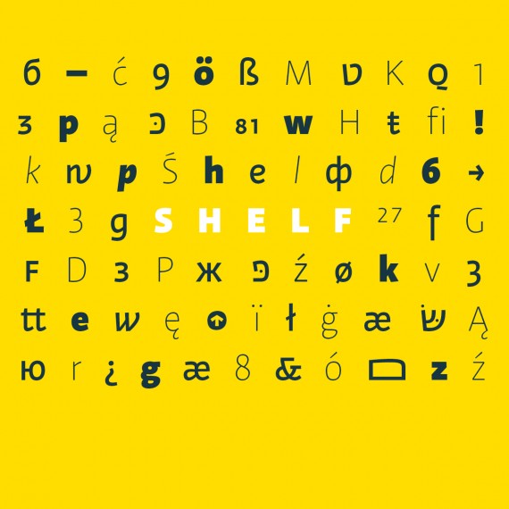
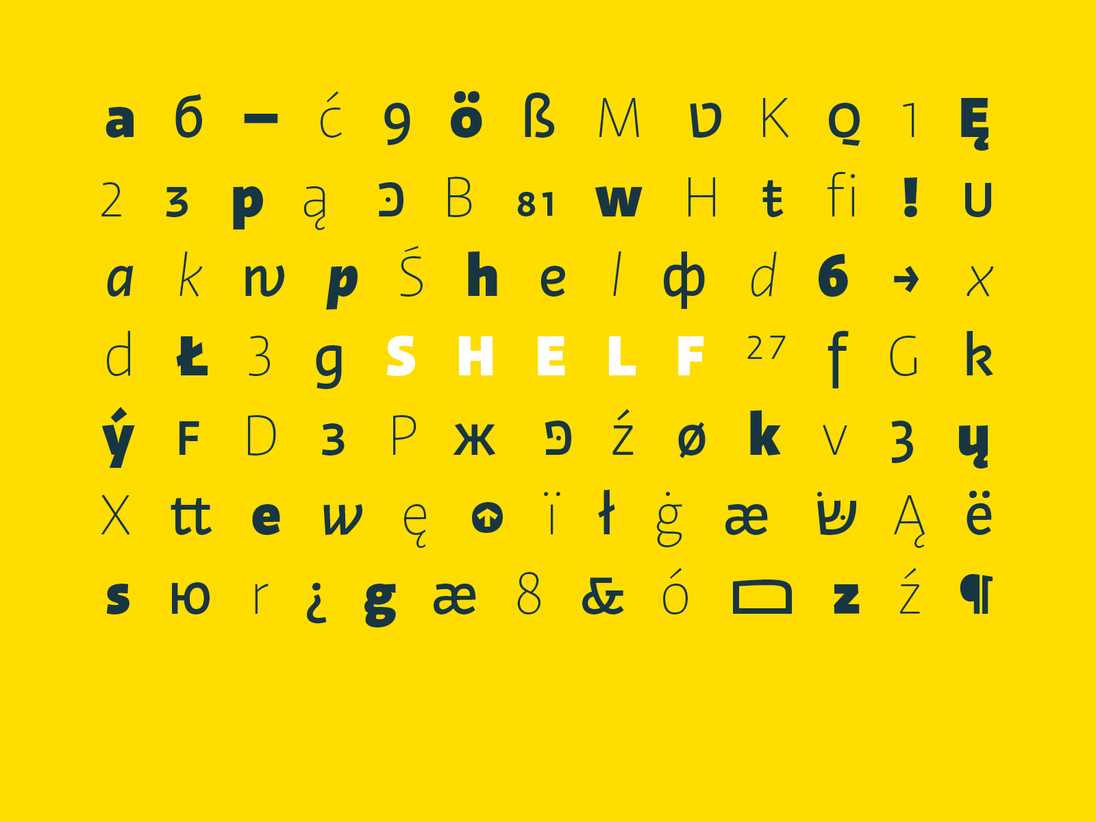
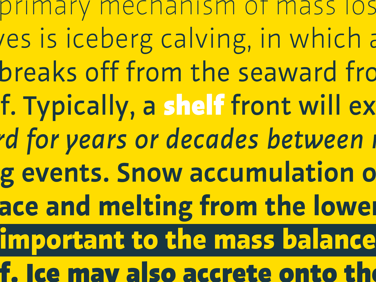
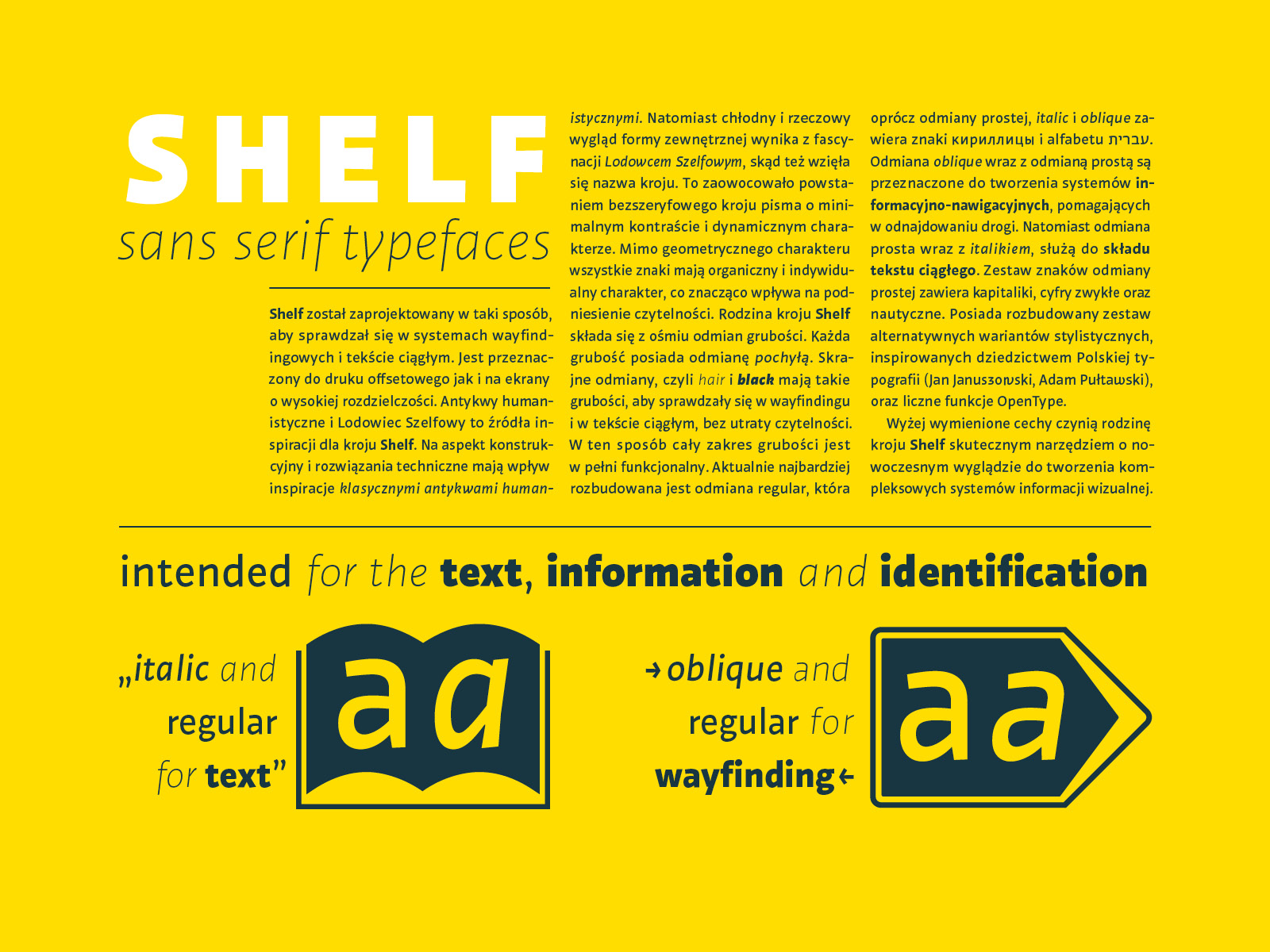
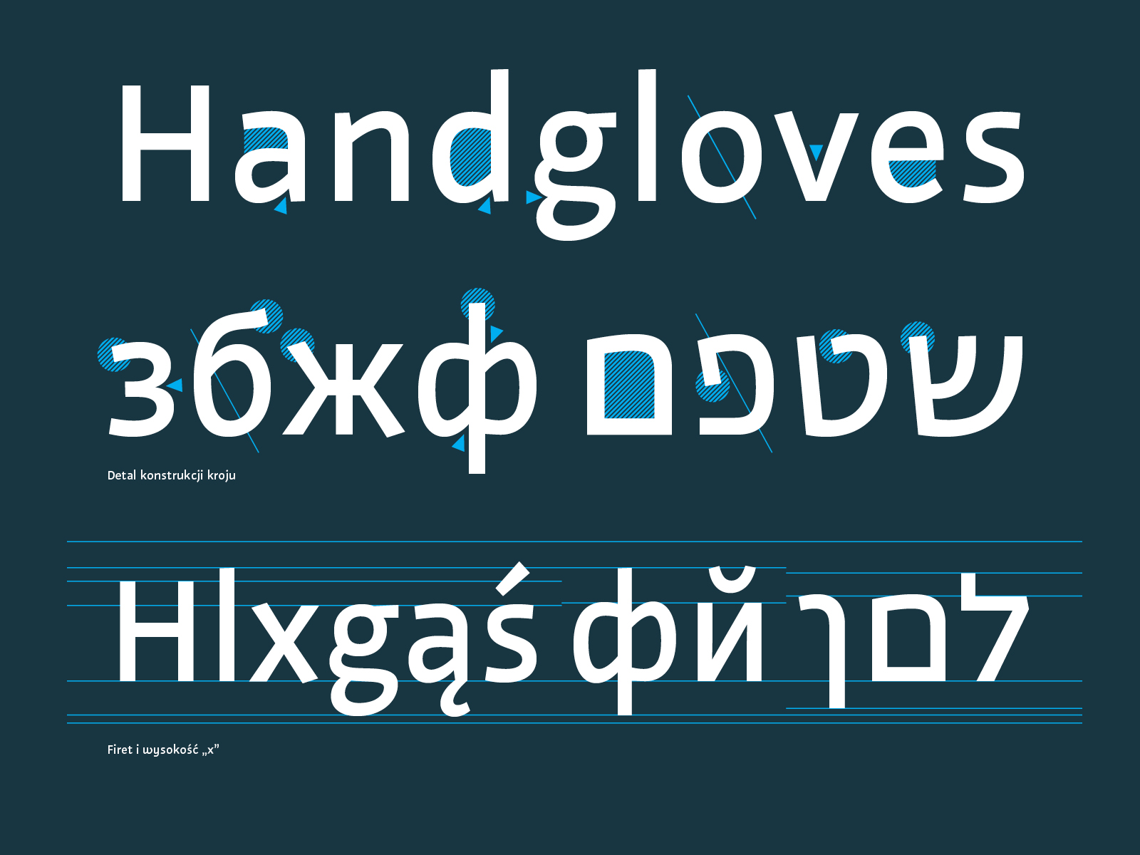
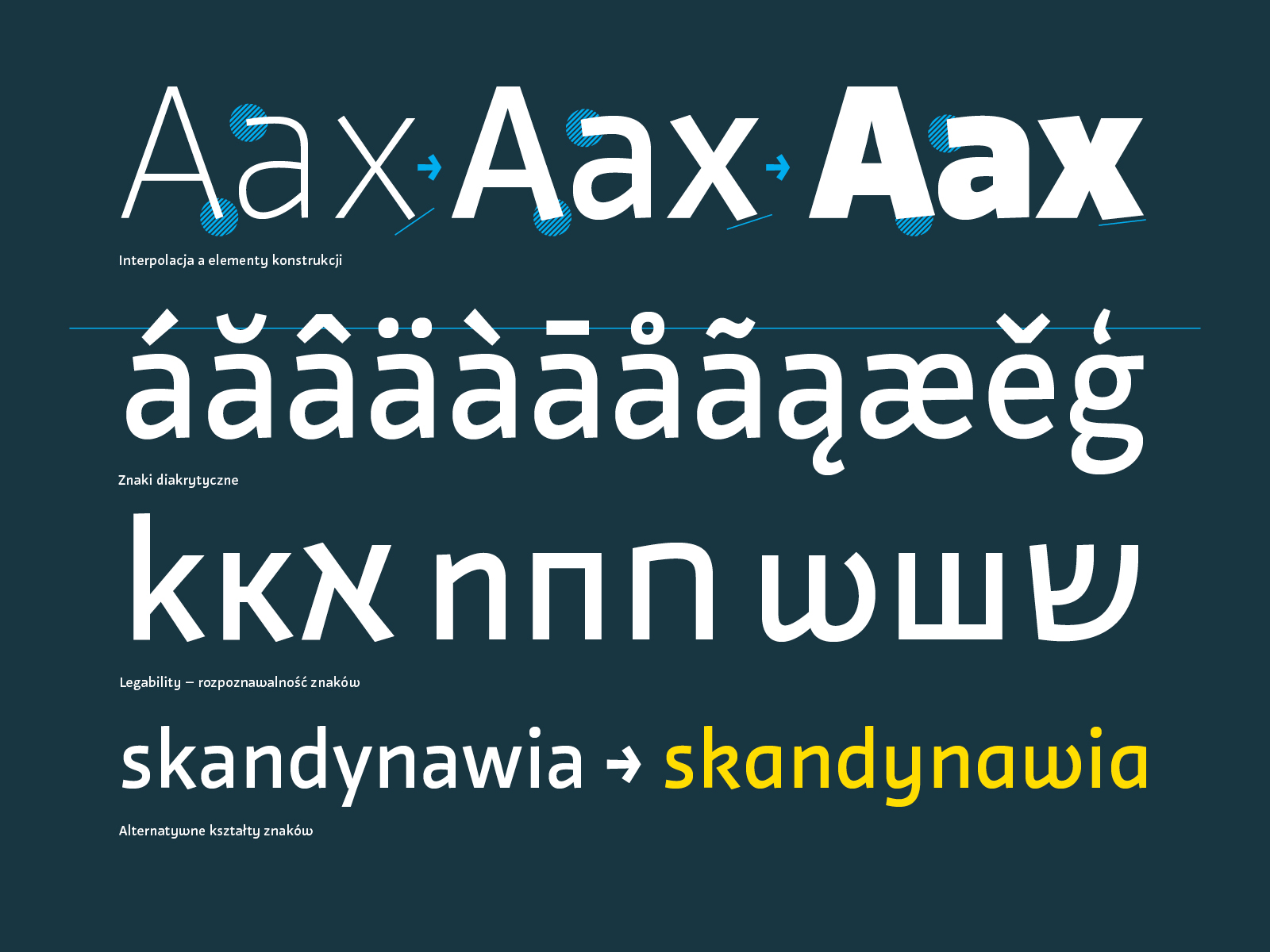
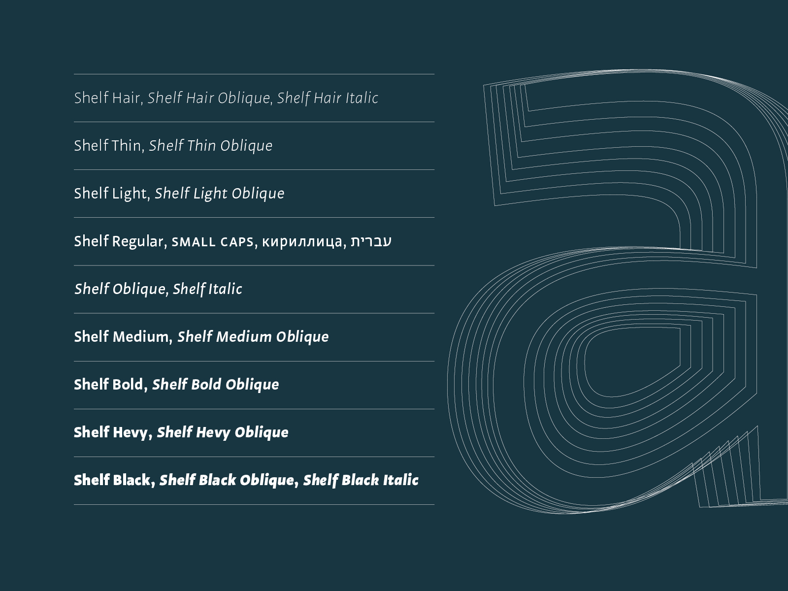
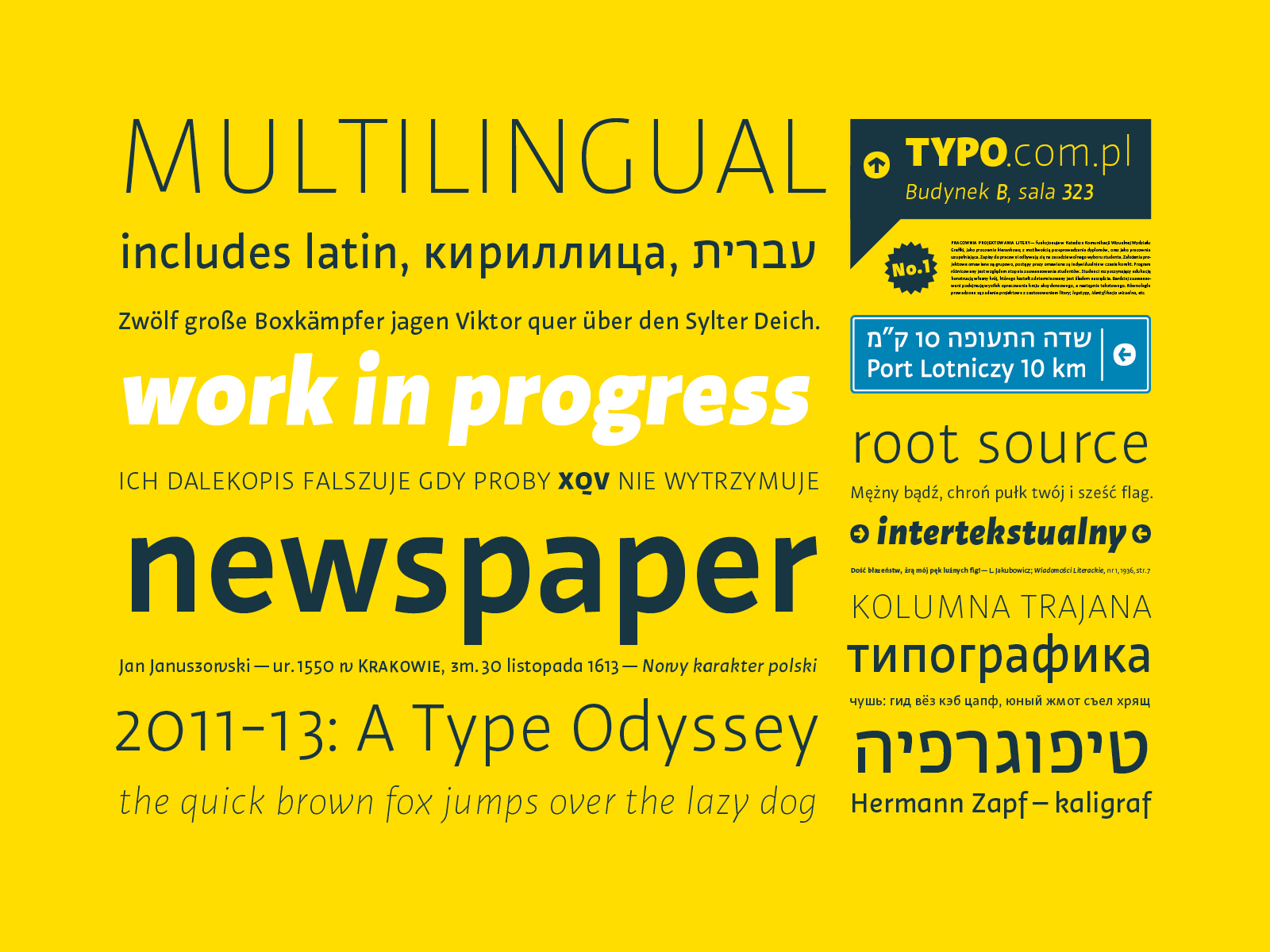
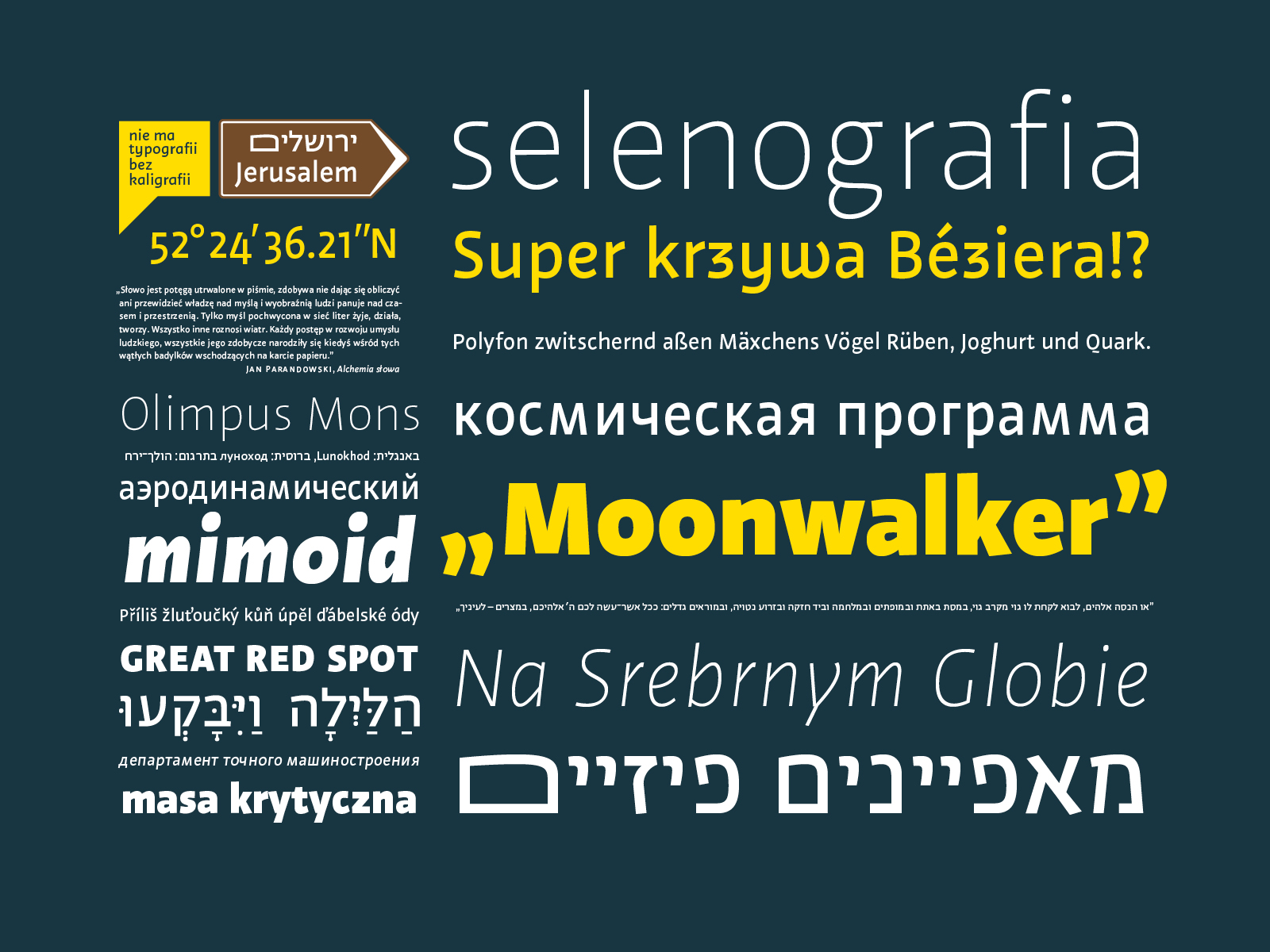
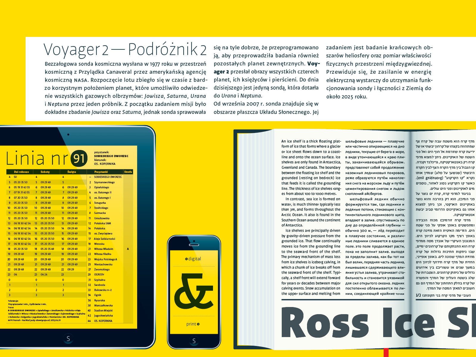
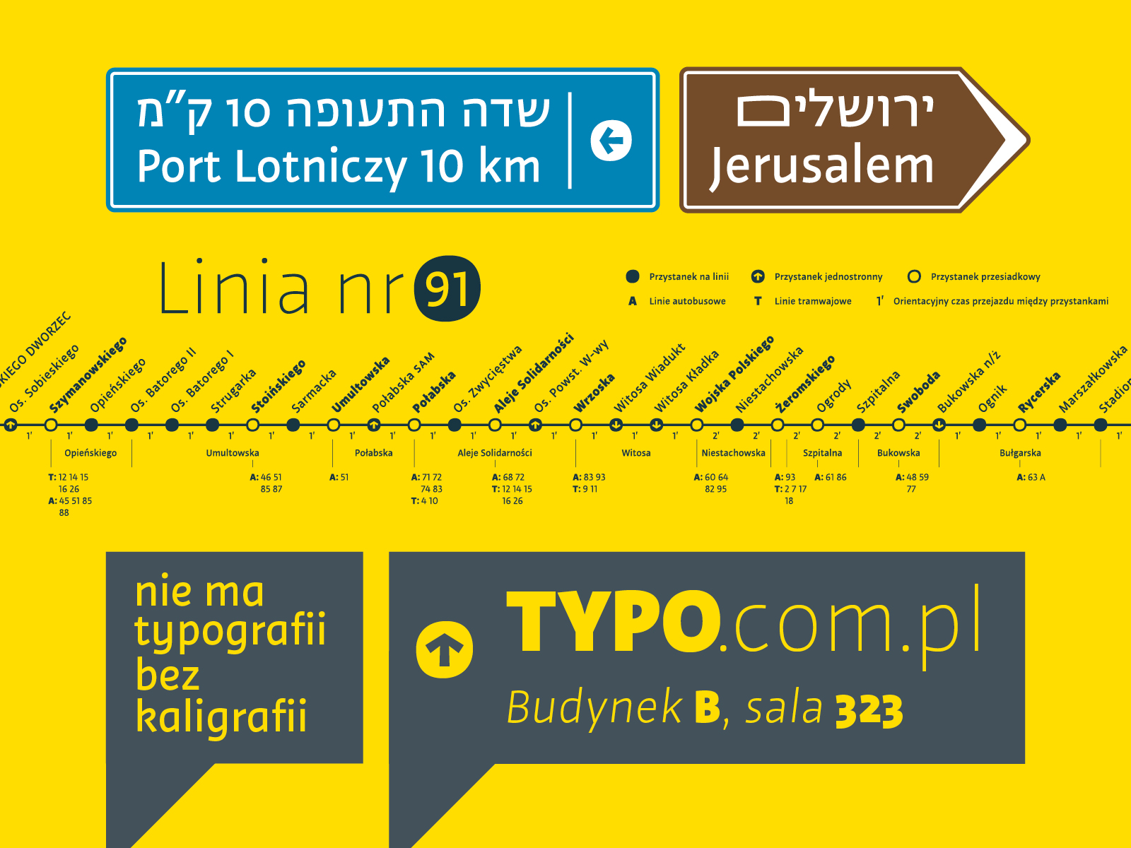
The Shelf sans‑serif type combines a geometrical look (the designer claims he was inspired by the forms of ice shelves) with the calligraphic attributes of humanist sans‑serif types. The type was designed with complex visual information systems in mind (including wayfinding systems), but also for body texts, and to be lit up on high‑definition screens. It comes in eight weights, each also featuring italics. The regular style is the most extensive, which, apart from italic and oblique versions, includes Cyrillic and the Hebrew alphabet, small caps, lining figures, and old style figures, as well as alternate style variants. We were somewhat surprised by the designer’s intention to use roman with the oblique variant for information systems and italic for extended texts. This division seems to us artificial and rather unmotivated. We fully realize that typographical specimens supplied by the designer do not tell us if a typeface has that “something” that makes it land on our shortlist for various designs. We have to wait, buy it, and try it out.