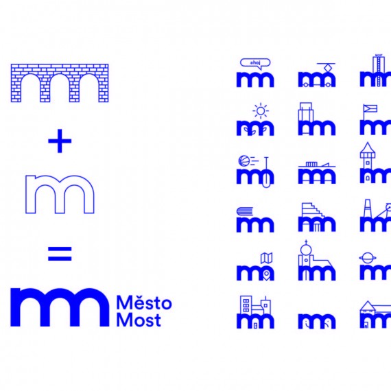
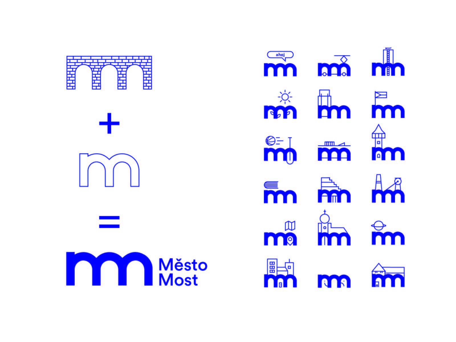
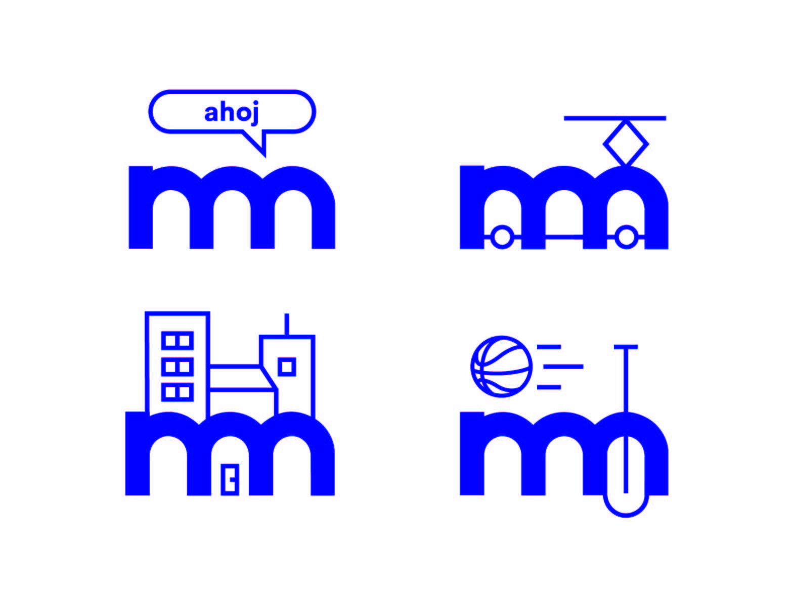
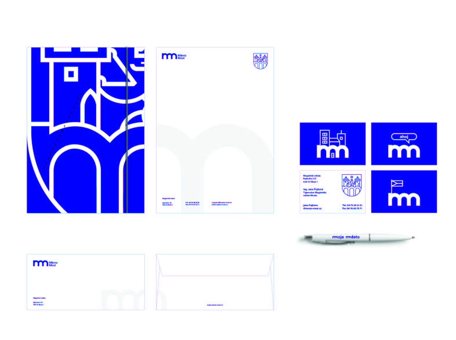
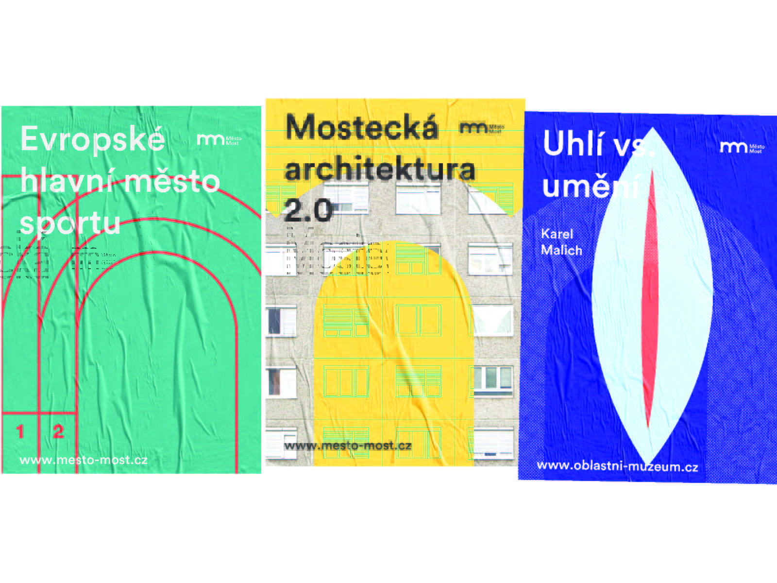
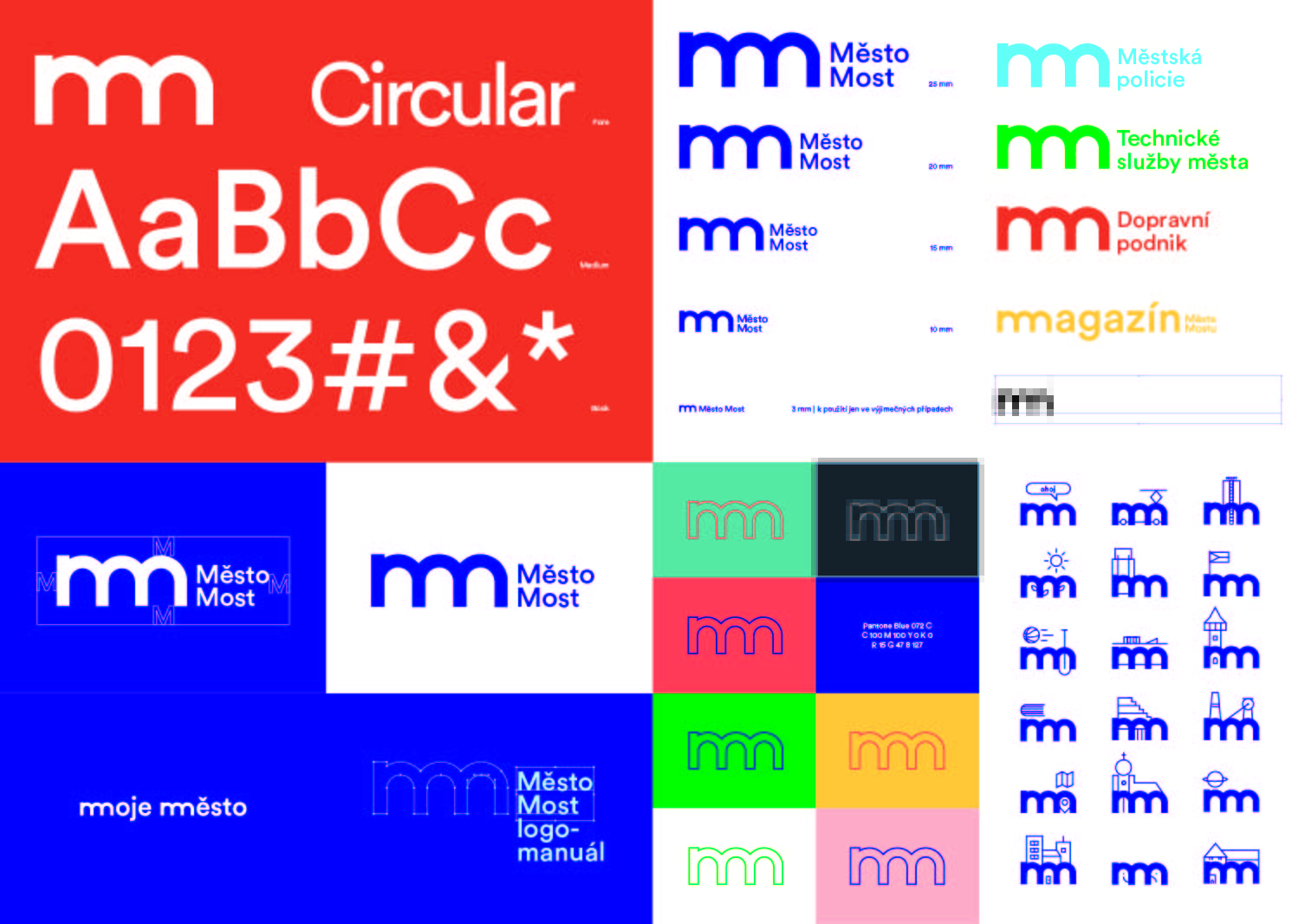
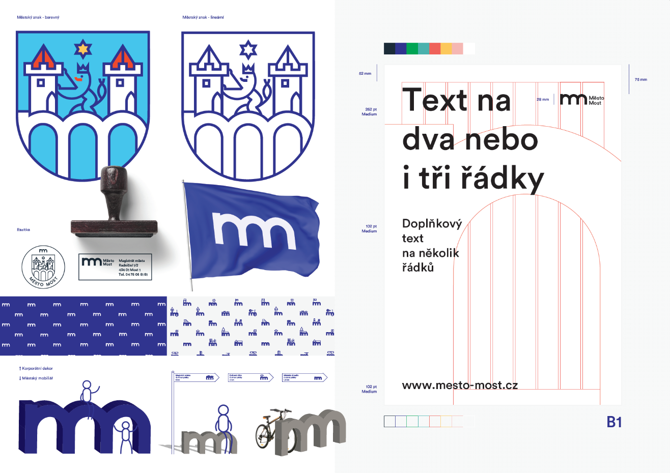
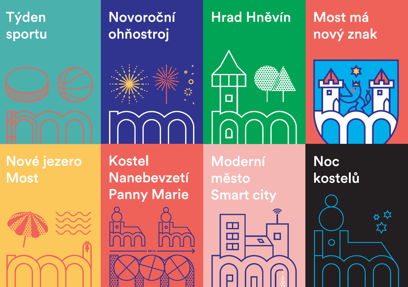
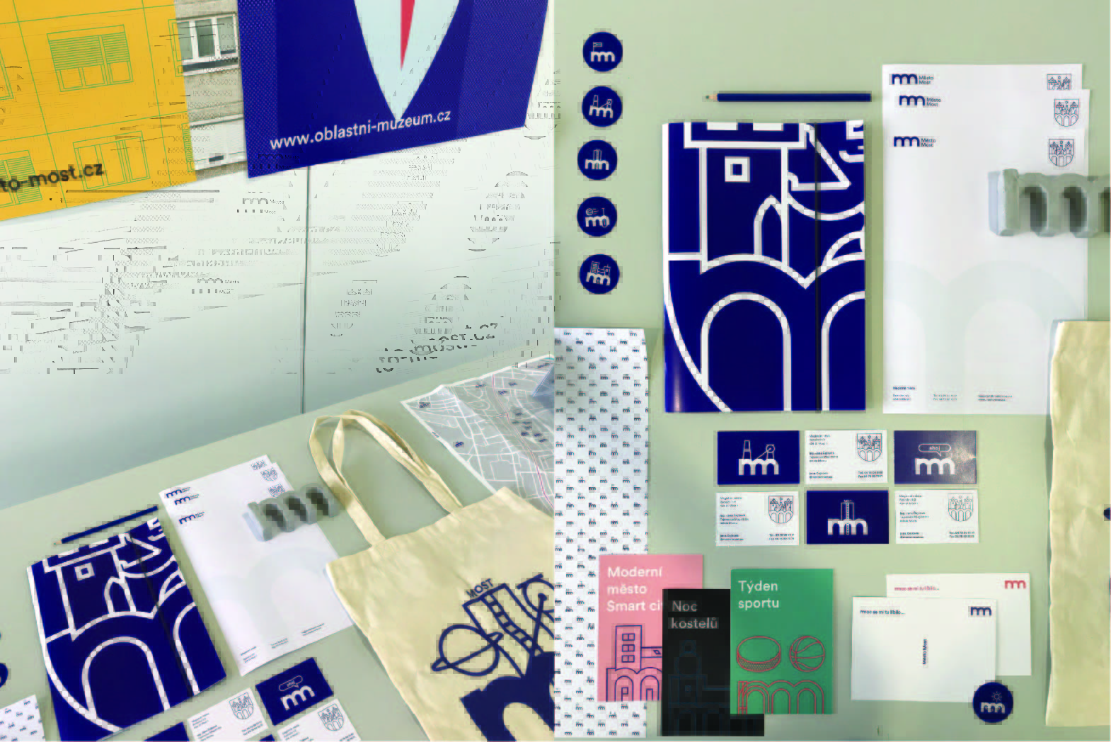
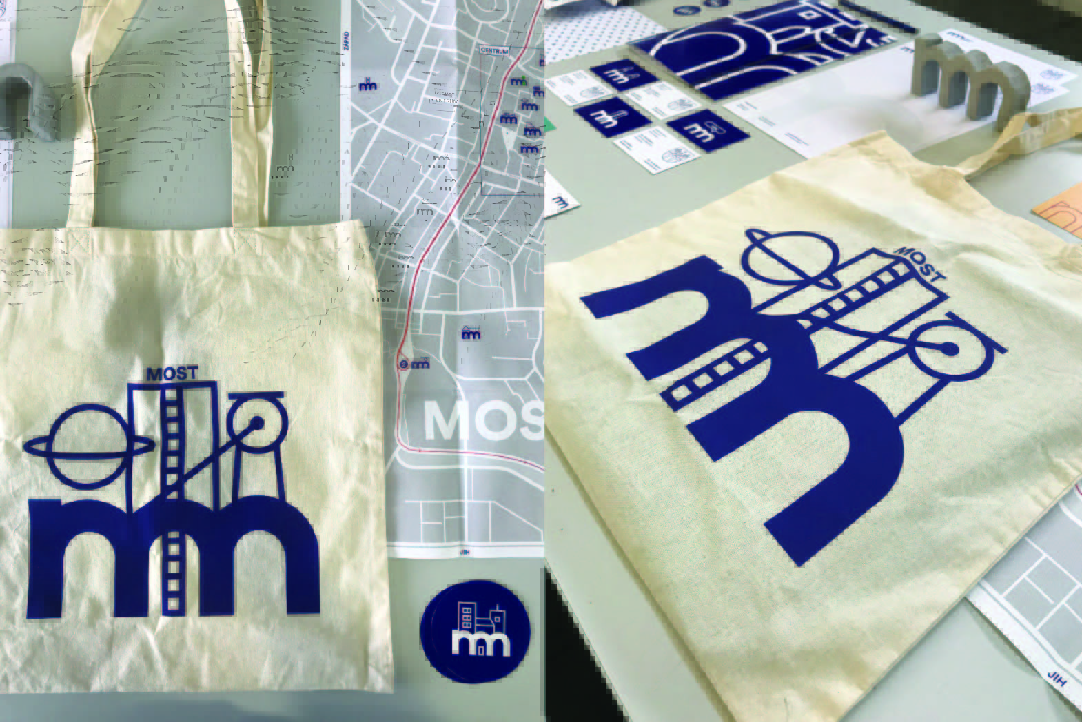
The new logotype for the Czech city of Most (Czech for “bridge”) is inspired by the three-arched stone bridge which does not exist anymore but used to be its symbol for a long time. The idea is based on the stylised letter M with three characteristic arches referring to the bridge. The author has developed the visual identity of the city, creating characteristic pictograms and illustrations. They are all based on the new logotype and are sometimes completed with linear drawings, often presenting the city architecture. The project is also concerned with diversity: both the historical bridge and the city itself are a specific combination of numerous differing people, various events, and diverse architectonical styles. The new visual identity comprises posters, leaflets, postcards, name cards, and occasional prints.