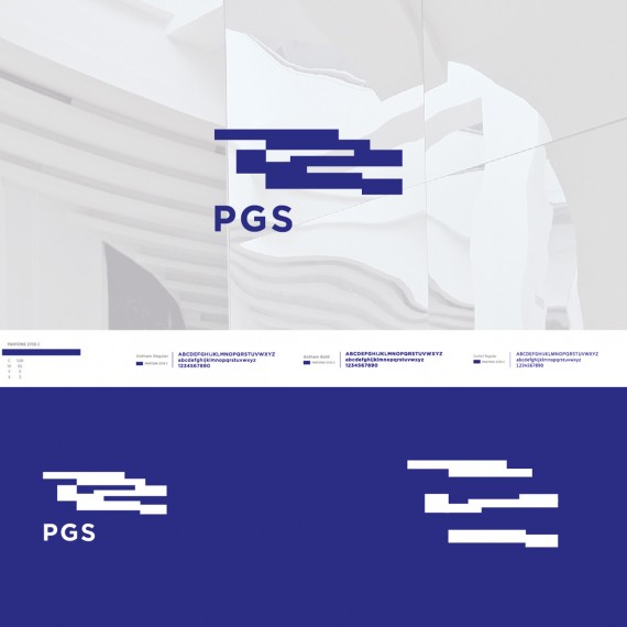
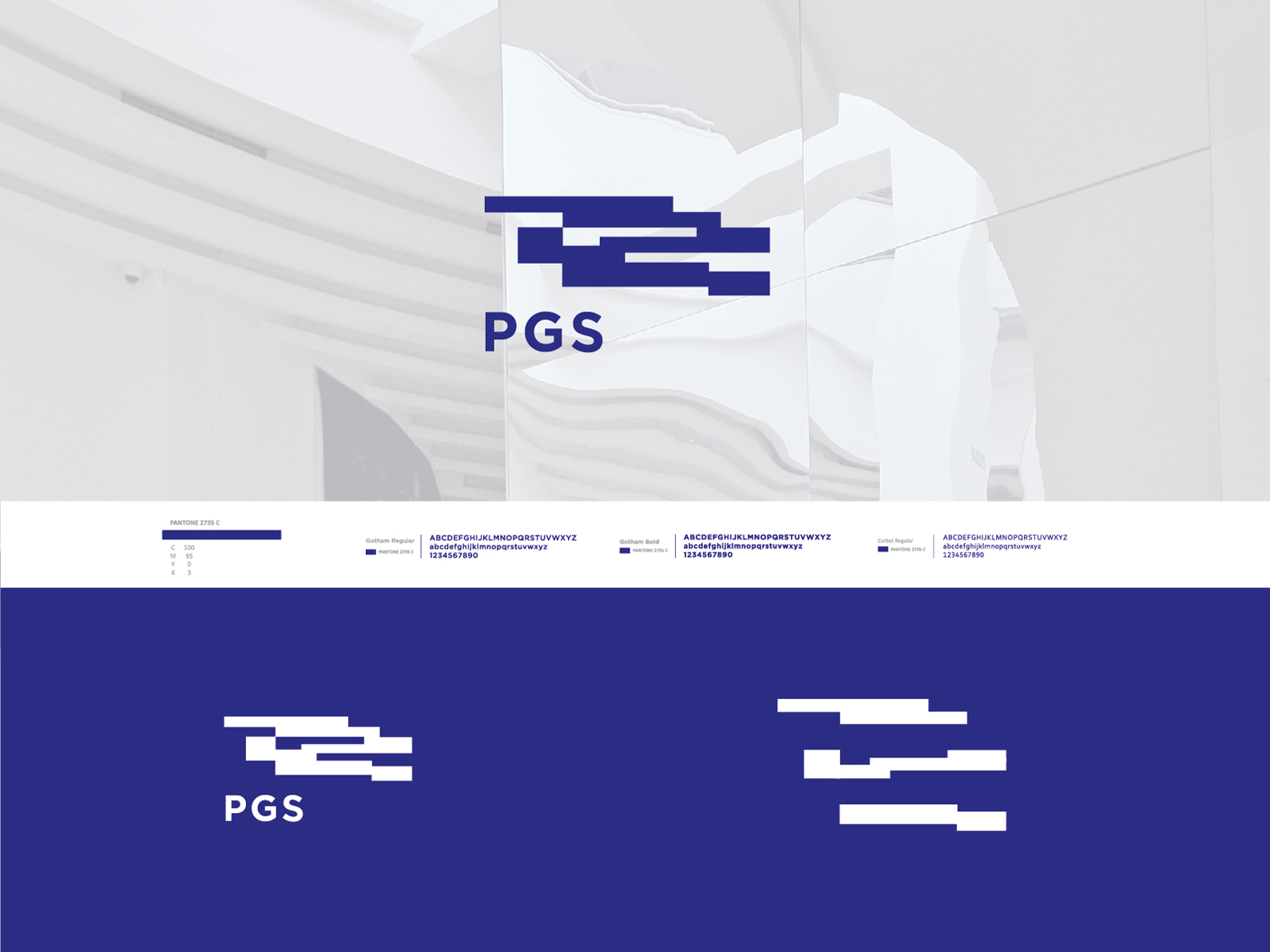
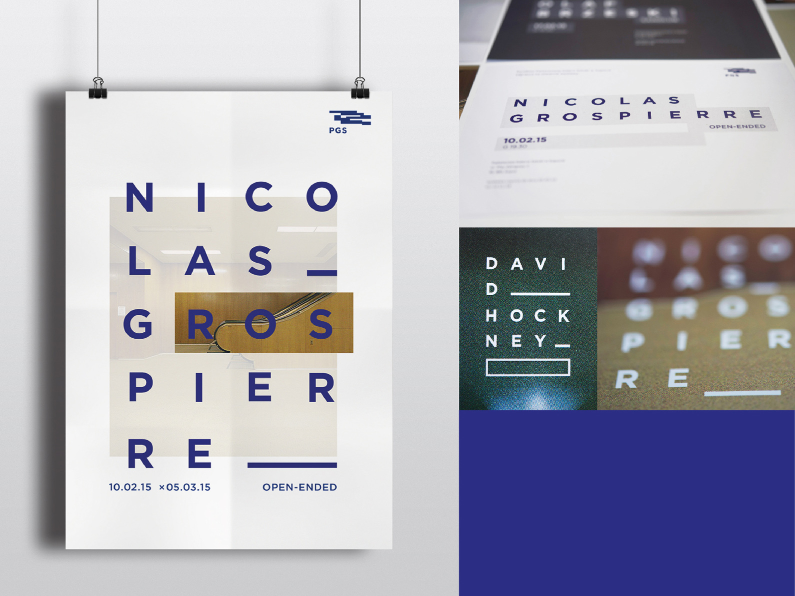
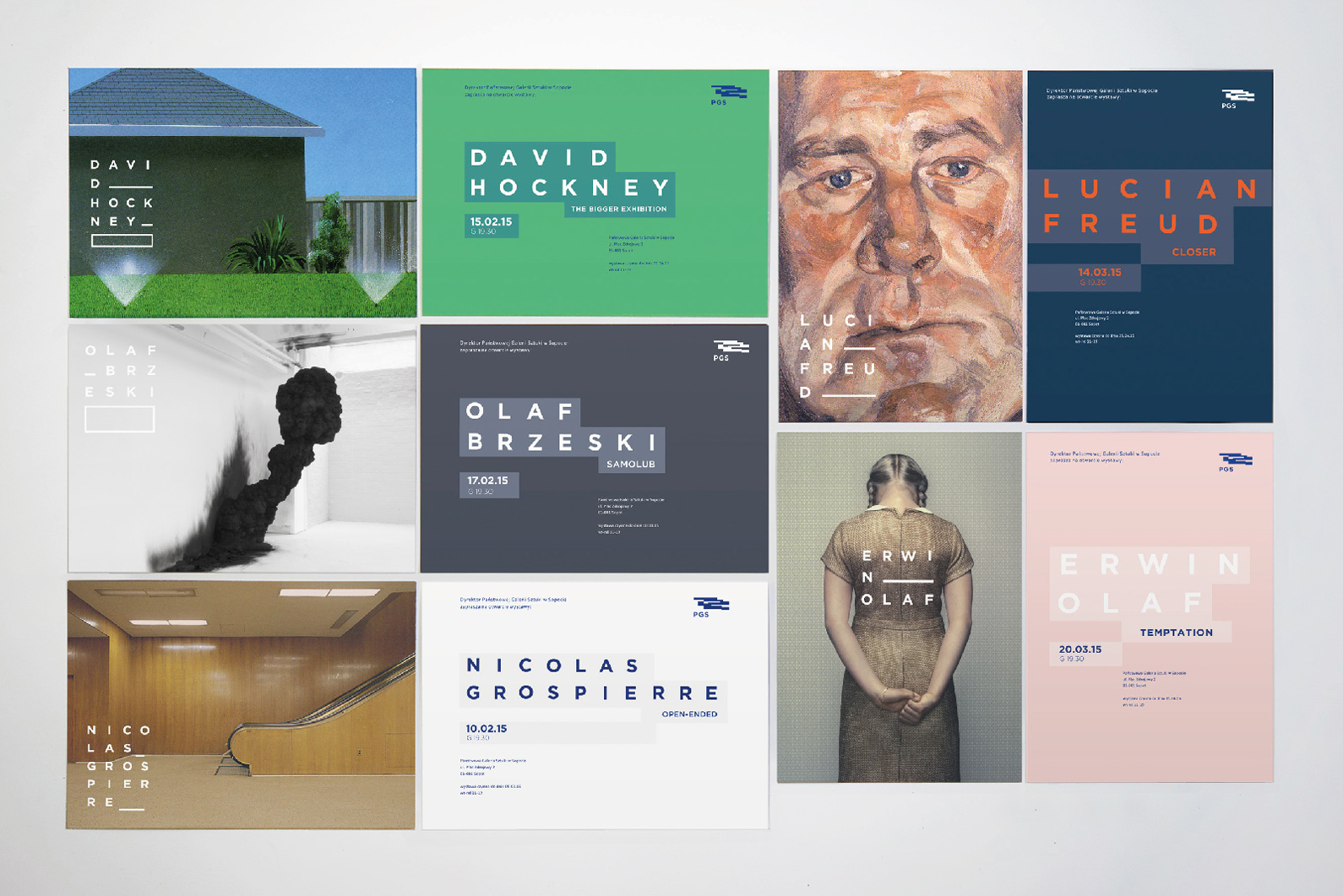
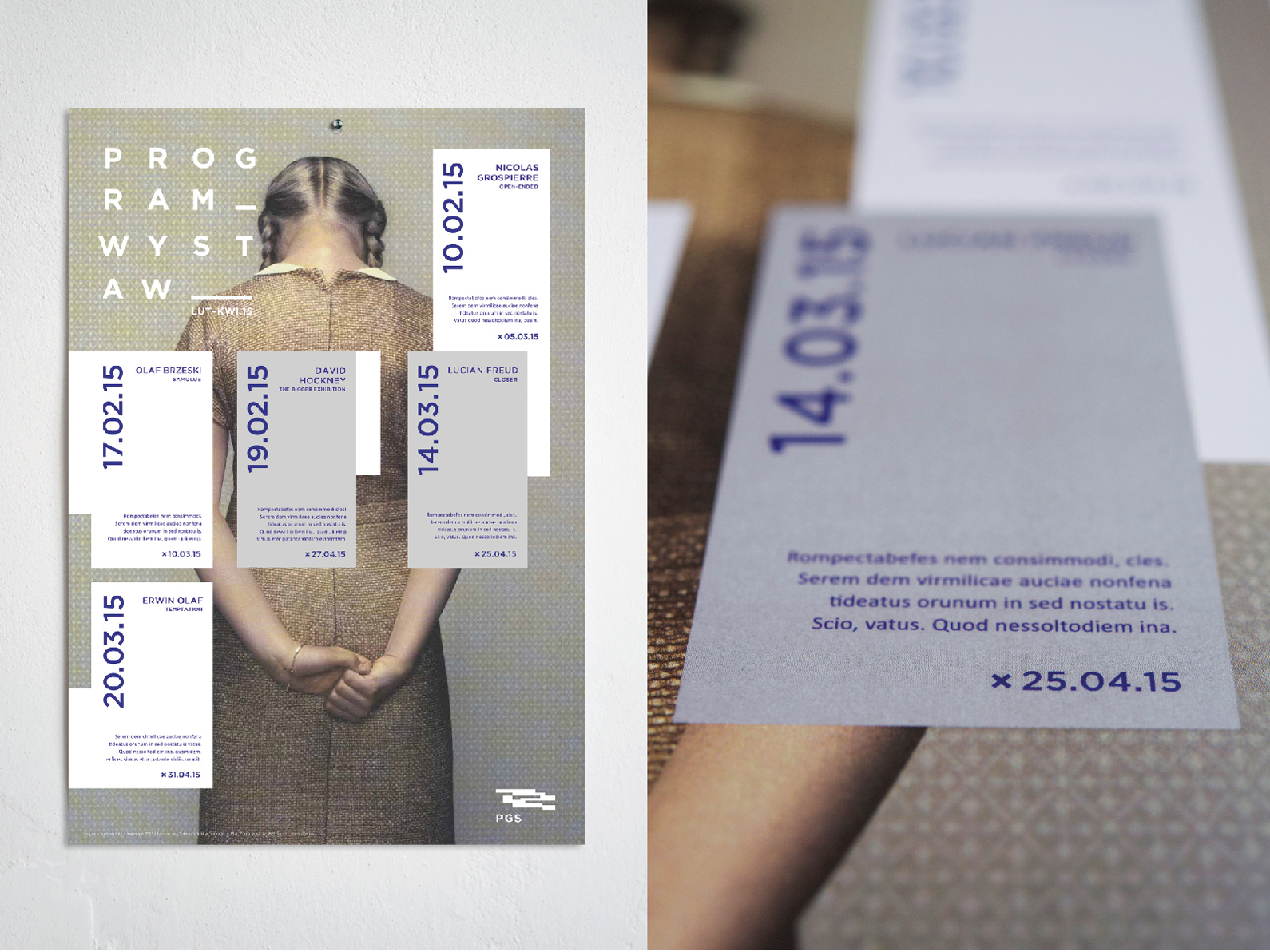
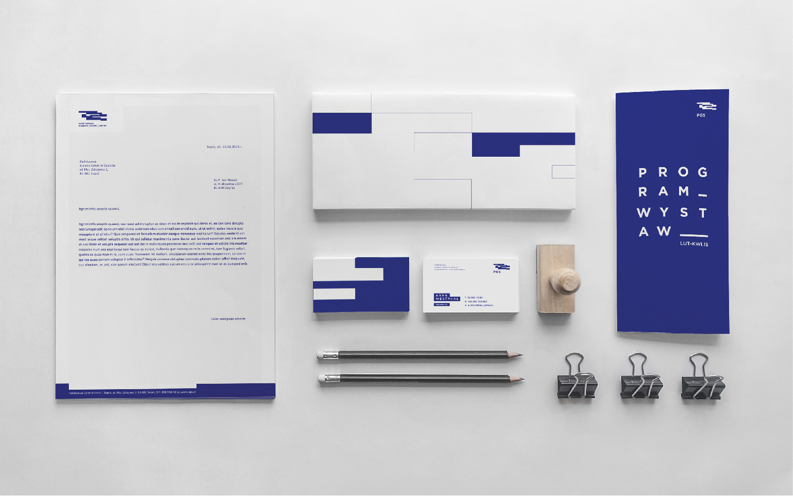
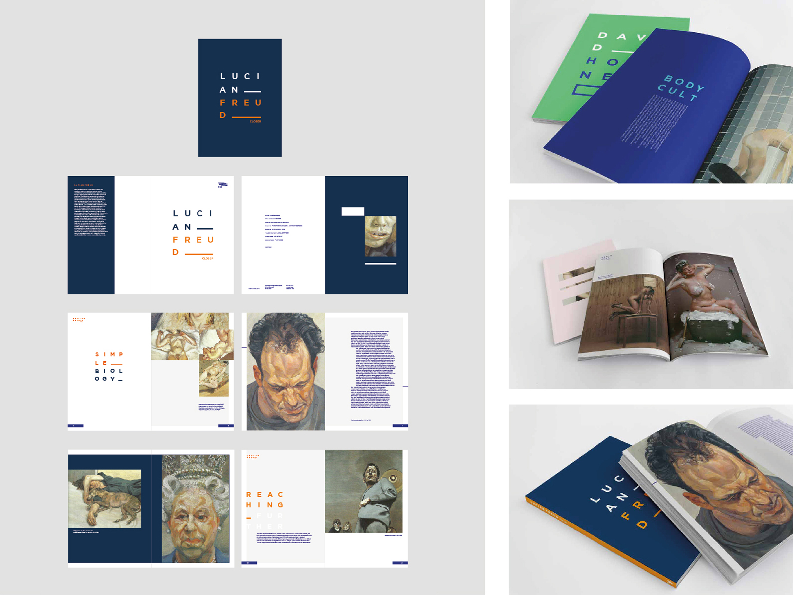
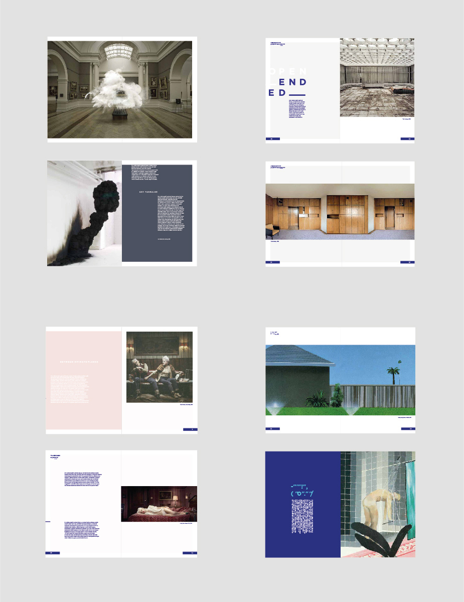
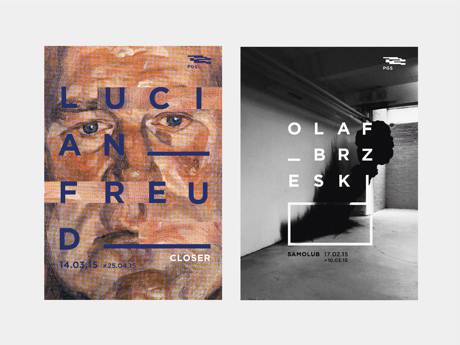
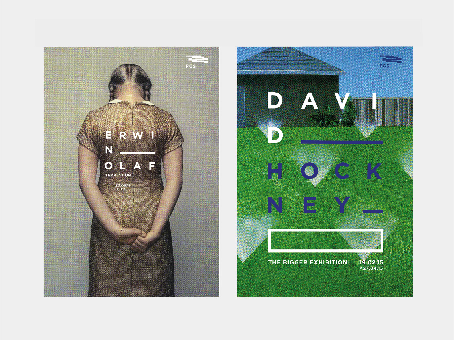
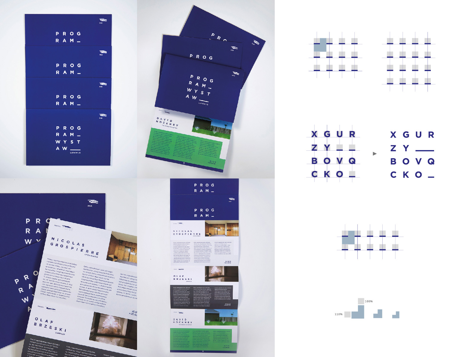
There are works that seduce us with their original approach to the design problem. Anna Okrassa’s design is one of these. It would seem that a visual identity for a cultural institution is an easy way out, and a somewhat bland choice for an MA project. And yet. Creating a simple, yet versatile system for an identity, maintaining its coherence in spite of various visual materials, and above all, fighting the temptation to “express oneself” with a seemingly light subject is a real test of the designer’s maturity. Anna Okrasa’s work reminds us that design is, above all, an intellectual process. All the designer’s decisions appear to be deeply pondered and result from factors that go beyond pure aesthetics. The graphic symbol is linked to the mirrored, three-floor elevation of the gallery building. Typographical compositions serve as the basis for the promotional materials, and their construction premises have been described in detail. The visual typographical core is neutral enough to avoid overwhelming the reproductions of the artist presently on show, yet it is expressive and unites the materials into a whole. The letters can be integrated or separated from the background, which additionally expands the range of possibilities for using the core visuals. As an entirety it may not be emotionally evocative, but nonetheless, many mature designers would not be ashamed to have this work in their portfolio.