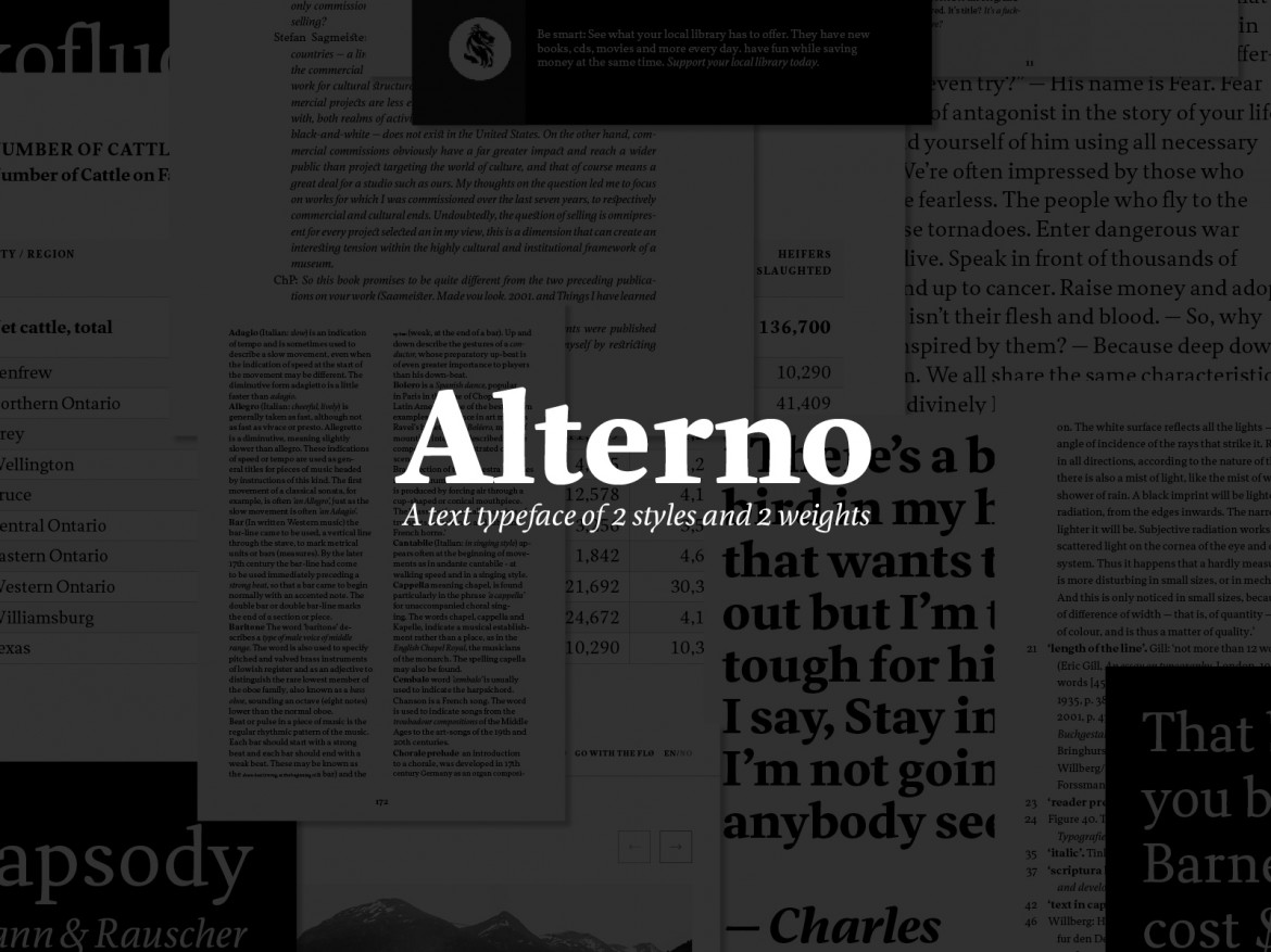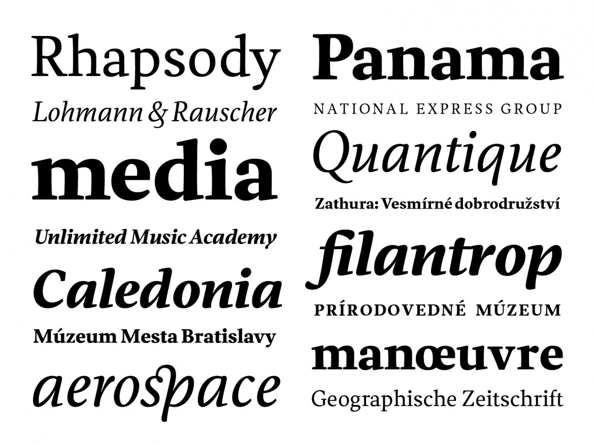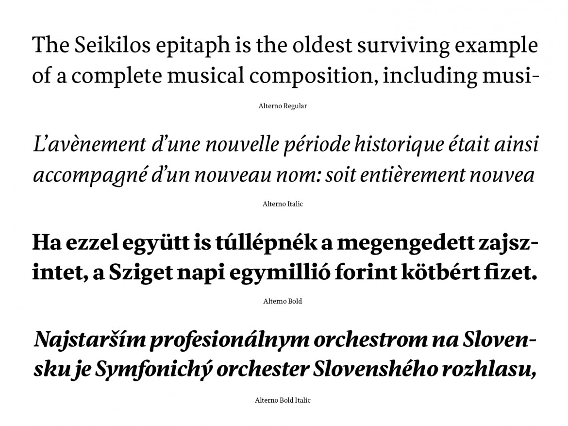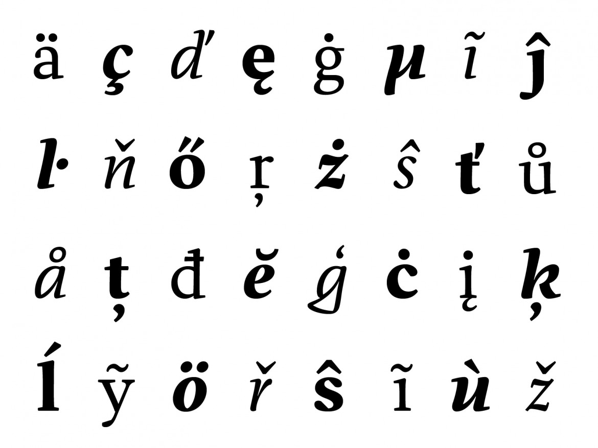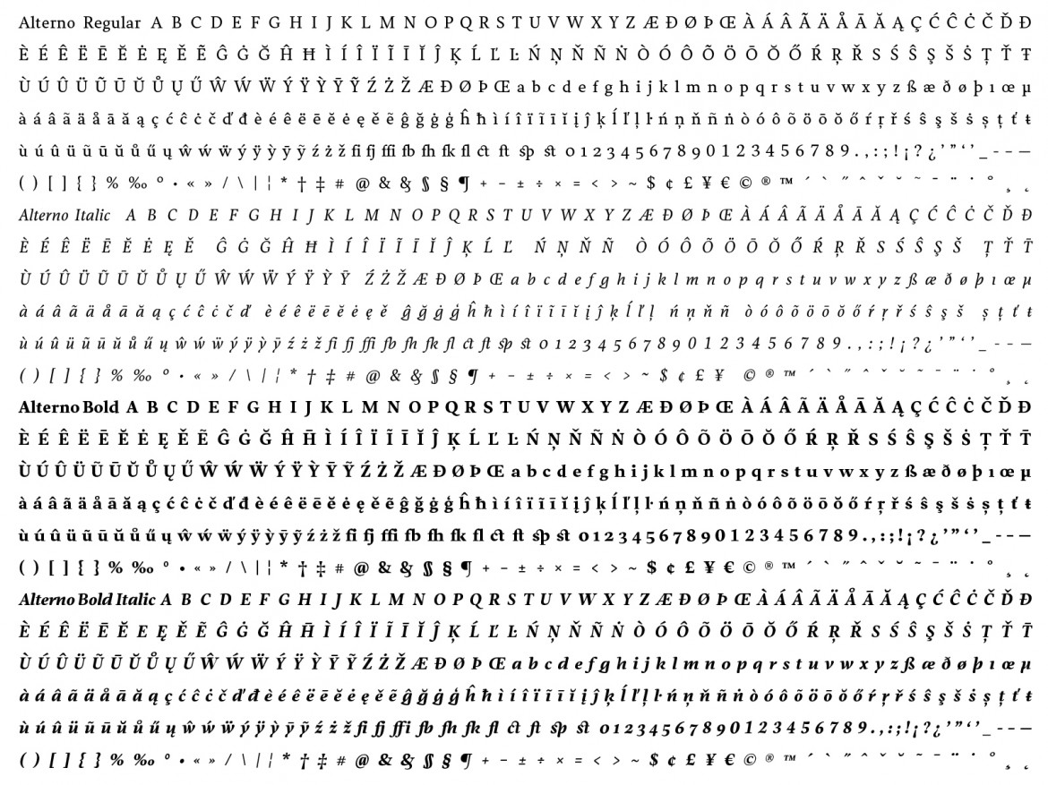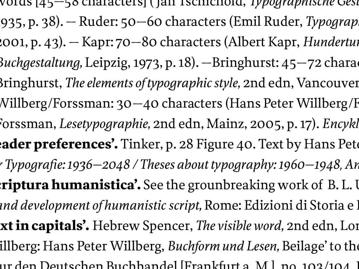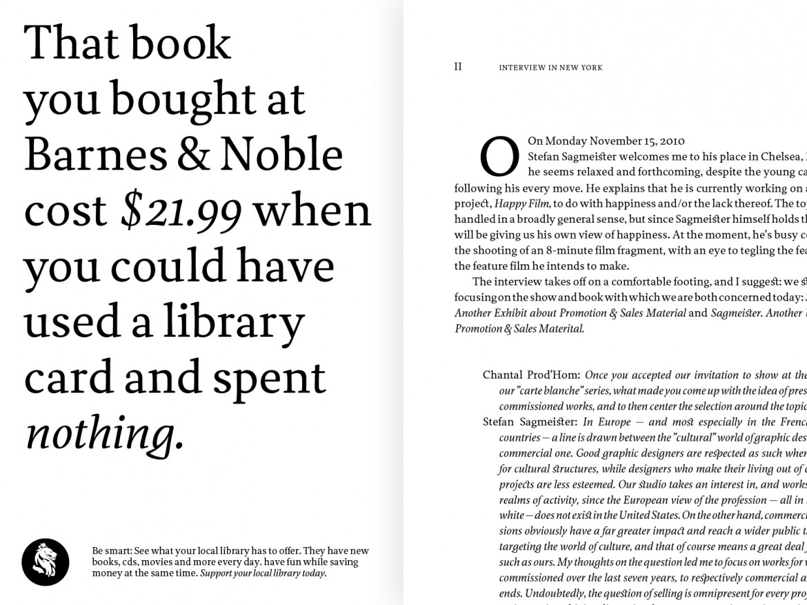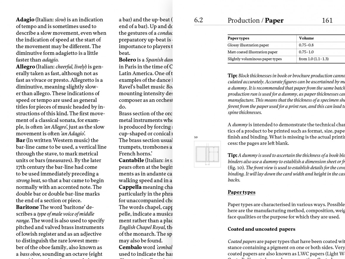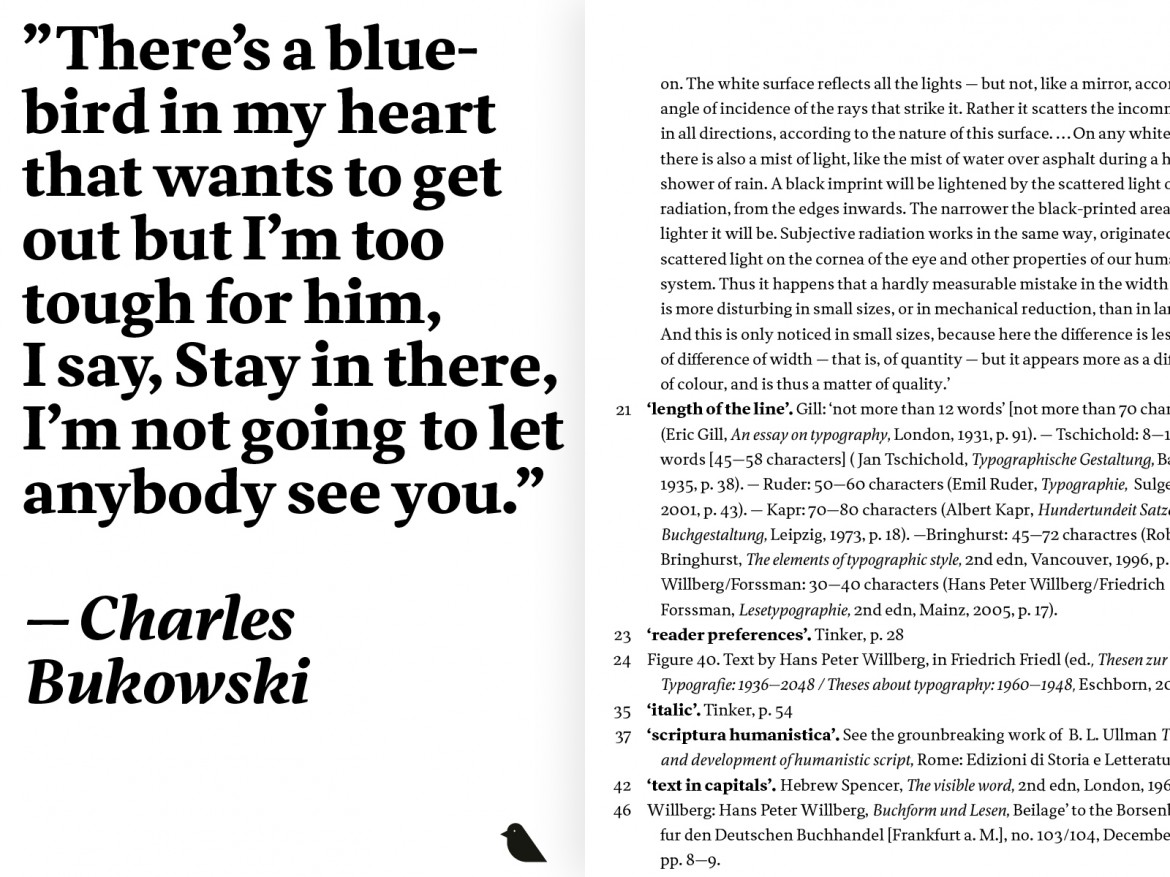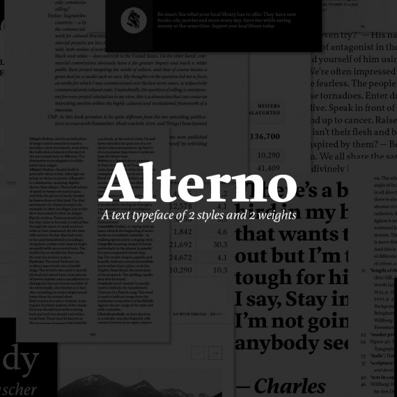
This design began with research on the pairing of upright and italic styles. The designer analyzed the rhythm and typographic color. The resulting typeface was designed for book and magazine layouts, but can also be successfully used for headlines. Although the italic is very idiosyncratic, the designer managed to strike a balance between remaining true to his individual style and the type’s functionality. The font has an extended repertoire of glyphs with diacritics that are well designed for many languages. The typeface has been designed in regular and bold.

