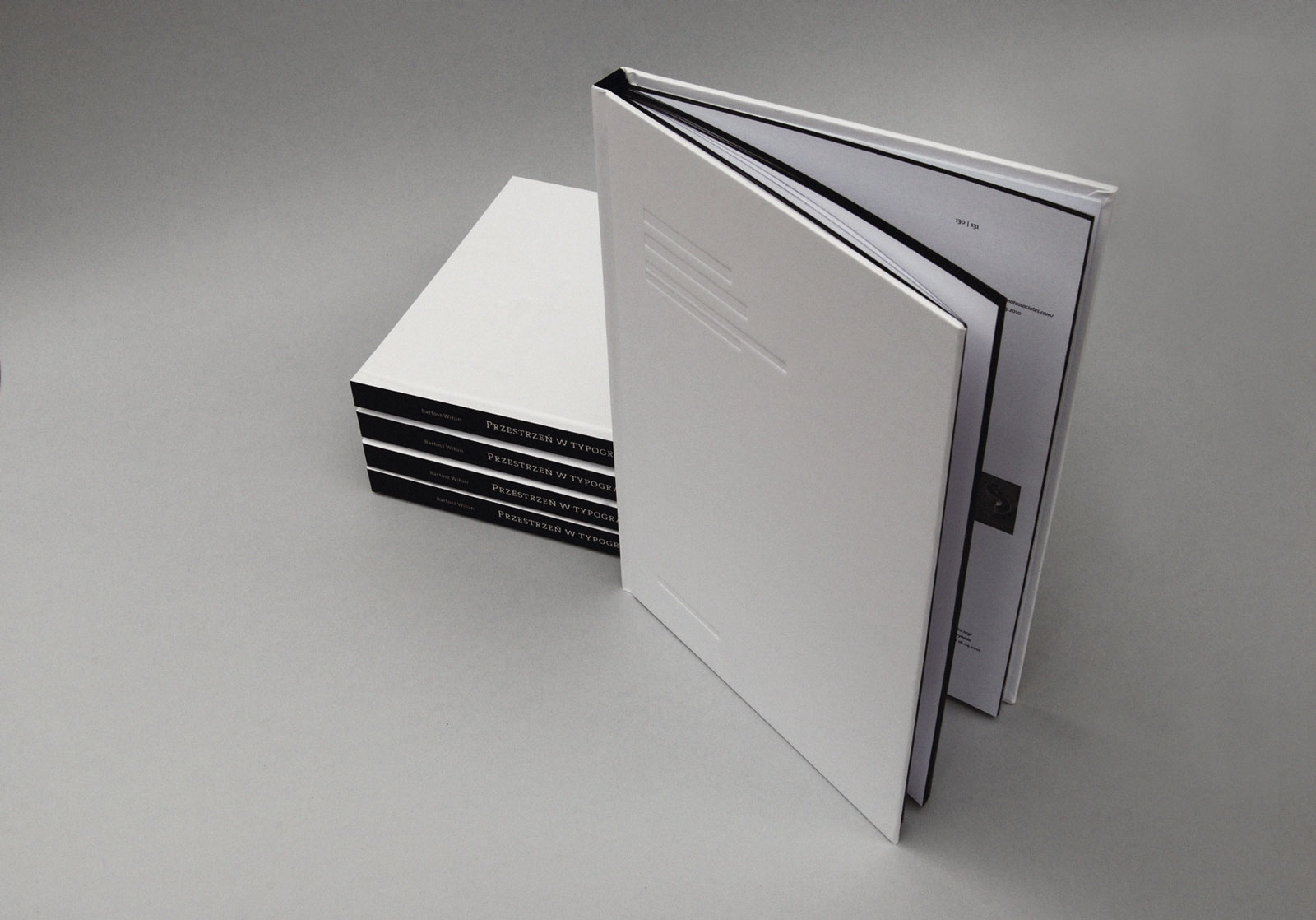
The issue of space, its lack and its proportions in typographical solutions is chiefly perceptible to professionals, or experts on the subject. And yet, “skillfully used [space] makes the flow of information between the sender and the receiver easy and aesthetically pleasing.” Perhaps space is invisible. Bartosz Wiłun perceives it, however. His design is composed of theoretical analyses of issues tied to space in typographical media, graphic design, architecture, literature, film, or life in general, and a practi- cal part – a book design demonstrating all these contents, which is the real test of whether the designer has a feel for his topic. The typographical solutions in the publication are hard to describe, and it is better to have a look. The design is based on clear and legible rules and a hierarchical structure of the text. The very layout is a play on space (or perhaps with space), an attempt to create an ergonomic environment for the reader to grasp the contents. The layout, symbol dimensions, proportions of the interlines, and parameters of the blocks of text literally aim at foregrounding typographical space, creating a very harmonious and elegant design, an impression reinforced by the detail work, impressions, and the color edges of the book.