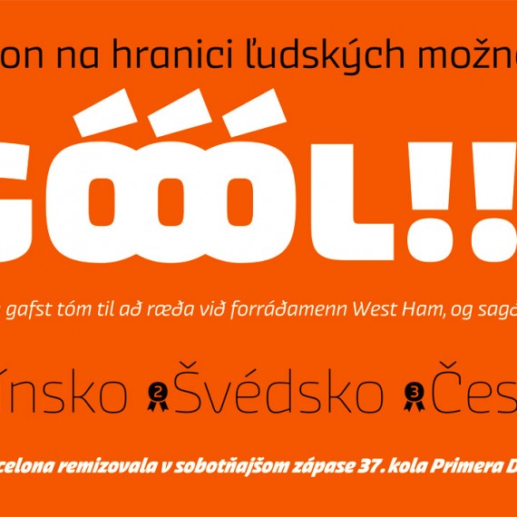
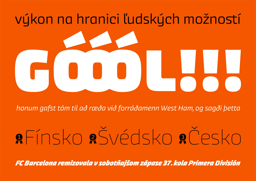
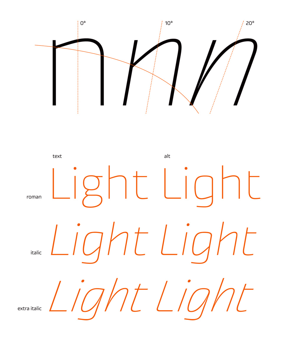
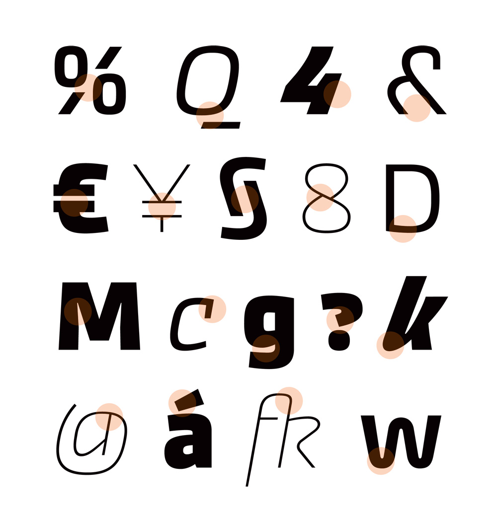
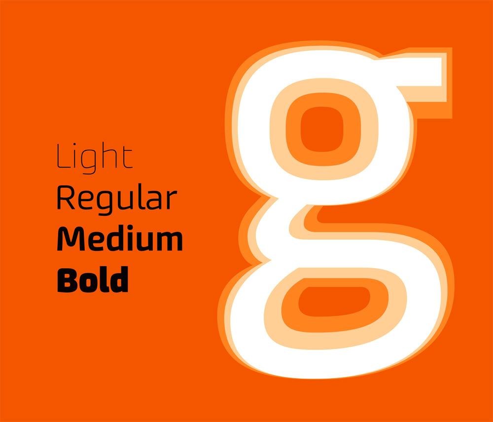
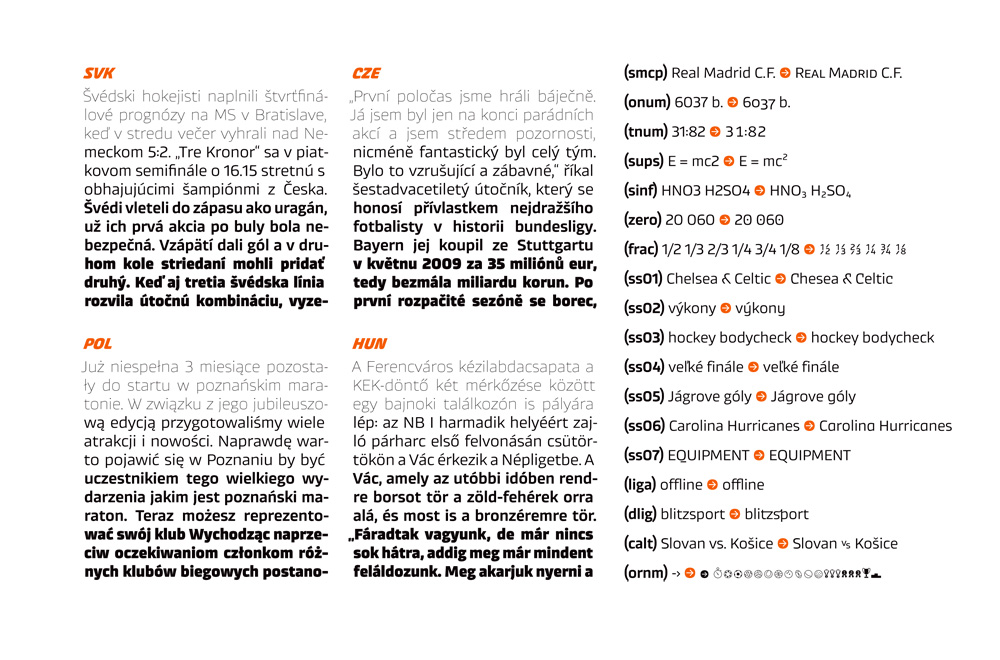
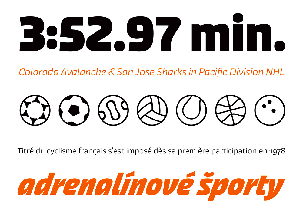
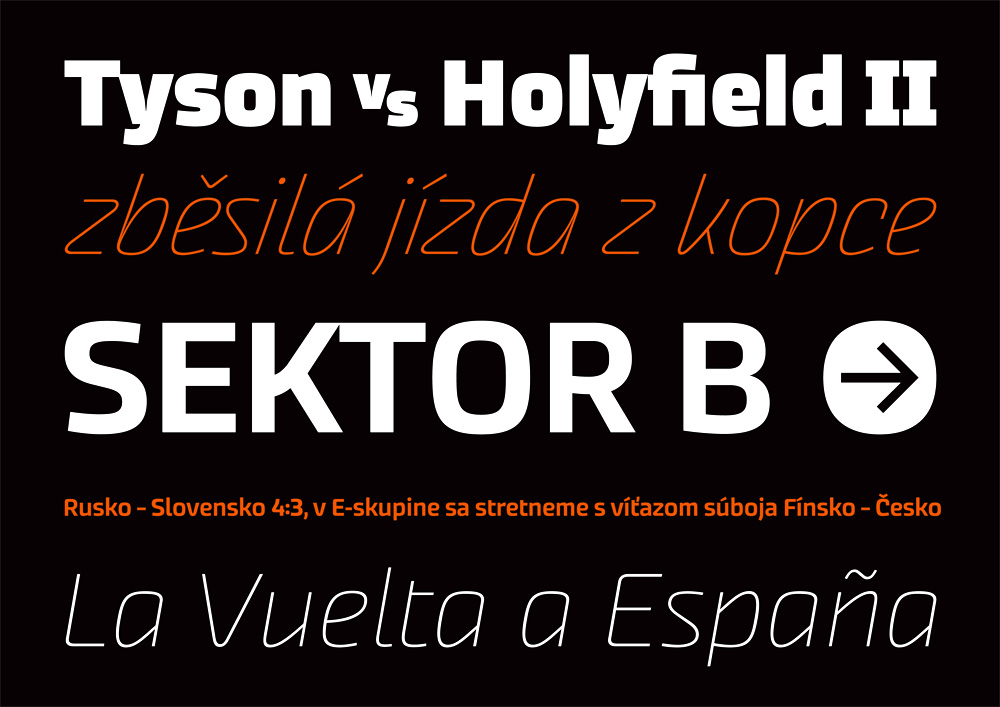
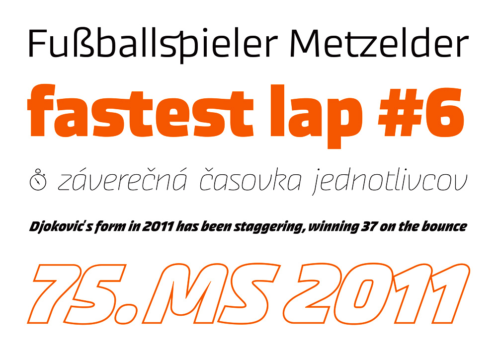
Andrej Dieneš’s premise was to create a typeface for sports. According to the designer, no typeface has been designed specifically for this aim. “Generally the only attempt we see is to bend the typeface or to add effects to make it more dynamic.” This system of three styles is meant for posters, catalogues, logos, sports magazine layouts, and so on. Two specially designed italics, both slanted to the right at an angle of 10–20 degrees, give the typeface a dynamic feel. Neither are they merely oblique variants on the basic typeface; they differ, moreover, in the manner of combining the arcs from the stem of the letters. Moreover, every variant appears in body type and alternative versions, where the combinations of the letter element have no right angles. Dieneš devotes a great deal of attention to the digits, which in his opinion – because of their pride of place in sports information – should differ from those used in an average layout. After reducing the difference between the cap‑line and the x‑height to a minimum, there remains a great deal of space for diacritics, which are important for writing surnames of players and the names of teams.