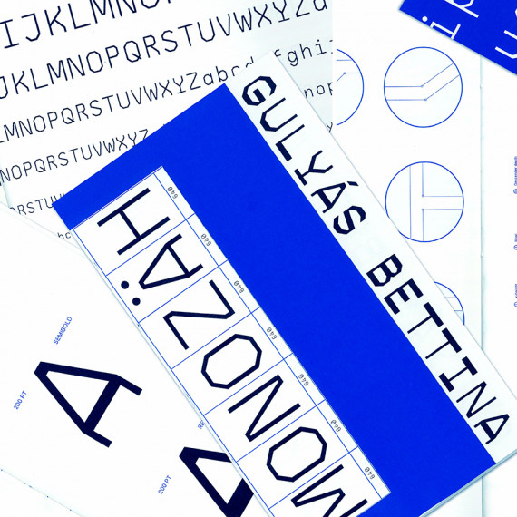
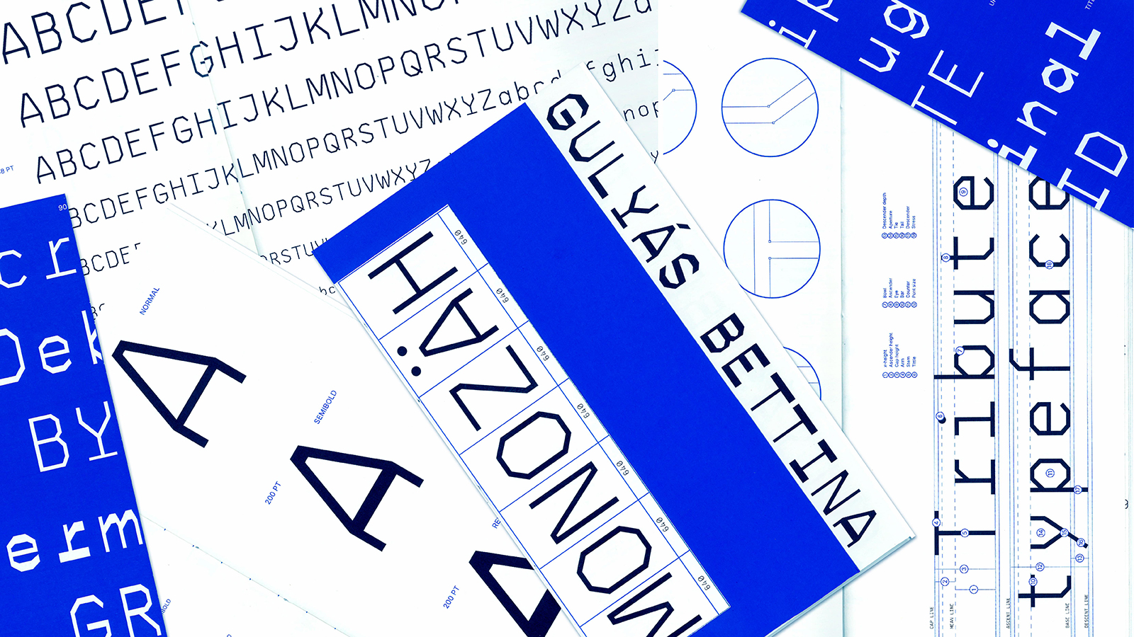
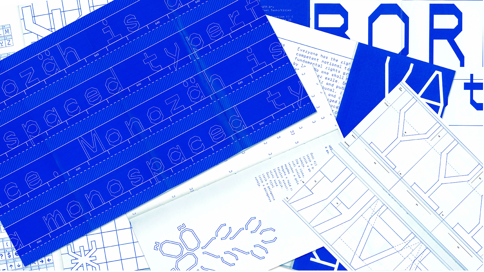
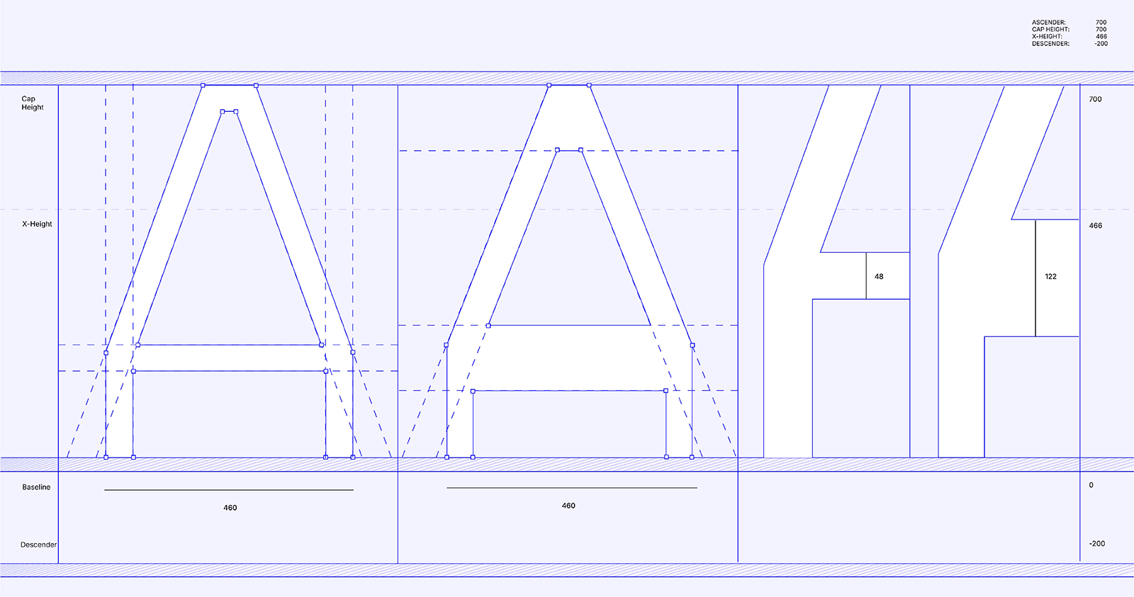
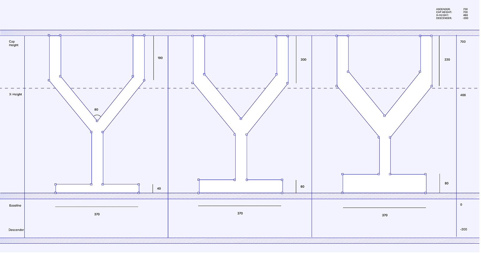
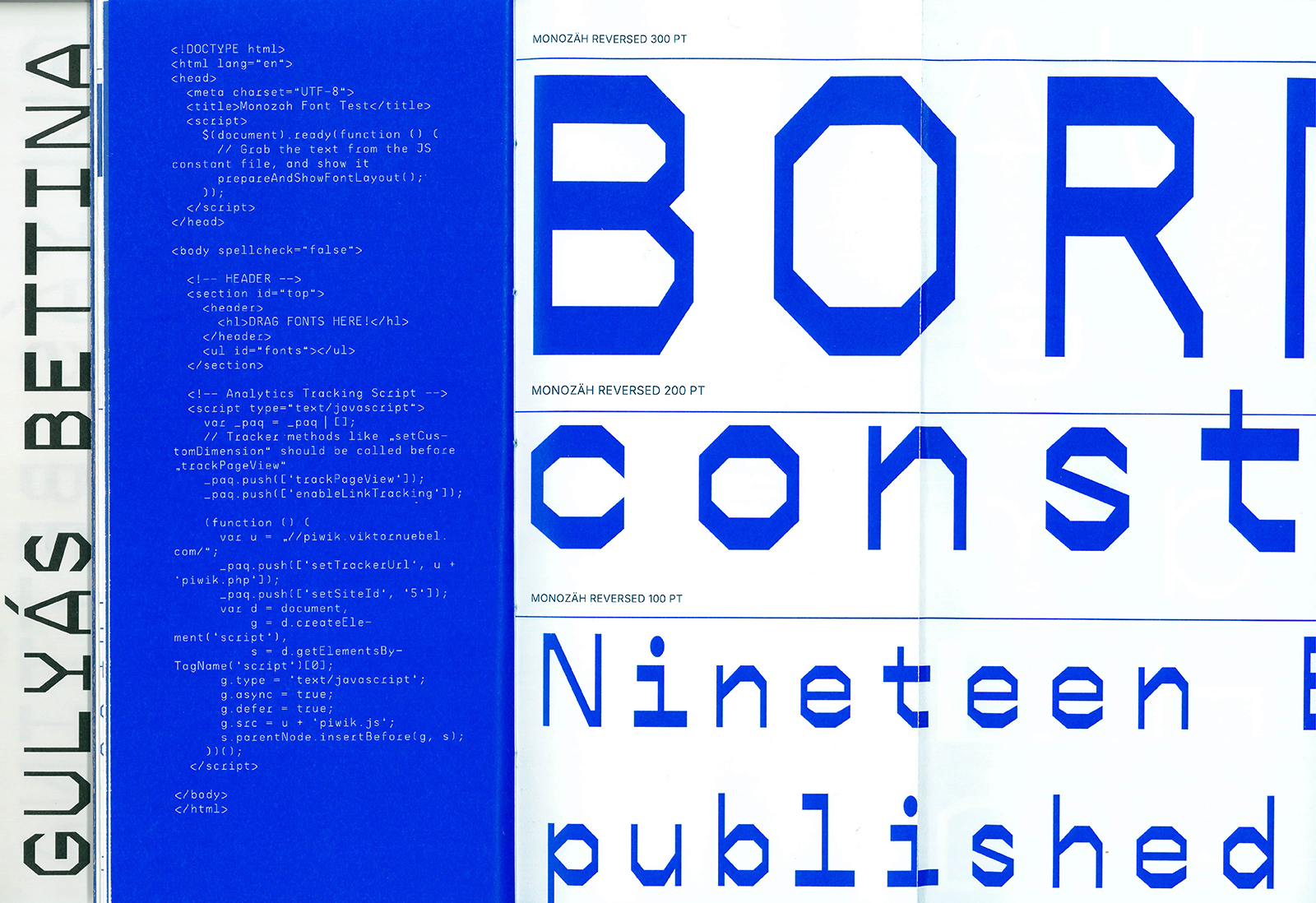
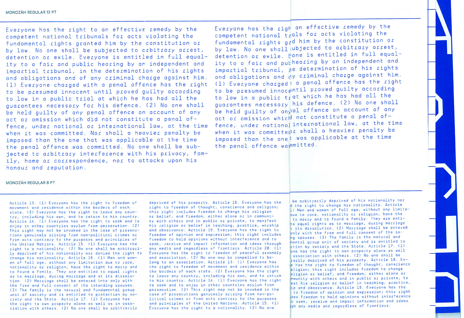
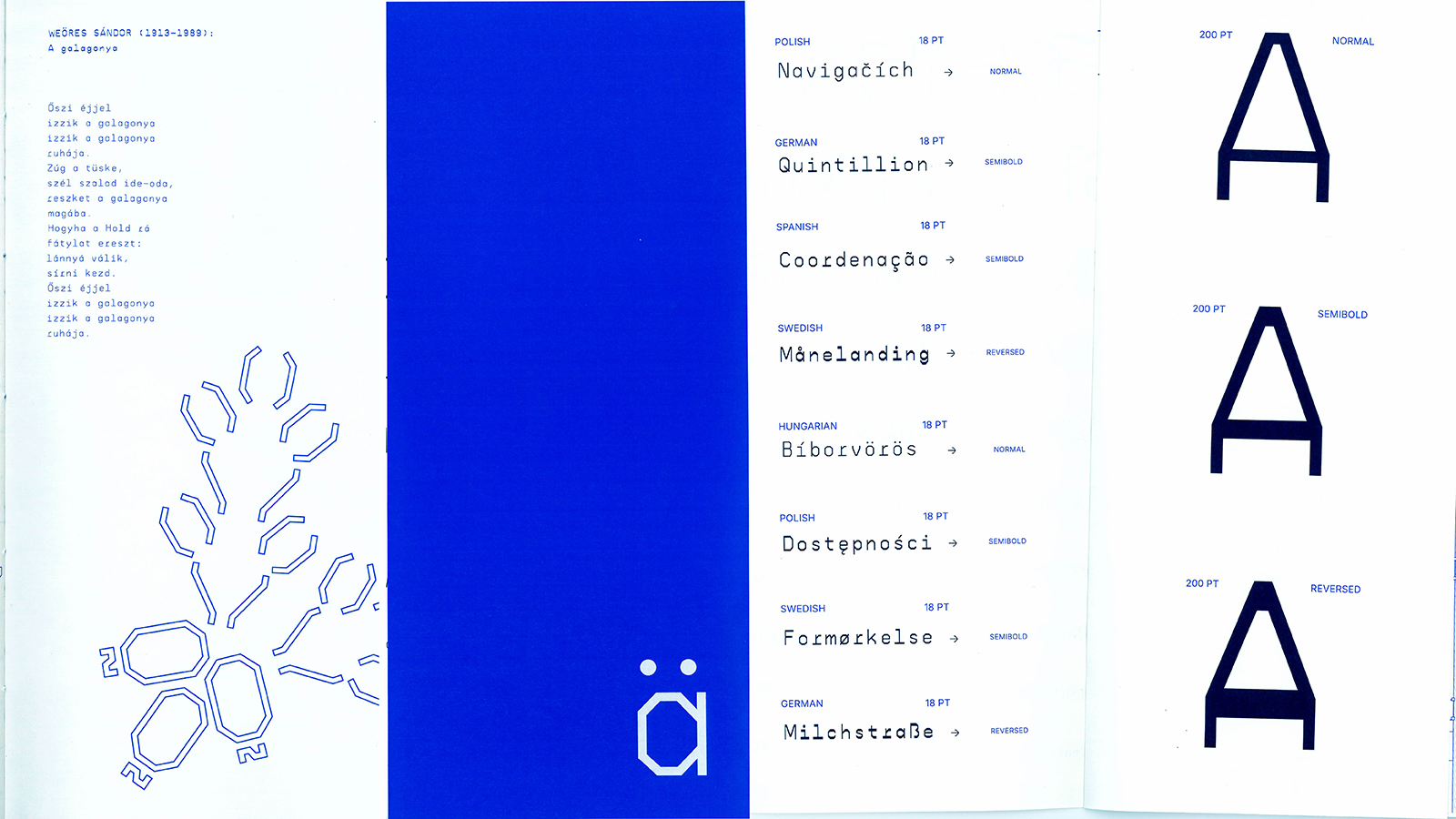
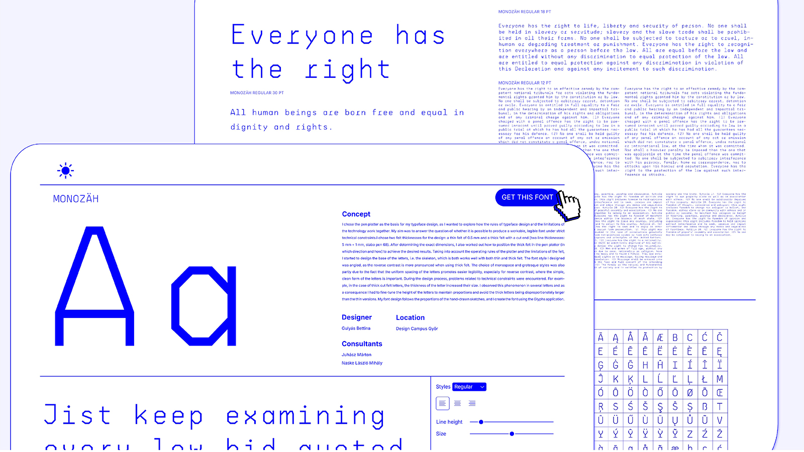
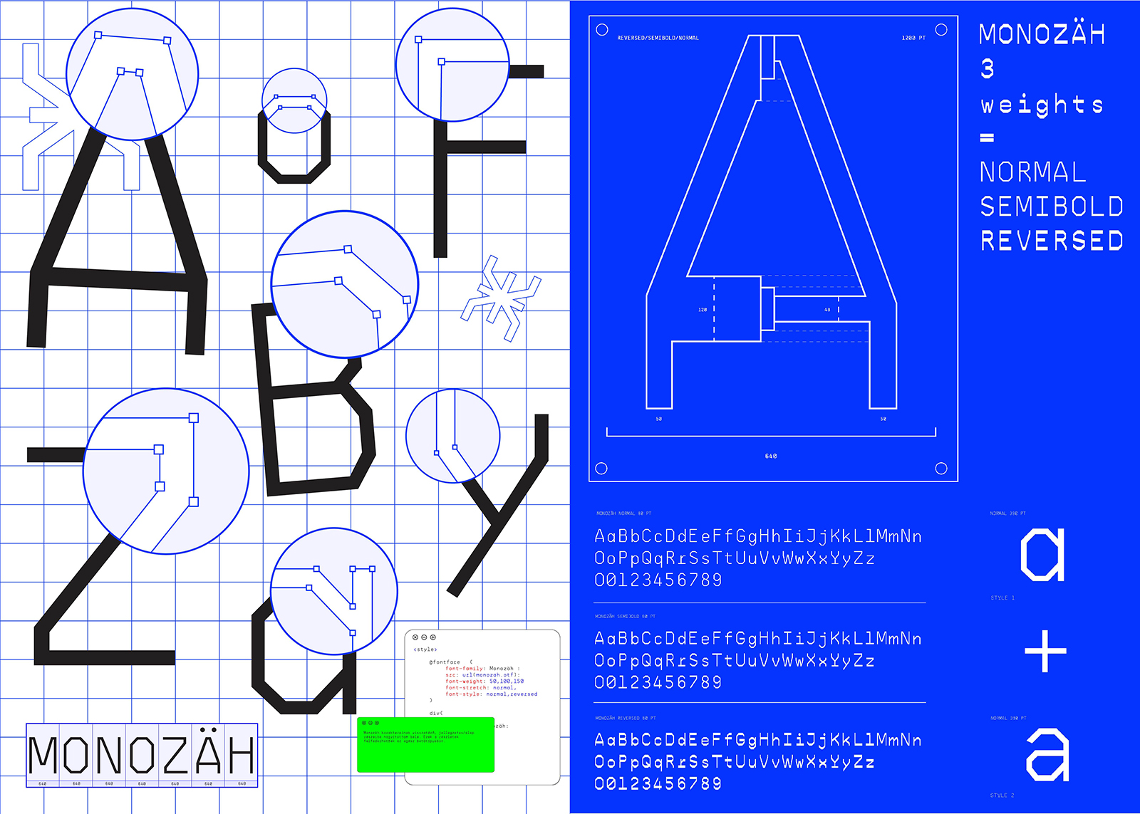
My type design project is based on the use of a CNC pen plotter, as I aimed to explore the interaction between the principles of type design and the limitations imposed by technology. The primary goal was to determine whether it is possible to create a functional and legible typeface within such technical constraints. During the design process, I selected two marker thicknesses: a thin 0.5 mm felt-tip pen and a thick chisel-tip marker After defining the exact dimensions, I also developed a method for positioning the thick marker in the plotter. I began by designing the structural foundation of the letters, or their skeleton The resulting type style became angular, as the use of the thick chisel tip accentuates the reversed contrast effect more strongly. The decision to work with monospaced and grotesque characteristics was partly motivated by their consistent spacing, which enhances readability The final type concept follows the proportions of my hand-drawn sketches, and I am developing the digital version of the typeface using the Glyphs application.